Spring Haiku Exchange


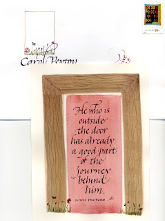
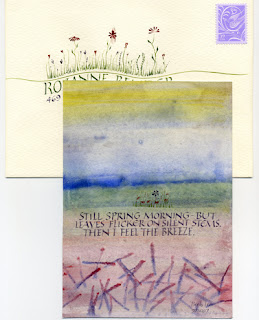
I’m running a little late on the deadline for this exchange amongst members of the Calligraphy Exchange group at Yahoo. Rozanne, I’m mailing it today, and here’s a preview. Click on the image for a closer look. I was working on another piece yesterday, and decided to do a similar wash on another piece of paper for testing; I cut this best 5″ x 7″ rectangle out of the middle to use for the spring haiku piece. Gouache + glair + Leonardt Principality nib + a Mitchell #3.5 nib. The wash is a little darker than I’d like, while, conversely, the wash for the piece I did yesterday always seemed a little too light, or at least too shallow or something. I’ll post that piece in a bit.

The Fine Press Designer’s Dilemma

The February issue (PDF link) of the Caxton Club’s journal Caxtonian features an intriguing article by Michael Russem, of Kat Ran Press, entitled “The Failure of Fine Printing.” He tells of the book edition he so carefully crafted, following, he thought, the best principles of book design — only to have his most avid collector tell him: I don’t buy your books to read.

This quotation encapsulates the main theme of the article:

Because we are so accustomed to mass market productions, the physical elements and processes traditionally chosen for fine press books—handmade paper, letterpress, and hand bindings—are foreign to the average reader and thus call too much attention to themselves, over stimulating the senses and spirit. It is impossible to handle them without relishing in the deliciousness of the materials — though all the while feeling panic over the possibility of damaging these precious items.

He concludes that fine binding is an impediment to the reading of the text, making them an example of bad design … while paperbacks, whose materials are so commonplace as to become invisible, function successfully as vehicles for the text.

I’m not doing the article justice; read it for yourself. And then go comment on the blog he set up for this purpose at http://failureoffineprinting.blogspot.com/

Happy New Year!

I’ve been skiing and I’ve been web redesigning. I’m about ready to start 2007, maybe a little late.

Check out my new website design at www.callibeth.com. I’m still working on it, but I’m very pleased with what I’ve got so far. (In case you want to compare “before” and “after”, the old site is still up at mywebpages.comcast.net/callibeth

New Year’s Resolution


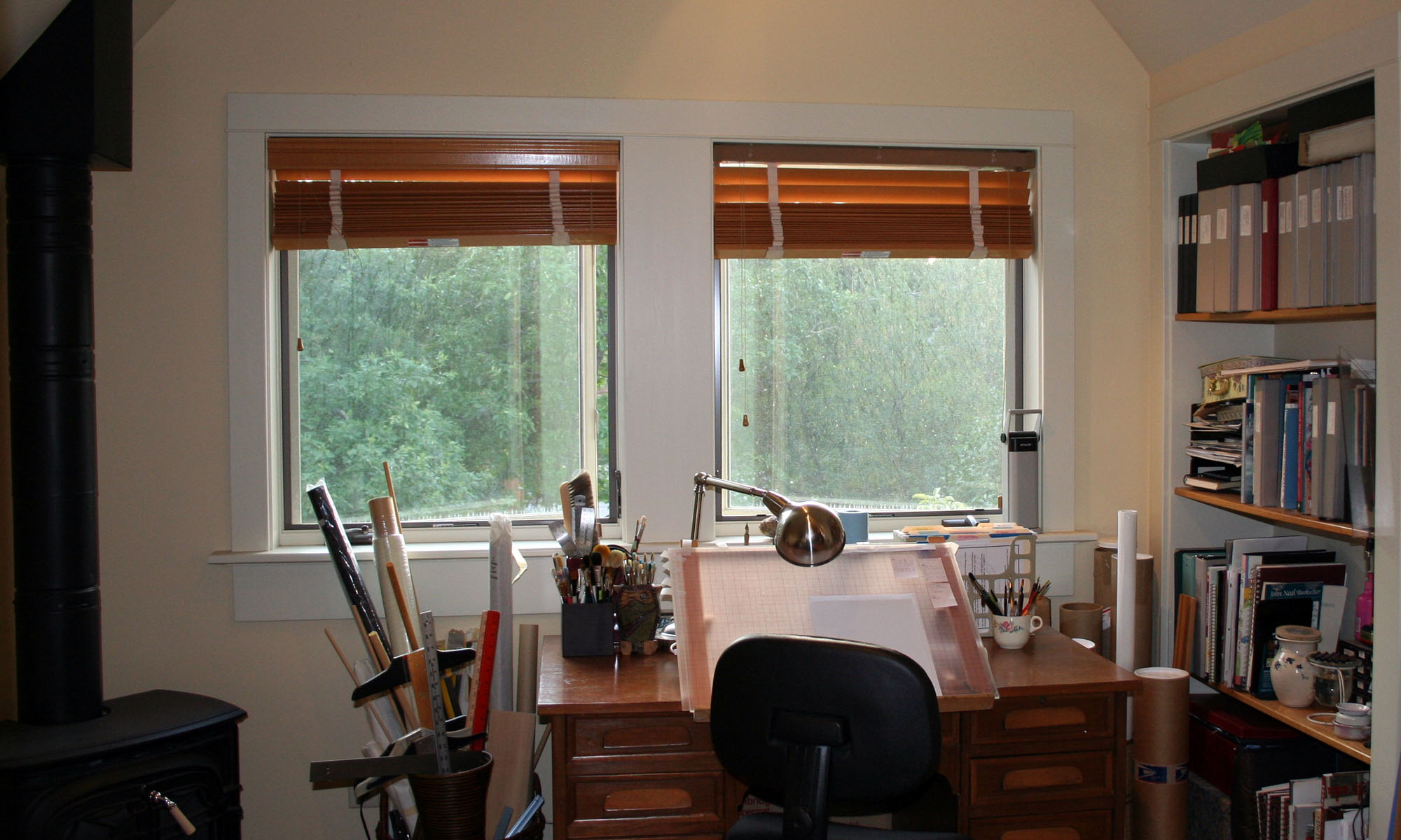
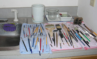
I’ve been having trouble with a layout lately. I’ve struggled with it quite a bit, with a common result: my work area is spotless, and all my brushes and pens and palettes are washed. It’s a way of processing, when paper and pencil aren’t working.

The shocking thing was how many brushes and pens I had to wash. It was simply ridiculous.

So my New Year’s Resolution: Never shut the studio down each night without washing any dirty brushes and pens.

I’m also thinking of putting away some of my brushes and pens, so that I won’t be tempted to keep using clean brushes instead of washing the ones I have. I wonder how many tools most calligraphers keep “out” in their studios.

New York City

I don’t have anything particularly calligraphic to relate, but I had a wonderful time in Manhattan this past weekend, and saw a lot of art.

Saturday morning we walked around Chelsea and looked in on a number of art galleries. I have a couple of pet peeves about New York art galleries. One of them is that some artists — or maybe gallery directors — have a reverence for space that is not shared by those of us who aren’t crowded into studio apartments. I appreciate space — really I do — but it seems as though some galleries have raised space itself to the rank of art, practically leaving the actual pieces of artwork to fend for themselves. I saw some of that this trip, but (paradoxically?) those galleries were … closed.

This show, “The Shapes Project“, at the Friedrich Petzel Gallery was fascinating, in an OC sort of way. Allan McCollum has created 300 shapes which combine in enough ways to produce a unique shape for every person on the planet. He has a developed a system to ensure that no shape will be accidentally repeated. The show mainly consists of row upon row of these black-and-white framed shapes, arranged in stadium-seating format and simply begging to be toppled, domino-style; also, notebook upon notebook upon notebook documenting the shapes that have been created so far. This man has so widened my understanding of the spectrum between whim and obsession that I’m thinking of going back and re-evaluating some projects I had abandoned simply because I thought them too complex or time-consuming.

My other peeve about art galleries concerns exhibits that consist entirely of pieces that are so self-referential as to be nothing more than confessionals or art therapy. I had the misfortune to stumble on one of those this trip. It was some sort of installation with random things on the walls and floors, irritating lighting that kept changing, and the most monotonous singing which tended to repeat lyrics way more times than their eloquence deserved.

Coming from the above-mentioned show, I was not in a good mood. So I was too ready to dismiss Robert Irwin’s installation, Who’s Afraid of Red, Yellow and Blue at Pace Wildenstein. I don’t know enough about modern art to say anything at all intelligent on the subject, so I probably ought to just shut up. But I won’t (more’s the pity). At first I thought this was a case of space-elevated-to-art. The huge warehouse of a room held only 3 foot-high, 15-foot square platforms painted in gloss red and blue and yellow, and aluminum panels suspended from the ceiling. That’s it. But the more I walked around it, the more I seemed to see the method in his madness. He had placed the yellow panel between the red and blue panels, I think because it had more tonal contrast. The suspended panels and the high-gloss paint on the platforms reflected colors back and forth, serving as a giant color wheel. Except the format of the color wheel was closer to the format of reflecting mirrors which reproduce images to infinity.

Or maybe it was all my head. That’s the niggling suspicion I usually experience when looking at modern/abstract art.

Saturday afternoon we saw the Broadway musical “Gray Gardens“. We hadn’t planned to see a musical this trip, but this was recommended and sounded interesting. Before attending the show, I couldn’t imagine how the plot could possibly lend itself to a musical. And I was of the same mind after attending the show. It was the strangest musical I have ever seen.

Saturday night we went to the Metropolitan Museum. The Vollard show was very interesting, as expected.


I didn’t expect the Tiffany exhibit to be spectacular, but it was. The exhibit recreated some garden architecture from whose eaves hung pane after pane of glass decorated with the wisteria design shown. What a breathtaking sight!

Sunday I visited The Cloisters for the first time. I had long wanted to visit this museum, which is a daughter of the Metropolitan Museum and dedicated to medieval art. The Cloisters itself is not to be missed. It’s one of the few places in the US where you could reasonably be confused into believing you’re in Europe — in Provence, maybe, or an Italian hill town. The walk up to the Cloisters is pleasant, and view at the top extends for miles. Many of the architectural details of The Cloisters were hauled over from Europe, including an entire 12th-century chapter room. In this museum I discovered that although I love medieval architecture — which is large-scale art — and manuscript books — which is small-scale art — I don’t care for much of the middle-scale artwork such as sculptures, painting, panels, and so on.

Looking back on the trip, I see that we packed a great deal into two days, and I enjoyed it even though I did without the attractions I rarely miss: The Morgan, SoHo, Talas, The Center for the Book Arts, Kremer Pigments, and a nice long walk from Chinatown to Times Square.

An Inconvenient Truth

Here’s some news that just ruined my day. Boing Boing reports that the National Science Teachers Association has refused 50,000 free copies of Al Gore’s documentary film, “An Inconvenient Truth“. Why? Here the Washington Post op-ed article (written by producer Laurie David) quotes the NSTA’s reasoning in its e-mail refusal:

Accepting the DVDs, they wrote, would place “unnecessary risk upon the [NSTA] capital campaign, especially certain targeted supporters.” One of those supporters, it turns out, is the Exxon Mobil Corp.

I saw the documentary film when it came out. I had a very selfish reason for not wanting to go see it: I believed I would just become more upset than I already am about our government’s role in perpetuating our abuse of our environment. But the facts and ideas were presented so thoughtfully and methodically that it was a pleasure to see it all laid out so clearly — sorry though that picture is.

At Wired Magazine, Lawrence Lessig wrote, about the film:

About halfway through, Gore cites two studies to explain why so many people remain so skeptical about global warming. The first looked at a random sample of almost 1,000 abstracts on climate change in peer-reviewed scientific journals from 1993 to 2003 and found that exactly zero doubted “that we’re causing global warming.” The second surveyed a random sample of more than 600 articles about global warming in popular media between 1988 and 2002 and discovered that 53 percent questioned “that we’re causing global warming.”

See the trailer here. And then, if you haven’t already done so, rent the movie.

We will shortly return to regularly scheduled calligraphy and book arts programming.

very once in a while you know for sure you’ve done your job well as a parent. Today our teenage son is working on a sculptural English project (depicting his version of Dante’s circle of hell, but that’s beside the point). I showed him how he could use a bone folder to help lay down a long line of tape without wrinkles. He thinks this is cool, and shows it by breaking into song, the lyrics of his own making, to the tune to “I Love My Dictionary” from “The 25th Annual Putman County Spelling Bee”:

“I love my cool bone folder,
It’s a very reliable friend.”

How satisfying!