Bagatelle #1

I recently posted this bagatelle on Instagram. It’s one of a series of daily useless writings made up of leftover paint and discarded papers. I’ve been making these as an antidote to the several long projects that I’ve been working on for what seems like forever. I can see the light at the end of this tunnel … but for now I’m still in the tunnel.

A little work/play in the studio

Deadlines are looming and inspiration is elusive. I tidy my studio, clear out some old practice sheets .. and make some more. It’s a never ending cycle.

To entice the muse, I sit down to play a little. I’m thinking of another little book (and just now remembering I’ve never posted the last little book), so I experiment with a number inks/paints and a #6 Mitchell nib. The lettering is 1.5 mm x-height.Experiments with small lettering

In anticipation of the upcoming conference, and the class that will be taught by Carl Rohrs, I get out a brush and do … something. It’s not much, but it reminds me what a pointed brush feels like in the hand. I feel some of the kinetic learning of a recent Spencerian workshop creeping in. That’s good.

Experiments in Metallic Gold


Here’s an example of a valuable scrap of an experiment I’ve saved from a job in which I had to match a very greenish gold printing ink. The notes have come in handy in later years. If you click on the image above, you should be able to read my penciled notes. In case you can’t, I’ll repeat them here. All the paints are gouache, a calligrapher’s best friend because they aren’t transparent as watercolors are, and yet don’t dry fast and turn to plastic as acrylics do.

Row 1: I started with equal parts Schmincke Glitter Gold + Schmincke Bronze.
Row 2: added Winsor Green.
Row 3: a little more Winsor Green, and a little more.
Row 4: a little more Winsor Green to the first row-3 block, and a little Yasutomo black stick ink to the second row-3 block; then a little more stick ink, and then a little less stick ink

Since a block of paint doesn’t look like a block of lettering, I continued on with lettering to further tweak the ink matching, using the ink from the last block on row 4, then adding more and more black. Notice that on the 4th line of lettering I didn’t change color at all, only taking off the pen nib’s reservoir; however, the 4th line looks darker than the 3rd line. Especially with metallic colors, the reservoir seems to collect color/metallic particles behind its tip and make the delivered paint more watery.

By the way, I’m using a Mitchel Roundhand nib here, probably a size 2½. The whole page is about 7″ x 8″. And this photo shows no light reflection. I tried to get a photo to contrast the color with light reflection, but no luck.

Happy ABC Flag Book


I’m so enamored of these little alphabet paintings I did summer before last. I’ve been scanning them in, altering the scans, deciding not to alter them after all, trying them out in my website design class, and playing with them in books. Here’s a flag book in progress. I had to tell myself this was just a very, very rough prototype so I wouldn’t spend all my time getting perfect accordion folds — a particular obsession of mine, and nearly totally useless in building models.

I imagine that the finished book — if I ever finish it — won’t look much like this. But it’s a start.

As always, click on the image for a close look.

Music Quote & Envelope Exchange


Yikes! I’m two weeks overdue on this exchange. Does anybody else get August and September dates mixed up when they’re in numerical-month — 08 and 09 — form? Anyway, this morning I got on the stick and got them done. They’re going in the mail today.

Here’s the way these started. I had:
1) A quote is by Auerbach: “Music washes away from the soul the dust of everyday life.”
2) A scrap piece of paper with a cut-out square in the middle — from the Concertina Carnival book I constructed the other day.
3) Some leftover square invitation envelopes from a wedding job.
4) Some scraps of watercolor paper which I cut 6.75″ square to fit the envelopes.

Just to get started, I wrote out the quote on this scrap of paper. I put the word “Music” above the cut-out square, realized I wasn’t going to have room at the top for the rest of the quote and so wrote the rest of the quote below the square. And voila! I had my design.

I masked off a 1.75″ square in middle of my scraps of watercolor paper, cut an abstract violin/viola/guitar shape from a couple of pieces of removable Scotch tape, rummaged around in my drawer for a palette with some gouache colors already on them … and had some fun. In the process, I got out a gold gel pen, the luscious Sennelier oil pastels I bought so long ago and some cosmetic sponges for rubbing the oil pastels over the gouaches.

The envelopes are supposed to have a teaser on the outside as to the quote inside. I painted my spattering brush with brown for dust, but I guess the blue that was dried on the brush had more effect than the brown.

It’s been a fun morning.

Broad-edge script

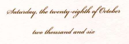
I’ve been away on an of-my-gosh-school’s-about-to-start-and- we’ve-got-one-more-opportunity-for-a family trip. Now I’m working on addressing wedding invitations. Here’s a bit from the invitation itself:

Although I first thought I’d use a pointed-pen script for the addresses, after struggling through a few envelopes I quickly bowed to the necessities of the materials. The paper proved to be way too toothy and not at all sized enough to allow the use of a pointed pen.

I could include a rant here about wedding stationers and their high-priced unwritable stock — even Crane has been known to make their envelopes inside-out at times, so that the sizing is on the useless inside of the envelope. Oh, the torture of having the beautiful side of the paper so close and yet so far away. It’s like a tying up a horse within 5 inches’ reach of water. All right, all right, I’ve just deleted the rest of this rant. Calligraphers know exactly whereof I speak, and the rest of you can only imagine our pain.

Anyway. On with my saga.

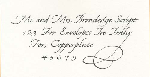
After I concluded that pointed pen was impossible for these envelopes, I started experimenting with a #5 Mitchell Roundhand nib — a narrow broad-edge nib — and tailored a script that I think complements the script above. Here it is (as always, click on the thumbnail for a closer view):

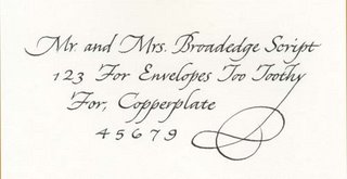
I began with a standard italic, and then made changes so that it more closely resembles a pointed-pen script such as Copperplate. I used the same lining guide I had set up for the original pointed-pen script, and this had the effect of a) making very small lower-case letters, b) enlarging the capitals in proportion to the lower-case letters, and c) slanting the lettering from the usual italic 5-15 degrees to about 40 degrees.

Then I modified the capitals to follow Copperplate forms a little more closely. See the B, the T’s and the F’s. This modification worked because the capitals are so tall: 11 pen-widths.

The x-height is 3 pen-widths tall, which necessitated a widening of the script.

And, voila! I like this script. I think I’ll add it to my standard style offerings.

Messing around in my recently clean studio


My 11-year-old niece Ashley is visiting for a short week of art camp. Yesterday we got out all the Zig markers — and I’ve got a slew of ’em: writers, calligraphy, brush-and-scroll — and spent half the day playing around with them. Here’s my experiment, on Fabriano cold-pressed watercolor paper. The bamboo comes out of a booklet, Color Layering System, by Suzy Ratto. The rather strange column of lettering is based on one of Hans Joachim Burgert’s pieces.