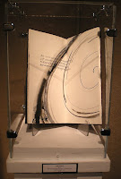
My friend Beth, who just turned 60, has set herself a challenge to finish making 60 books by her 62nd birthday. So far she’s posted images of the first 3 books. It’s really wonderful to look through the images. I’m looking forward to viewing the next 57 books! I’ve added her blog to my blogroll at the right. Have a look also at her editioned book, For Immediate Release.
Feathers, Fins & Foliage — Opening
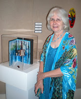
The opening reception for “Feathers, Fins & Foliage” was this evening, and there was a very lively turnout at LeMoyne,
both for the members-only reception at 6pm and for the general reception beginning at 7pm.
I took just a few photos before my camera batteries died. I’ll get more tomorrow night at the First Friday reception.
Book Exhibition in Burlington, Vermont
If I lived anywhere near Vermont, I’d be making plans to attend the Vermont book art guild’s exhibit currently up at the Firehouse Center for the Visual Arts in Burlington. The center’s website (linked in the title of this post) has only one book image, but Elissa Campbell has photos of the exhibit up on her Blue Roof Designs blog.
Book commission
I’ve just finished a book that was commissioned as a birthday present. It was such a Jekyll-and-Hyde experience. The text was simply lovely, and I enjoyed the design of the book. But for the longest time I simply could not complete a block of writing without spilling gouache on the page, skipping a word, or unknowingly shifting the guidelines. Once I got through those mistakes and got a block of lettering done, I found I had accidentally used regular tape to affix the page to the pad of paper that was acting as a writing cushion. When I removed the tape I wasn’t able to preserve the top layer of the corners of the pages. Aargh. So I started over again. But amidst all these starts and restarts, I came to the conclusion that the text paper I was using just didn’t present the gouache well. So I switched to Fabriano Ingres, which is such a ubiquitous paper that I didn’t think of it initially. The warmer cream color of the page looked gentler, and the gouache laid down better on the surface.
Alongside the frustration, though, was a satisfaction in writing a pretty wonderful text, something that was written very directly and personally. That part of the process was a real joy.
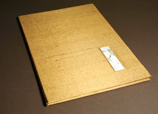
I used a new roll of Japanese paper to back the gold/tan silk that I found in the home decorating section of the fabric store. That went well; I believe this new kozo paper is a little thinner than the 15-year-old roll of Tableau that I’ve nearly used up.
Decorated Paper Accordion
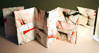
A little experimentation in the studio, inspired by Alisa Golden’s new book, Painted Paper. Both the decorative technique — using sumi ink and FW acrylic inks — and the folded structure are presented in the book. I like the look. I’m thinking of what kind of content could accommodate this layout.
A book in between the drawings
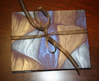
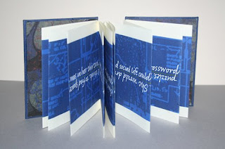
A small commission of a single poem. I love this marbleized paper — I’ve got at least two color schemes of this design, and I hope I’ll be able to get more when I run out. I’ve had it awhile — probably 6 or 7 years. It coordinates beautifully with Schmincke ultramarine blue calligraphy gouache.
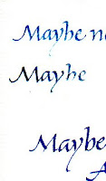
With this small commission I started a series of trial papers that I hope to keep together so that I don’t keep reinventing the wheel. I was looking for a text-weight paper that plays nicely with the ultramarine blue. Ultramarine doesn’t play nicely in the pen to begin with, so there’s all the more reason to find that paper that doesn’t add to the general trouble. I thought I was going to have to settle for Crane’s Crest, but I was finally able to make Somerset Book laid work well enough, on one side at least, which is all you need for an accordion book. Which is what this was.
Anyway, now I have similarly sized samples of both sides of Somerset Book Laid, Mohawk Vellum, Lana Laid, Arches Text Wove (which is good if you’re painting but why struggle with it for straight lettering?) and Crane’s Crest. I’ll keep using them as samples until I’ve covered them so completely I’ve got to start another sheet.
Feathers, Fins & Foliage: Artist Books on Florida
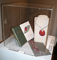
LeMoyne Center for the Visual Arts in Tallahassee, Florida, is seeking submissions for a juried exhibition of handmade artist books embracing themes of Florida’s natural resources – places, animals, and plants.
This exhibition will be presented in conjunction with LeMoyne’s annual exhibition of jewelry.
Postmark deadline for entries: July 11, 2008
Exhibition dates: October 3-26, 2008
Eligibility: Open to artist books of any medium and style created as either an edition or one-of-a-kind. Open to all living artists who reside in the North America over 18 years of age. Artwork must have been completed within the last 3 years.
Prospectus and entry form may be found at http://www.callibeth.com/bookshow2008/
Contact Beth Lee, callibeth@callibeth.com, or Julia DeHoff, 850-224-9751, if you have questions or need more information.
A birthday present
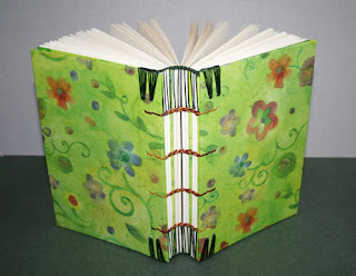
See what my sister, Mary Jo, gave me for my birthday recently! A couple of years ago we went to a book arts workshop in Asheville. I blogged about it here. Daniel Essig taught the workshop, and we made wooden Coptic books. It was lots of fun, but so far I haven’t done much to follow up. Mary Jo decided to refresh her memory and make another one, just not with wooden covers, and I was the lucky beneficiary.
We met last weekend — she’s in central Florida, 4 hours away — and exchanged book making supplies. I had bought book board, she had ordered Cave paper and rolls of Oriental paper for book cloth backing. I got to see the book she’s working on now. It incorporates 15 or 20 quilt blocks that she made when we went up to Montreat for a week in 2001. It’s an interesting structure which involves a base page on which the quilt square is sewn plus an extension that wraps around and becomes a frame which also connects to the next page. She had finished the text block and I was bringing her book board she needs to do the covers. I can’t wait to see what it looks like finished.
February 14 — Finishing Things
This photo has double import for today.
First, and less obvious but still significant, the box upon which these books are displayed: this is the leftover Crane box from the 425 invitation addresses that were finished today! Yay!
Second, the books. I looked around the studio after the invitation addresses went out, and decided I could still make the artistbook swap deadline — if I got them done today and overnighted them, that is. I got right to work 🙂 No time for a new design, so I decided to do something I’ve done before, only with different covers. And I’ve never swapped these before.
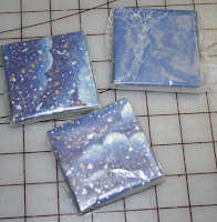
Here are the books swaddled in wax paper and lying on my gridded cutting mat. I sent them off that way to ensure that the accordion folds closest to the covers didn’t stick to the covers in transit.
Oh, it’s fun to make books, even if the design isn’t new.
Butterfly Tunnel Book
Here’s a the front cover of the tunnel book I did in my 3D Design class this semester. (Odd that I would have a tunnel book assignment in 2D Design last semester, and another one in 3D Design this semester.) I’ll post the first tunnel book when I get it back. Julia DeHoff and I are exhibiting some of our artist books at the public library during the month of October, and that first tunnel book is on display there.
The idea for the book came from an essay on butterfly collecting by Ann Fadiman in her book At Large and At Small: Familiar Essays. She describes her childhood obsession with butterfly collecting, recounting in gruesome detail the catching and killing and mounting and collecting of the butterflies. This quote stayed with me: “When did we realize that this was horrible? My brother, Kim, and I had started collecting butterflies when he was eight and I was six. Shame set in about two years later. I remember a period of painful overlap, when the light of decency was dawning but the lure of sin was still irresistible.” This seems to me an excellent description of our current relationship with our planet.
The left side of this image shows quotes from the essay written on the side accordion folds of the tunnel book. (You probably can’t even see it unless you click on the image to get the full-size image.) The right side of the image is a view of the tunnel book from above. Since the view window of the tunnel is a magnifying glass, it was even more difficult than usual to photograph the view inside. The butterflies, cut from my stash of pasted-painted and decorative paper scraps, hang from the tunnel frames by strips of transparency film.
The back of the tunnel book was made to look like a Riker mounted dead butterfly, or perhaps ghost of a butterfly. I made a covered box and a lid which glass from a battered 5″x7″ frame. I thought I’d have to secure it closed with some pins, but the fit was quite snug enough to stay closed on its own. If I’d had more time, I would have found some jeweler’s cotton; as it was, the morning the tunnel book was due I was feverishly pulling apart cotton balls and trying to approximate that layer of cotton.
Such is often the nature of class projects. I have to keep remembering that they’re not actually going in a juried show, for instance.