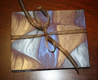
 A small commission of a single poem. I love this marbleized paper — I’ve got at least two color schemes of this design, and I hope I’ll be able to get more when I run out. I’ve had it awhile — probably 6 or 7 years. It coordinates beautifully with Schmincke ultramarine blue calligraphy gouache.
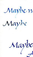
 With this small commission I started a series of trial papers that I hope to keep together so that I don’t keep reinventing the wheel. I was looking for a text-weight paper that plays nicely with the ultramarine blue. Ultramarine doesn’t play nicely in the pen to begin with, so there’s all the more reason to find that paper that doesn’t add to the general trouble. I thought I was going to have to settle for Crane’s Crest, but I was finally able to make Somerset Book laid work well enough, on one side at least, which is all you need for an accordion book. Which is what this was.
Anyway, now I have similarly sized samples of both sides of Somerset Book Laid, Mohawk Vellum, Lana Laid, Arches Text Wove (which is good if you’re painting but why struggle with it for straight lettering?) and Crane’s Crest. I’ll keep using them as samples until I’ve covered them so completely I’ve got to start another sheet.
