Watercolor Moleskine

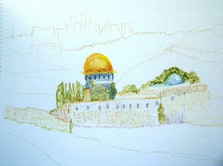
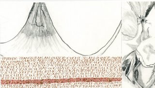
The very first page of the new watercolor Moleskine I picked up in Atlanta. I thought I ought to at least do one thing in it before I leave Jerusalem.

Water-soluble pencils and crayons, water. It’s the little Moleskine, the 3-1/2 x 5-1/2-inch one.

Regardless of perspective, this is the Dome of the Rock, not the Leaning Tower of Pisa 🙂

Shalom, Ellen

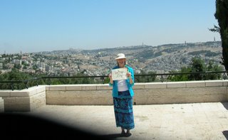
So my relative Ellen (yes, I do know exactly how we’re related, but there isn’t space in this post to go through the whole explanation) has a collection of photographs of friends in places all over the world holding up signs which say “Hello, Ellen”. I saw this collection in her office in downtown Atlanta the same day I got on the plane to Jerusalem, and I decided then that I’d add to her collection. I’ll send her a print when I get home.

The gold dome to the left of my head is the Dome of the Rock, and you can see the walls of Old Jerusalem spreading out just below the dome. I was fiddling with the timer on my digital camera when a nice guy stopped and offered to take my picture for me. The shadow at the bottom left isn’t really a shadow: it’s the shutter which failed to open completely. (Shadows like that are not so common in Israel, but a shadow can lower the temperature incredibly.) On the left is southern Jerusalem, where we’ve been staying, and on the right is East Jerusalem.

Third post from Jerusualem

We leave for the US tomorrow. I haven’t posted much while I’ve been here, but I may make up for it today. This morning I took a long walk to the Promenade, painted a little there, and then walked back. It took most of the morning, and it was enjoyable. I took a lot of pictures on the way but, fortunately for you, I’ll only share a few. Which reminds me of a rather funny thing that happened last week. I met up with some friends from Tallahassee who were visiting Jerusalem for a few days. We shared a taxi out to Kibbutz Tzuba for a wonderful hike on the hills and down into a couple of Arab villages in the valley and back up to Tzuba for dinner. On the way there, my friend was showing me pictures of the three days of hiking they’d just done in the desert. Every time she switched to a new photo, I’d say, “Cool!” Finally, the taxi driver asked if he needed to turn down the air conditioning. I guess I should have been saying, “Yofi!” instead. Hmmm. Maybe you had to be there …

Anyway, here’s a sign I’ve been passing every day — walking or on the bus — and meaning to photograph. It took a few times of looking at it before I realized it looks funny. And then it took a few more times before I realized why it looks funny to me. Maybe only a calligrapher would notice, and maybe only a Latin calligrapher who’s been concentrating on holding a 60-degree pen angle for making Hebrew letters. Hint: it’s the “d”. The top of it has been trimmed to a 60-degree angle. Looks funny to us romance-language folks, who are used to seeing letters generally begin and end at somewhere between 0 and 45 degrees. Or 90 degrees, now that I think about it. But 60 degrees looks odd. (I mentioned this to my husband, and he just looked at me blankly. If you too are now looking at your computer screen blankly, at least I can’t see it. That’s the beauty of blogging.)

Pen nib size comparison chart

This morning I needed to find out what size Mitchell Roundhand nib is 1.5mm wide. I’ve got a chart at home somewhere (how many thousand miles away is that, I wonder), but the Niagara Calligraphy Guild has posted Barbara Qualley’s chart online. How convenient!  Here’s a link to the chart.

And the answer is: #2-1/2 nib.

Second note from Jerusalem

How in the world do people manage to travel and blog daily? It’s a mystery to me. It’s taken me a long time to adjust to the change in time zone and climate.

I’m continually amazed at the lushness of the flowering trees and shrubs in Jerusalem. Here’s a view of the sky from the sidewalk on Hamelitz, near our apartment. It’s quite pleasant to walk in Jerusalem if one avoids the main roads and keeps to the gardens, parks and neighborhood roads. This is easy to manage. I’ve been walking a lot here. On Thursday, I walked at least 6 of the hours between 10a.m. and midnight.
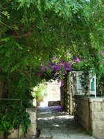
Here’s a photo of the entrance to a house near our apartment. This is a relatively high-maintenance entrance, because the overhead vegetation has to be trimmed frequently. At least that’s my impression, judging from the number of people I’ve seen trimming branches from sidewalks and walls. But the maintenance is well worth the shade! The difference between standing in the shade and standing in the sun is, well, night and day. Haha. Okay, I’m exaggerating. But still.

In between all this walking, I’ve been taking a non-correspondence version of Izzy Pludwinski’s Hebrew calligraphy correspondence course, geared toward “Latin” calligraphers. For anyone who’s taken a good course in foundational bookhand or Roman capitals, the course begins in a comfortably familiar way, with monoline skeletal forms.
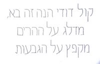
An optional assignment is to amend the aleph-bet to produce a variation. In my variation, I narrowed the proportions to 2/3 of the original, and added curve to a couple of elements that are repeated throughout the aleph-bet. A thumbnail of my variation is shown at right. Click on the image for a closer look. (And please excuse the quality of the image. Microsoft Office Picture Manager can’t match Adobe Photoshop in dealing with my indifferent photography skills.)

The next lessons introduce the broad-edged pen and and x-height of 3cm (!), reduced to 8mm after some practice. This smaller size is still plenty large for at least some errors to be glaringly obvious. Not to mention the sneaking suspicion that there are glaringly obvious errors which I’m completely missing. Not to worry: Izzy will point them out to me at the next meeting.

So, all in all, the letters are not so familiar to me, but the process — of seeing and learning and seeing more and learning more — is much the same as it is for any Latin hand. It is difficult for a non-Hebrew calligrapher to work out the basic architecture of the aleph-bet, because so many different pen-made and drawn versions of it exist. So far, the most valuable thing I’m learning is that basic architecture.

First note from Jerusalem

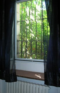
Although I arrived on Tuesday evening, this is the first day I’ve been up to speed. This is a photo of the living-room window which overlooks the back garden of our apartment in the German Colony. The photo and this post is mostly in the nature of an experiment to see whether I can handle the different technology of my husband’s notebook computer and software. Although you can’t see it, the window casements are deep in this Arab style house. The walls are so thick that we have to step outside or lean deep into the window casements to make a mobile phone call. It’s a charming apartment, with high ceilings and lofts.

I’m taking Hebrew calligraphy lessons while I’m here, and my first assignment is due at noon today. I’ll post more when I’ve gotten my homework done.

Thanks, Mr. Postman!

I just got today’s mail (at 5:30pm — but this is not the time to be complaining about my postal carrier) and found that my entry in this year’s contest, The Graceful Envelope, received an Honorable Mention! Yay, me!

This is the 12th annual Graceful Envelope contest, and for many years I’ve planned to submit something, but this is the first time I’ve ever actually gotten something in the mail.

“Eighty percent of success is showing up.” — Woody Allen

Inspire Me Thursday: Word Art II


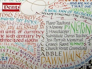
More Word Art for Inspire Me Thursday. This was done about 10 years after the “Love” quotations shown in the previous post. (Sorry about the glare — I didn’t want to unframe it.)

This was a birthday present for my mom sometime in the mid ’80s. I had done one for my dad the previous year, and for many years they hung side by side in my parents’ house. Several people who saw them commissioned me to do similar pieces for their own special occasions/people, and I’ve always enjoyed doing them.


Here’s more detail. Both images can be clicked to get a larger image.

Inspire Me Thursday: Word Art I


I’m still working on last week’s Inspire Me Thursday theme: Abstract Art. But the new theme, Word Art, is right up my alley.

Here’s a piece I did in high school or college, before I ever knew about calligraphy. It consists of a collection of quotations about love, many of them conflicting with one another. I used felt-tip markers and paper from some unremembered sketch pad.

Click on the thumbnails to see a bigger picture.

The lower image shows detail from the upper image.

Later, I did word pictures of people. I’ll post the one I did for my mom back in ? A long time ago, anyway, but after I had begun to learn calligraphy.