New York City

I don’t have anything particularly calligraphic to relate, but I had a wonderful time in Manhattan this past weekend, and saw a lot of art.

Saturday morning we walked around Chelsea and looked in on a number of art galleries. I have a couple of pet peeves about New York art galleries. One of them is that some artists — or maybe gallery directors — have a reverence for space that is not shared by those of us who aren’t crowded into studio apartments. I appreciate space — really I do — but it seems as though some galleries have raised space itself to the rank of art, practically leaving the actual pieces of artwork to fend for themselves. I saw some of that this trip, but (paradoxically?) those galleries were … closed.
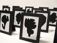
This show, “The Shapes Project“, at the Friedrich Petzel Gallery was fascinating, in an OC sort of way. Allan McCollum has created 300 shapes which combine in enough ways to produce a unique shape for every person on the planet. He has a developed a system to ensure that no shape will be accidentally repeated. The show mainly consists of row upon row of these black-and-white framed shapes, arranged in stadium-seating format and simply begging to be toppled, domino-style; also, notebook upon notebook upon notebook documenting the shapes that have been created so far. This man has so widened my understanding of the spectrum between whim and obsession that I’m thinking of going back and re-evaluating some projects I had abandoned simply because I thought them too complex or time-consuming.

My other peeve about art galleries concerns exhibits that consist entirely of pieces that are so self-referential as to be nothing more than confessionals or art therapy. I had the misfortune to stumble on one of those this trip. It was some sort of installation with random things on the walls and floors, irritating lighting that kept changing, and the most monotonous singing which tended to repeat lyrics way more times than their eloquence deserved.

Coming from the above-mentioned show, I was not in a good mood. So I was too ready to dismiss Robert Irwin’s installation, Who’s Afraid of Red, Yellow and Blue at Pace Wildenstein. I don’t know enough about modern art to say anything at all intelligent on the subject, so I probably ought to just shut up. But I won’t (more’s the pity). At first I thought this was a case of space-elevated-to-art. The huge warehouse of a room held only 3 foot-high, 15-foot square platforms painted in gloss red and blue and yellow, and aluminum panels suspended from the ceiling. That’s it. But the more I walked around it, the more I seemed to see the method in his madness. He had placed the yellow panel between the red and blue panels, I think because it had more tonal contrast. The suspended panels and the high-gloss paint on the platforms reflected colors back and forth, serving as a giant color wheel. Except the format of the color wheel was closer to the format of reflecting mirrors which reproduce images to infinity.

Or maybe it was all my head. That’s the niggling suspicion I usually experience when looking at modern/abstract art.

Saturday afternoon we saw the Broadway musical “Gray Gardens“. We hadn’t planned to see a musical this trip, but this was recommended and sounded interesting. Before attending the show, I couldn’t imagine how the plot could possibly lend itself to a musical. And I was of the same mind after attending the show. It was the strangest musical I have ever seen.

Saturday night we went to the Metropolitan Museum. The Vollard show was very interesting, as expected.


I didn’t expect the Tiffany exhibit to be spectacular, but it was. The exhibit recreated some garden architecture from whose eaves hung pane after pane of glass decorated with the wisteria design shown. What a breathtaking sight!

Sunday I visited The Cloisters for the first time. I had long wanted to visit this museum, which is a daughter of the Metropolitan Museum and dedicated to medieval art. The Cloisters itself is not to be missed. It’s one of the few places in the US where you could reasonably be confused into believing you’re in Europe — in Provence, maybe, or an Italian hill town. The walk up to the Cloisters is pleasant, and view at the top extends for miles. Many of the architectural details of The Cloisters were hauled over from Europe, including an entire 12th-century chapter room. In this museum I discovered that although I love medieval architecture — which is large-scale art — and manuscript books — which is small-scale art — I don’t care for much of the middle-scale artwork such as sculptures, painting, panels, and so on.

Looking back on the trip, I see that we packed a great deal into two days, and I enjoyed it even though I did without the attractions I rarely miss: The Morgan, SoHo, Talas, The Center for the Book Arts, Kremer Pigments, and a nice long walk from Chinatown to Times Square.

Apologies for the redecorating — but look how nice it is now!

To those of you who subscribe, apologies for all the updating. I know you’re getting notification that all my old posts are new again. I think it was unavoidable, but I also think it’s over. The other day I moved from Blogger to beta Blogger, and then added labels to many of my older posts. That’s probably when all the posts popped up again on the subscriptions. Anyway, now if you see a label at the bottom of a post (e.g. “experiments”) and you want to see more posts on that subject, you can click on that label in the sidebar to get all the posts with that label. Cool!

Today I updated my template to Minima Dark, added my header image back in (what a chore that was, until I found these instructions for beta Blogger), changed the background to match my website — at least, the website I’ll have when I finish overhauling it — and reorganized the sidebar. It’s all so tidy now!

Notice that I’ve added some new calligraphy blogs. It’s great to see all the calligraphers blogging away! Makes me feel not so all alone.

Experiments in Metallic Gold


Here’s an example of a valuable scrap of an experiment I’ve saved from a job in which I had to match a very greenish gold printing ink. The notes have come in handy in later years. If you click on the image above, you should be able to read my penciled notes. In case you can’t, I’ll repeat them here. All the paints are gouache, a calligrapher’s best friend because they aren’t transparent as watercolors are, and yet don’t dry fast and turn to plastic as acrylics do.

Row 1: I started with equal parts Schmincke Glitter Gold + Schmincke Bronze.
Row 2: added Winsor Green.
Row 3: a little more Winsor Green, and a little more.
Row 4: a little more Winsor Green to the first row-3 block, and a little Yasutomo black stick ink to the second row-3 block; then a little more stick ink, and then a little less stick ink

Since a block of paint doesn’t look like a block of lettering, I continued on with lettering to further tweak the ink matching, using the ink from the last block on row 4, then adding more and more black. Notice that on the 4th line of lettering I didn’t change color at all, only taking off the pen nib’s reservoir; however, the 4th line looks darker than the 3rd line. Especially with metallic colors, the reservoir seems to collect color/metallic particles behind its tip and make the delivered paint more watery.

By the way, I’m using a Mitchel Roundhand nib here, probably a size 2½. The whole page is about 7″ x 8″. And this photo shows no light reflection. I tried to get a photo to contrast the color with light reflection, but no luck.

Christmas envelopes & gold ink

Well, it’s that time of year: The Season of Gold Ink.

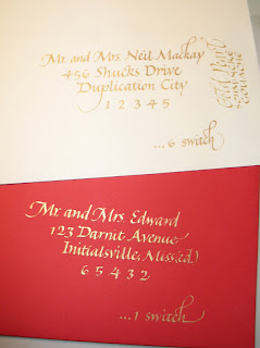
I just finished a Christmas-card-addressing job. Some of the envelopes were red, and some were a creamy white. The two you see here are — obviously — the remains of a couple of errors. I shouldn’t say “obviously”. You, my readers, may be calligraphers, in which case you most likely looked more carefully at the letter forms than the actual words, a tendency which non-calligrapher friends and spouses find humorous.

Anyway. As I was saying.

I thought I would have to use two different media: a light gold for contrast on the red, and a darker gold for contrast on the white. I started with the red envelopes and Schmincke gold pearl calligrapher’s gouache, which is about the lightest gold I know of, excepting only the late lamented Schmincke platinum gouache. Although it worked well on the red, the pearl gold is too light to make enough contrast on the creamy white. I checked.

After awhile I switched to the creamy white envelopes. After some experimentation, and a look at a handy metallic colors guide I painted awhile back (maybe I’ll blog that later), I determined that after I shook up my bottle of “Dr. Ph. Martin’s Iridescent Calligraphy Colors 11R Cooper Plate Gold” ink (henceforth known in this post as “long-name ink”) — and it took a very long time before I could see movement on the bottom of the bottle when I turned it upside down — umm, I lost my train of thought. I think I was headed toward something about the little ball in the bottle of fingernail polish that could have helped this process … Have I mentioned that I’ve had a sinus-and-respiratory infection for 13 days? This is my 2nd day of antibiotics and I’m feeling quite light-headed (haha). Or it could be the Claritin.

Anyway.

I used the long-name ink for the creamy white envelopes, since it was dark enough to contrast with the paper. And the ink was so much easier to use than the gouache! With the gouache I was constantly re-mixing with the brush, occasionally cleaning the nib, and sometimes going over letters twice. With the ink, I just reloaded the pen nib with a a drop from the dropper onto the top of the nib and kept going.

So when I switched back to the red envelopes I tried the long-name ink on one, and was surprised to see that the contrast was just about equal to the contrast I had been achieving with the gold pearl gouache (which took 25% longer because of the mixing and double-stroking, etc.). I never looked back. The rest of the envelopes were done using long-name ink.

As usual, click on the photo for a closer look.

The creamy white envelope shown (poorly photographed, sorry) has an address in long-name ink, with a contrasting vertically oriented note in the gold pearl gouache. The difference in contrast with the paper doesn’t show up so well here as it does in real life.

The red envelope’s first line of the address was done in gold pearl gouache, and the rest in long-name ink. There’s almost no difference in contrast here or in real life.

P.S. Anybody get the zip code references? (Looking back, the entire post seems to be a very broad hint.)

Eye candy

I’ve been rather immersed lately in HTML, CSS and web design. But I need a break every once in awhile. Here are a few places I visit when I want a little eye candy:


Denis Brown’s website. This guy knows quills and he knows digital. After a week-long workshop two years ago, I brought home a slew of notes and experiments and his DVD, none of which I’ve yet digested.


Thomas Ingmire’s website. You’ve got to have Flash to look at it, but it’s worth looking at. You’d think that the “Collections” and “Gallery” links would be the best — and they are great — but the most interesting work on the site is in “Commissions”: a book of Richard Braudigan’s poetry, in code invented by Thomas Ingmire; poetry by Rimbaud; Canto V from Dante’s Inferno. I’ve taken week-long workshops with him several times over the past 15 years. His craftsmanship is unparalleled.


Martin Jackson’s website. He’s got portfolios of lettering samples and commercial art, which I like, but I especially like the portfolio of fine art. I’ve never taken and class from him, but I know several people who rave over his teaching.

An Inconvenient Truth

Here’s some news that just ruined my day. Boing Boing reports that the National Science Teachers Association has refused 50,000 free copies of Al Gore’s documentary film, “An Inconvenient Truth“. Why? Here the Washington Post op-ed article (written by producer Laurie David) quotes the NSTA’s reasoning in its e-mail refusal:

Accepting the DVDs, they wrote, would place “unnecessary risk upon the [NSTA] capital campaign, especially certain targeted supporters.” One of those supporters, it turns out, is the Exxon Mobil Corp.

I saw the documentary film when it came out. I had a very selfish reason for not wanting to go see it: I believed I would just become more upset than I already am about our government’s role in perpetuating our abuse of our environment. But the facts and ideas were presented so thoughtfully and methodically that it was a pleasure to see it all laid out so clearly — sorry though that picture is.

At Wired Magazine, Lawrence Lessig wrote, about the film:

About halfway through, Gore cites two studies to explain why so many people remain so skeptical about global warming. The first looked at a random sample of almost 1,000 abstracts on climate change in peer-reviewed scientific journals from 1993 to 2003 and found that exactly zero doubted “that we’re causing global warming.” The second surveyed a random sample of more than 600 articles about global warming in popular media between 1988 and 2002 and discovered that 53 percent questioned “that we’re causing global warming.”

See the trailer here. And then, if you haven’t already done so, rent the movie.

We will shortly return to regularly scheduled calligraphy and book arts programming.

very once in a while you know for sure you’ve done your job well as a parent. Today our teenage son is working on a sculptural English project (depicting his version of Dante’s circle of hell, but that’s beside the point). I showed him how he could use a bone folder to help lay down a long line of tape without wrinkles. He thinks this is cool, and shows it by breaking into song, the lyrics of his own making, to the tune to “I Love My Dictionary” from “The 25th Annual Putman County Spelling Bee”:

“I love my cool bone folder,
It’s a very reliable friend.”

How satisfying!

The Box Doodle Project

Inspire Me Thursday is back, and directing visitors to an interesting gallery of box art. Click the title of this post to see several pages of box art. These pieces are interesting to me as a book artist because they span the art disciplines of paper, line, color, sculpture, and, in a few notable cases, time — the same disciplines in which book artists work.

Zadie Smith on the practice of reading


don’t know any calligraphers or book artists who aren’t voracious readers. In fact, most calligraphers I know credit the start of their interest in calligraphy to two things: 1) a love of reading, and 2) OSA. Makes eminent sense, really. But there’s another piece to it, and that’s the budding calligrapher’s interest in turning over the words, processing them, re-reading them for new emphases and slightly altered meanings.

I was reminded of this this morning when I read Boing Boing’s transcription of a portion of an interview with novelist Zadie Smith on KCRW’s Bookworm program:

But the problem with readers, the idea we’re given of reading is that the model of a reader is the person watching a film, or watching television. So the greatest principle is, “I should sit here and I should be entertained.” And the more classical model, which has been completely taken away, is the idea of a reader as an amateur musician. An amateur musician who sits at the piano, has a piece of music, which is the work, made by somebody they don’t know, who they probably couldn’t comprehend entirely, and they have to use their skills to play this piece of music. The greater the skill, the greater the gift that you give the artist and that the artist gives you. That’s the incredibly unfashionable idea of reading. And yet when you practice reading, and you work at a text, it can only give you what you put into it. It’s an old moral, but it’s completely true.

She describes it so well. You can listen or watch the entire interview here.