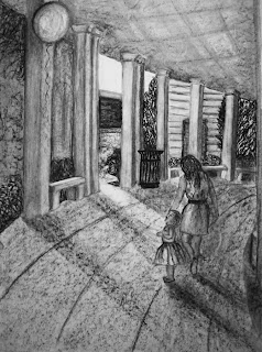
Amphitheater with Balloon

Here’s the next drawing assignment that followed the monster assignment. We walked over to the music school and chose a view to draw. I chose the walkway that curves around the back of the seating area. We were to start the general scene one day, take it home and add an imaginary scene, and finish it on location during the next class meeting; it was the due the following class meeting in case we wanted to continue work some more.

The mother, the child, the lost balloon: Could I have found a rustier cliché? I don’t think so.

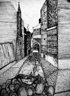
Mob Rule

In the spirit of showing work as it’s happening, and not just putting up my masterpieces (just in case you couldn’t tell that from the previous posts – ha), here is some drawing homework. The assignment at the end of October was to draw a monster. It could be any kind of monster — fairy-tale, institutional, cinematic, humorous, serious, whatever.

I’ve never been one for scary movies or Stephen King thrillers, but when I was in high school I regularly drove home on the weekends at midnight from a dinner theater gig. The narrow road twisted between two rivers, with just enough room on one side or the other for the occasional solitary house amongst the jungle of overgrowth. And the only thing on the radio at midnight was some kind of mystery theater program. It coincided exactly with my 30-minute trip, and I would arrive home terrified to get out of the car and go in the house. (Who knew what lurked in the carambola tree that shaded the front porch?)

The scariest episodes included a stranger and a case of mistaken identity carried by a mob mentality to the point of lynching. So that’s what I drew. The 18″ x 24″ piece shows the hangman’s noose against the darkness of the arch at the end of the street.

As usual, click on the thumbnail …

Butterfly Tunnel Book

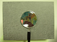
Here’s a the front cover of the tunnel book I did in my 3D Design class this semester. (Odd that I would have a tunnel book assignment in 2D Design last semester, and another one in 3D Design this semester.) I’ll post the first tunnel book when I get it back. Julia DeHoff and I are exhibiting some of our artist books at the public library during the month of October, and that first tunnel book is on display there.

The idea for the book came from an essay on butterfly collecting by Ann Fadiman in her book At Large and At Small: Familiar Essays. She describes her childhood obsession with butterfly collecting, recounting in gruesome detail the catching and killing and mounting and collecting of the butterflies. This quote stayed with me: “When did we realize that this was horrible? My brother, Kim, and I had started collecting butterflies when he was eight and I was six. Shame set in about two years later. I remember a period of painful overlap, when the light of decency was dawning but the lure of sin was still irresistible.” This seems to me an excellent description of our current relationship with our planet.

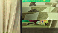
The left side of this image shows quotes from the essay written on the side accordion folds of the tunnel book. (You probably can’t even see it unless you click on the image to get the full-size image.) The right side of the image is a view of the tunnel book from above. Since the view window of the tunnel is a magnifying glass, it was even more difficult than usual to photograph the view inside. The butterflies, cut from my stash of pasted-painted and decorative paper scraps, hang from the tunnel frames by strips of transparency film.

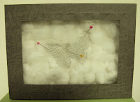
The back of the tunnel book was made to look like a Riker mounted dead butterfly, or perhaps ghost of a butterfly. I made a covered box and a lid which glass from a battered 5″x7″ frame. I thought I’d have to secure it closed with some pins, but the fit was quite snug enough to stay closed on its own. If I’d had more time, I would have found some jeweler’s cotton; as it was, the morning the tunnel book was due I was feverishly pulling apart cotton balls and trying to approximate that layer of cotton.

Such is often the nature of class projects. I have to keep remembering that they’re not actually going in a juried show, for instance.

Wise Advice on Pointed Pen Nibs

When I first began trying to develop a pointed pen script, my most urgent questions were about tools and materials. I was never sure whether I was using a nib that was suitable for the script, whether the ink was capable of suitable thicks and thins, whether the paper was contributing to the catches and spatters, and so on. Answers to my questions about pen nibs were usually something along the lines of: “It all depends on your preferences. Everybody writes a little differently. What works for one person may not work for another …” In fairness, these answers are very accurate. Still, it was a frustration for someone who didn’t have the experience to be able to judge what was causing what.

On the Ornamental Penmanship list, Nan recently posted a link to Caroline Paget Leake’s article about choosing a pen nib for a pointed script. I’d read this excellent advice before, and it bears mention here. The article was written, I believe, before the development and production of my currently favorite nib, the Leonardt Principle (shown above). John Neal provides photos and more information about a selection of nibs here.

Although the Leonardt Principle is my favorite all-around nib, I also use Brause EF66 nibs for finer work, and I still like vintage Hunt 22 nibs. But the advice I got stands, and your mileage may vary.

Gandhi drawing

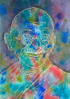
The assignment was to draw two public icons: one you love, and one you hate. We were to communicate our love and our hate in our choice of mark-marking, colors, pose, etc. I chose Gandhi for the public icon I love; I won’t be showing the “other” public icon. I will say that she appears regularly on Fox News, and has expressed the sentiment that women should be armed but not allowed to vote, since they have “no capacity to understand how money is earned.” That’s enough of a hint, I think.

I had more trouble figuring out what to do about Gandhi, because I cared about whether I would like the outcome. I did an acrylic ink wash to start. Then I poured some acrylic matte medium into a squeeze bottle and drew the lines. I had planned to use composite (a.k.a fake) gold leaf on the matte medium lines, but it turned out that only 23K gold leaf would actually stick to the lines. Aargh! I gilded the outline of his head and did some other lines. The rest of the lines I overpainted in Schmincke pearl gold gouache. I am nothing if not persistent. If you click on the thumbnail for a closer look, you can see the two colors of gold. I think it’s more obvious in the photo than in real life. The reason I gilded the outline was so that I could wash the outer world in a muddy outer-world color (which I also used on the other icon in a similar way for a different reason) without disturbing the outline.

Client work

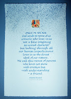
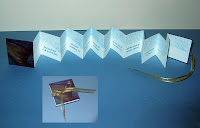
This business of catching up after a trip is the pits. I’m close to being caught up. Here’s a broadside and book for a client — same quote for each. The inset in the 2nd photo shows the book closed.

I’ve been addressing invitations, and using hot glue and cardboard, but it seems like I haven’t dealt with paint lately — although that’s not true, now that I think about it (I may post my Gandhi drawing later). Anyway, for whatever reason, I’ve been making beginner mistakes with paint — getting it on my hands, in my hair, without realizing it … generally being covered in paint for no good reason. Makes me feel kind of like a kid, though. That’s not bad.

As usual, click on the thumbnails for a closer look.

3D Design: the finished assignment

Here’s the finished assignment. I’ve discovered a couple of practical things about cardboard and hot glue:

First, the Teflon thimble/burnisher (I was never sure what that thing is) that I got in a goodie bag at a calligraphy conference many, many years ago is very useful for pushing around hot glue. I’m not sure the thimble/burnisher will ever be useful for burnishing again, unless I’m willing to spend an awful lot of time getting bits of hot glue off first.

And here’s a little example of the vagaries of human nature: even though this is the first time I’ve ever found a use for this tool, now I’m thinking how useful it would have been for folding paper if I hadn’t gotten hot glue on it. I’m thinking this even though a bone folder is perfectly good tool for folding paper and I have 8 or 10 bone folders, and even though this tool has saved my fingers from multiple burns in its present use.

Let’s see, what else have I learned? Hmm. Well, I’m recommitted to the idea of not becoming a sculptor. That’s not a new bit of education, just a solidification of previous knowledge. I find it hard to think in 3D. We were supposed to draw a picture of what we planned to make, and I found that so hard as to be virtually impossible. So I followed the Jasper Johns’s dictum: “Do something, do something to that, and then do something to that. ” Without, perhaps, his results 🙂

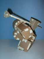
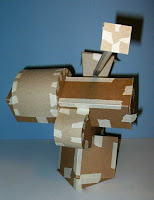
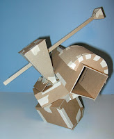
3D Design

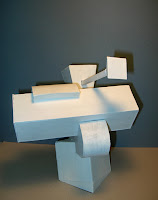
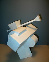
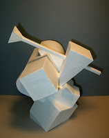
After 10 days in Mexico, I’m scrambling to complete projects due in classes early next week. Here are 3 views of my 3D assignment (at the taped-only stage), which requires 7 elements and a non-90-degree base. I think. I’ve read and re-read the printed assignment instructions, but it’s no substitute for the classes I missed last week. All that’s left to do now is to take the whole think apart, re-assemble it with hot glue, and paint it. That’s all …

As usual, click on the images for a closer view.

Photoshop serendipity

A mysterious depiction of a alien nest? An excavated cave drawing? No, just the hodgepodge of brush strokes that are the result of working through the first 40 pages of Adobe Photoshop CS2 Studio Techniques. It’s a great book. It’s not so much that there are too many pages on brush options and settings … it just seems that there are too many brush options and settings. It’s pretty amazing.