Epiphany

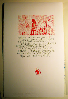
A quotation from Milton about epiphanies, on this day of Epiphany.

The red blob at the bottom of the page was the first mark on the paper, made when I leaned over to look past the board and my brush, held at the ready, connected with the paper in a most untimely manner. This is a signature of my journal, though, and so I continued on from that inauspicious first mark.

The illustration came from who-knows-where. I don’t know who the woman might be, or what the broom-like appendage signifies. That’s creativity for ya, eh?

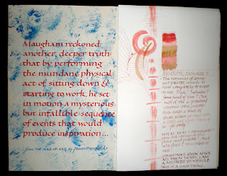
Journal – January 5

I’m reading The War of Art, by Steven Pressberg. It’s an empowering book, although I sometimes wonder at the pugilistic tone. The left side of the journal spread is a quotation from that book, about Somerset Maugham. The right side uses up the gouache that remained in a mysterious color palette that I don’t remember at all.

Cloth-Covered Card Case

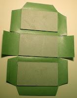
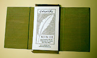
I always enjoy reading Denis Yuen’s blog, Cai Lun. En route to filing something else, I came across a saved bookmark to his tutorial on making a card case, or, as he calls it, a namecard holder. To a book artist who is guilty of carrying her cards in a rubberband, this seemed like a good project for today! Although his example places the side flaps on the bottom section of the structure, I placed mine on the center section.

I was pleased with the overall result, although I imagine that the only way to avoid stupid mistakes in construction is to make the structures often enough and enough times that I don’t have to stop and think about where to make the cuts.

Dennis’s instructions say to make the lining flaps a little larger than the cover flaps — and this is sound advice since it allows the trimming of the flaps after the lining and cover flaps are pasted together. But I found this problematic if too much leeway is allowed for, because there is that awkward intersection of center section and adjacent hinge and flap.

I used a green moire book cloth that is fairly unforgiving of paste-y fingers. The book cloth was left over from my final project last semester in photography class. And now I realize I never posted anything about that. Maybe I’ll post photos of that soon.

Slot and Tab Book


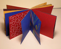
Over at the Book Arts list on Yahoo, there’s currently a discussion about the slot-and-tab book structure. Carol blogged about the structure here when people asked her about the book in her blog header, and Celia posted her sample with instructions here.

I followed the instructions in Alisa Golden’s book, Creating Handmade Books. I’ve made many of the book structures in the book, but I had never tried this one before. I used scrapbook stock decorated with woodless colored pencils and water-soluble crayons — 8 sheets in 4 colors, with half decorated and half plain. Even with all these colors and patterns to help me keep it straight, I may not have attached the 2-sheet signatures to one another in a consistent manner. I’ll look at it again later when I have more time. I only had an hour for this today.

Some of the heavier tab papers were harder to curl through the slot papers without damaging. I imagine a strong, long-fiber paper like kozu paper would work well with this structure. It’s a great non-adhesive binding structure.

A Walk in the Woods

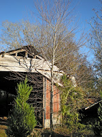
I like to take our dog, Quixote, for a walk on the conservation easement near our house. The land is a pleasant combination of fields and woods, and this old barn is on the property. We went for romp yesterday afternoon. Q discovered a hawk dozing on a low limb, and there was some excitement for a bit. I took a lot of photographs, but the beautiful late-afternoon light proved difficult to translate in the lens. Here’s one of the more successful(ly Photoshopped) shots.

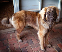
I photographed Quixote in the early morning in our barn. He’s a 9-month-old Leonberger.

Happy New Year

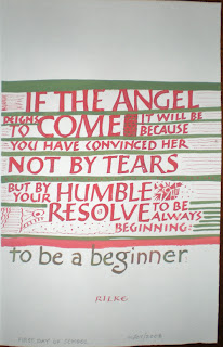
Happy 2008! I’m looking forward to the new year. This month (I’ve given up on yearly resolutions) I plan to do something creative every day. I may not get to post every day, but I’ll do something creative every day and post it when I can.

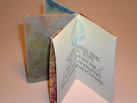
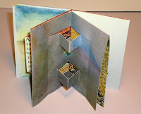
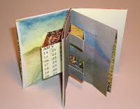
Today I made this one-page book with pop-ups.
The text is from the Herman Hesse poem, “Stages”. My favorite part of the poem is not in this little book, but they are appropriate words for the new year:

In all beginnings dwells a magic force
For guarding us and helping us to live.

Although the structure is very simple and quick, it took me awhile because I decided to make the switch from Microsoft Publisher (2000) to CS2 InDesign. Since I got CS2 I haven’t wanted to upgrade my very old version of Publisher but have always been in too much of a hurry to figure out InDesign. It was fairly easy to pick up, although I’m that today sure I saw about 2% of what it can actually do.

Black Tie Exchange

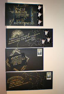
Finally … something calligraphic!!

Here are the 4 envelopes I mailed yesterday for the Black Tie Exchange over at the Yahoo group, Calligraphy Exchange. The rules: Use a black envelope and either white or gold “ink” address in calligraphy.

I made my envelopes out of Strathmore Artagain black paper — comes in a 9″ x 12″ pad. The two insert square are on Arches cover black, I think. I used my favorite gold ink — Dr. Martin’s Copper Plate Gold.

Names and addresses blurred to protect the innocent.

As usual, click on the image for a closer look.

3D Design Project — Walking Stick

I haven’t been posting anything from my classes because I’ve been working on them right up until the due date, and once I turned them in they were in the classroom until the semester ended.

So I’ve got all this stuff in my studio that I don’t know what to do with. This walking stick was our penultimate project in 3D Design. We brought a 2×4 to class and then, after being shown most of the tools in the wood shop, we were told to work on that 2×4 until it was a walking stick. Many people’s sticks were all naturalistic and such — carved leaves and vines and so on. One very unusual one was a bright multi-colored syringe full of candy. Another very cool one was a sharpened stick with 3 carved fishes on it, as for a barbecue. Mine looks like a piece of furniture. I had fun on it, though.

I ripped my 2×4 into two 2×2’s so it would be square, then mitered the corners of square on the table saw. The knob at the top is 2 2×4’s glued together and then ground into a squared globe and doweled into the 2×2. Each section is a different experiment with the grinder or the drill or the Dremel or the band saw or the sander, or some combination of those.

I enjoyed the finish work: the rough sanding, the finer and finer hand sanding, the painting (cheap acrylic paints in the scrapbook aisle at Target) and the ebony stain over top that.

It’s a big image, but you’ve got to click on the thumbnail to see it properly.

It’s a whirlwind life

Where does the time fly? What with semester final projects and work and eight days in Mexico, I’ve hardly had time to take a breath.

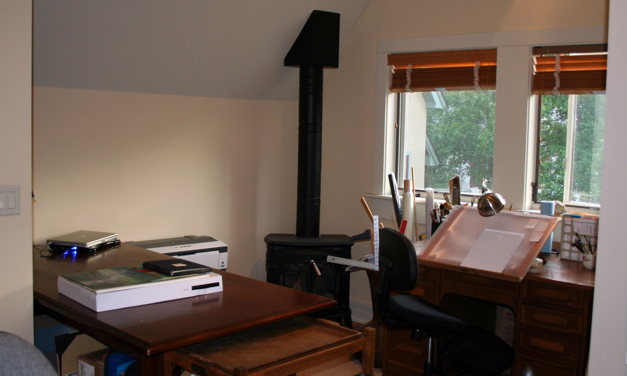
But I just caught sight of my large drafting table, and it looks so … satisfying. There’s my final project in 3D Design — an assemblage of found objects — propped against the back wall. That’s partially covered by two envelopes in the midst of construction for the Black Tie Exchange over at the Yahoo list, Calligraphy Exchange.

In front of that is some trial lettering and rubrication for a Kipling poem. And then there are stacks of wedding envelopes done in black copperplate, and the brown envelopes with gold italic in front are Christmas card envelopes. The Crane stationery has a luscious gold and green palm tree on the front. It’s simply luscious, writing on that dark brown paper and watching that gold ink flow through the pen and sink into the paper.

That beautiful jumble of work on my drafting table is so happy-making. And I think of what Brenda Ueland wrote:

Why should we all use our creative power … ? Because there is nothing that makes people so generous, joyful, lively, bold and compassionate, so indifferent to fighting and the accumulation of objects and money.

I am so lucky.