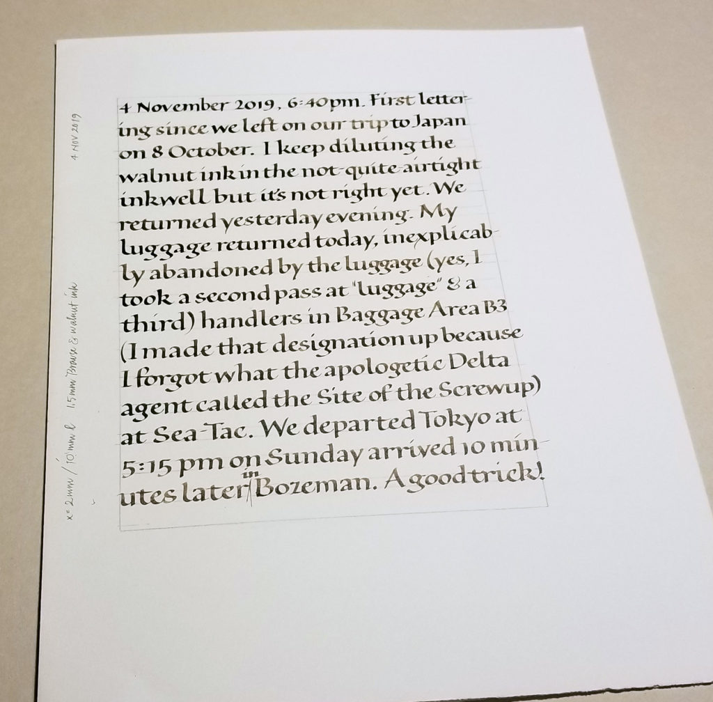
Home again, after a month in Japan. And back to daily lettering practice.
Calligraphy & more — the studio of Beth Lee, Bozeman, MT

Home again, after a month in Japan. And back to daily lettering practice.
I’m so excited about the edition of books I’m working on now. This makes … uh … three different variable editions of manuscript books I’m working on at the moment. Ain’t it great!
The first seven of this 12-book edition are going to my book exchange group so I won’t show the whole thing just yet. But they’ll be going in the mail in about 10 days, so stay tuned for more after that.
Oh, all right. I’m too enthusiastic about it to be totally discreet. Here’s a sneak peek at the text block.
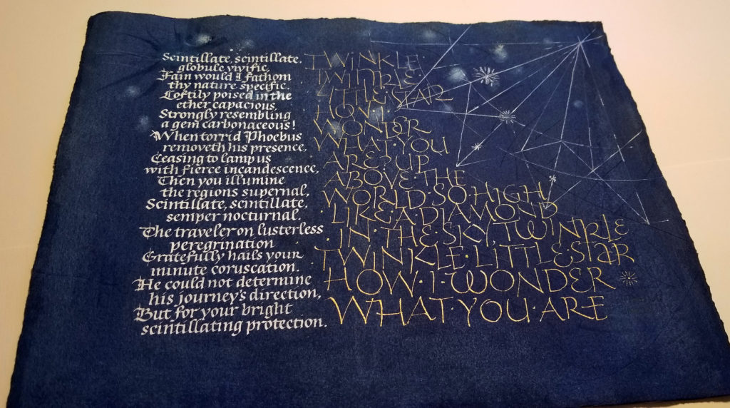
Sometimes in the making of a book edition, you get stuck. I am, or was. I’ve been working with a few texts about stars, and had dyed a stack of Arches Text Wove. The possibilities for structure and order and style having overwhelmed me, I took a step back and chose just one of the texts for a broadside. Nothing like a deadline to get the ink flowing. This was made for submission to “Inktober” an exhibit whose main requirement was that it include ink. The theme for the exhibit is “a few of my favorite things”. Stars are more than a few of my favorite things.
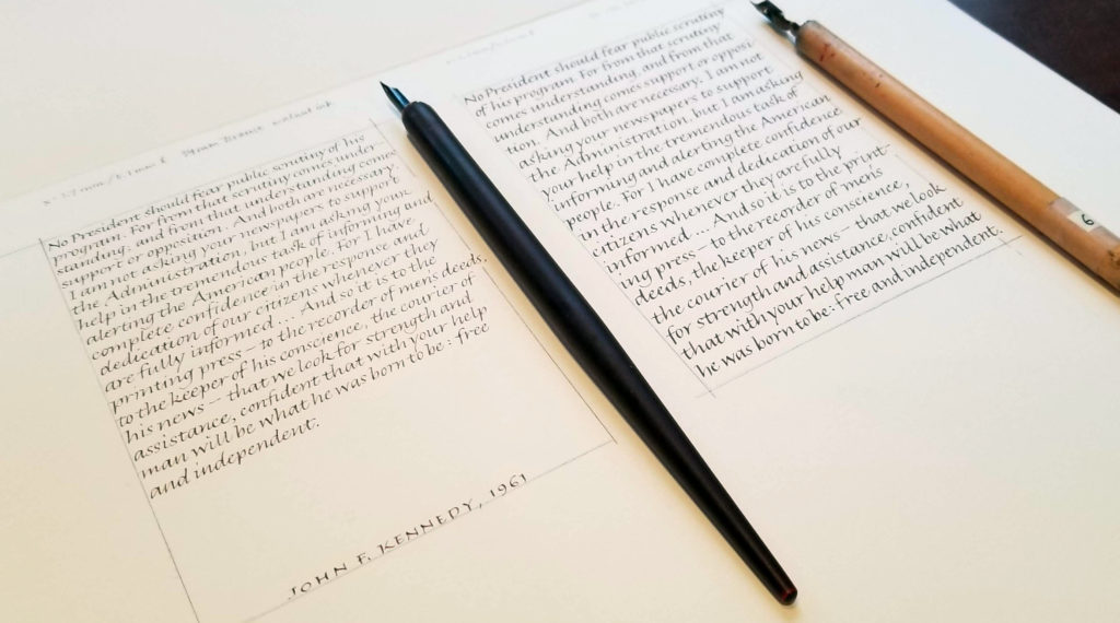
I’ve been making progress on my latest variable edition of manuscript books, which includes, in part, quotations from presidents 1-44 on threats to democracy. Writing out these quotations has been a good experience, reminding me that our nation has had some great leaders.
It’s interesting to see what how other artists are addressing our current political problems.
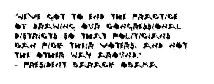
Hyperallergenic reports on a new typeface, “Gerry”, which renders maps of gerrymandered districts into letters of the alphabet as a commentary on the “eroding of democracy.” The entire article is here.
I would like to have attended the exhibit “Hope to Nope: Graphics and Politics 2008-2018” at the Design Museum in London last year … before many of the artists removed their artwork from the exhibit early to protest the the “artwashing” of an arms industry leader: the museum hosted a private event for Leonardo, an Italian defense contractor.
Paul Kennard had donated Union Mask, which featured an image of a gas mask spewing US and UK missiles, to the museum, but demanded that his work be withdrawn from the exhibition. As he put it, “I certainly don’t want my work to be viewed during a jolly by arms dealers at the museum.” Protesters held signs that read, “#NopeToArms and “The revolution will not be patronised.” Clever.
AIGA has devoted an entire category (or is it a tag?), Politics + Design, on their website. My favorite recent article, filed in Design History 101, is one about Corita Kent.
The design is complete and the text copy-fitted for my next variable manuscript book edition. I’m ready to start lettering.
So I’ve spent the past three days trying to decide what paper. I’ve been testing lettering and painting on various book papers, from Somerset Book to Hannemuehle Ingres to Lana Laid, and more.
All that testing has brought up ideas for other books, and reactivated my attention toward the “other” edition I’ve been working on. But first things first: I’ve got a lot of lettering to do on the present design. I’m totally absorbed in this one, but, objectively, these test marks might be more interesting.
I’m loving working in my studio every day. Can you tell?
We calligraphers have so many choices! Size, compression, letter spacing, slant, line spacing, ascender/descender length, color, weight, shape, serif, tool, paper, writing fluid — the list goes on and on. Sometimes I begin by lettering a line in as many ways occur to me within the parameters of the page size. It can be a way in to a new project.
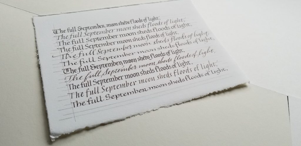
After just a few days off, the hand seems to slip through my fingers when I lose focus, but I am enjoying gothicized italic. This page was done June 11.
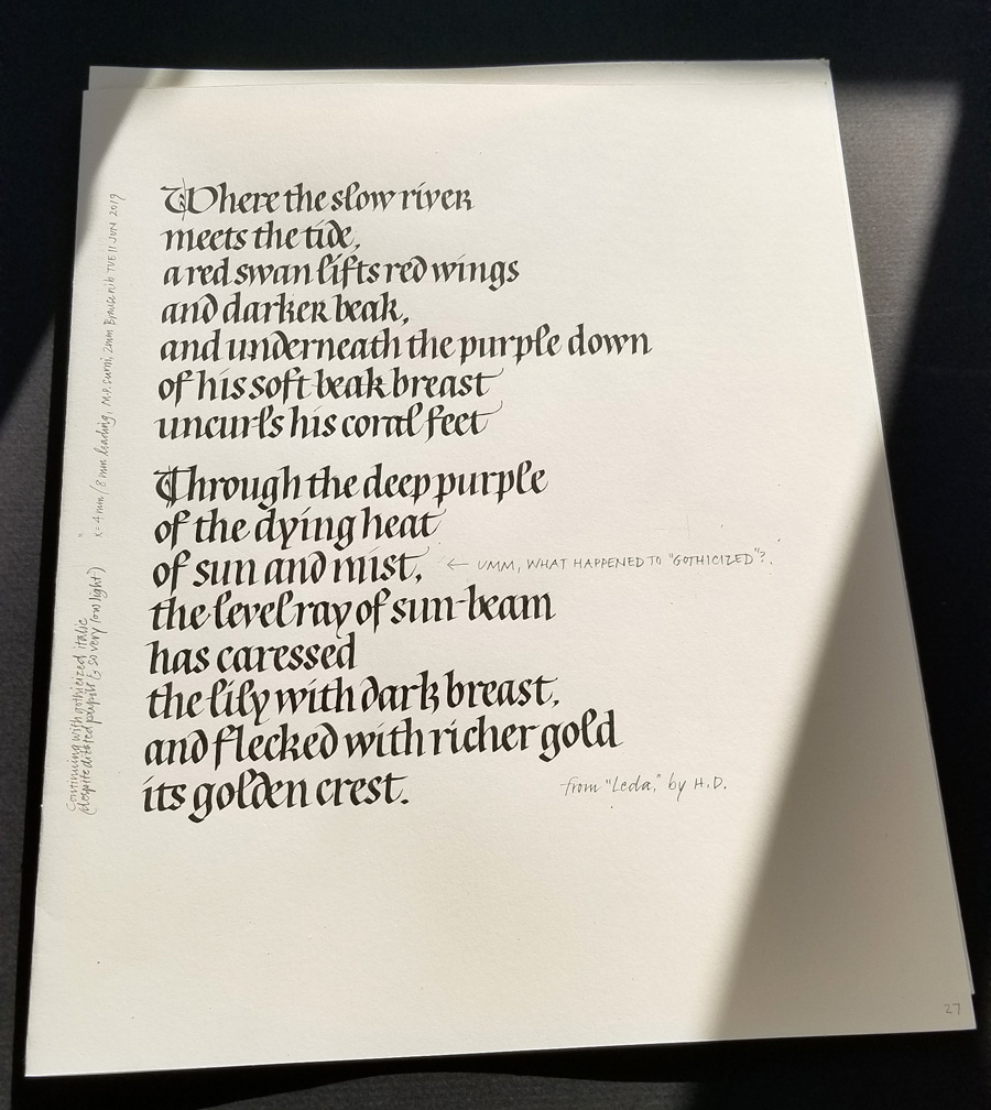
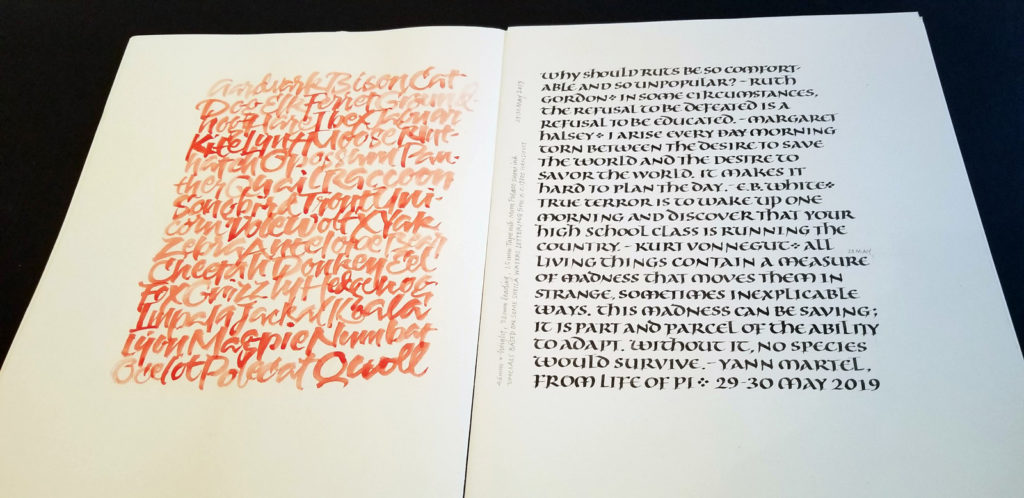
I’ve been negligent here on my blog — has it really been two months? to the day! — but I’ve been working pretty steadily in my studio. Here are a few pages of daily lettering, mostly delving into gothicized italic and uncial letter forms.
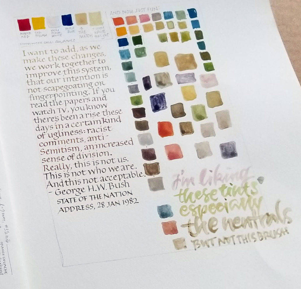
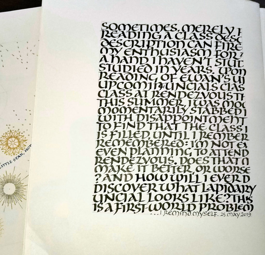
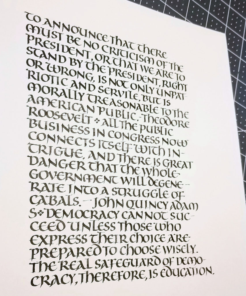
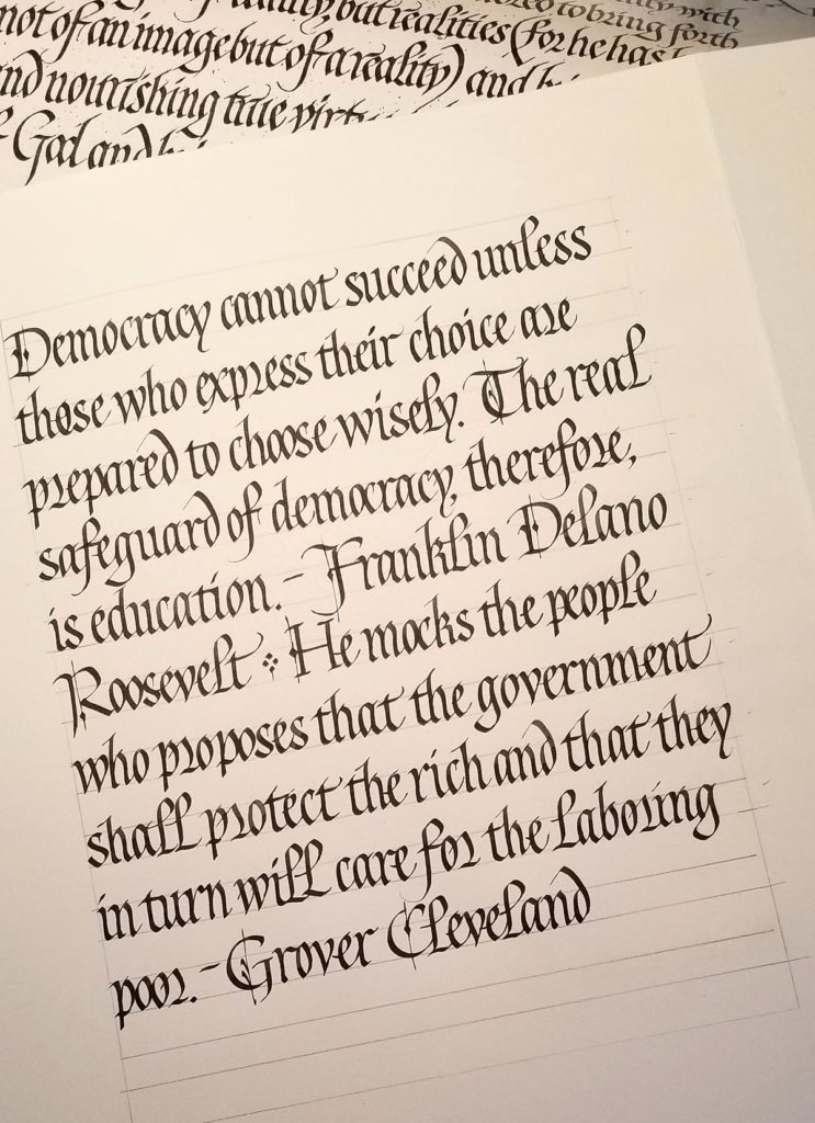
I’ve been studying gothicized italic, a hand I’ve never mastered. I began by analyzing a handout of a Lincoln quotation that Sheila Waters provided in a long-ago workshop. I determined the x-height and pen-width, lined up a sheet of paper, penciled in the bare bones of the letters, and had at it. As I worked I made notes about surprising discoveries: “the s is wider than I had thought”, “the final stroke of the e continues diagonally and does not go horizontal”, and so on. Then I repeated the exercise without penciling in the skeletal letters. (I won’t sully Sheila’s reputation — or mine — by reproducing my practice sheets here!) Next, I put up another handout from Sheila, a reproduction of a piece of Edward Johnston’s gothicized italic writing. You can see a portion of that handout in the image above. Once again, I analyzed it, ruled up a sheet, and copied the lettering as closely as possible, making notes as before.
Finally, I wrote out this sheet, choosing another text. My goal was to stick to Johnston’s lettering closely yet adhere to some best calligraphy practices and to make it more my own. I didn’t care for the long thin finials on his t and h, and his standard r is so wild and woolly that the next letter must be shorter to compensate. Next time around I will work on letter width and spacing to better match Johnston’s: mine were both two wide. Also, I regretted the use of the alternate r on the 2nd line. It seems to work best next to another oval letter such as a p.
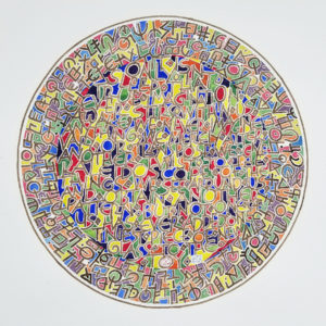
I’m pleased to have one of my works in the The 37th Bradley International Print and Drawing Exhibition in Peoria, IL. The openings – across six venues – are this afternoon and evening. I wish I could be there.
I’ve glimpsed my piece being installed in the Contemporary Art Center of Peoria … via Facebook.
The exhibition will be up through April 12.