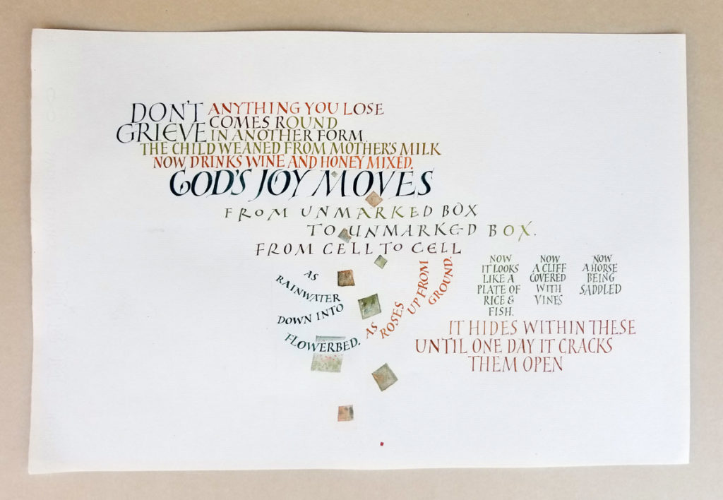
18 in x 12 in. Three gouache colors, #4 and #5 Mitchell nibs, on Arches MBM. Text from “Unmarked Boxes” by Rumi.
These versal variations are simply addictive. Slowly, slowly, I internalize how to waist the strokes (but not too much), how to finish the finials squarely, how to add a hairline serif. Then my concentration drifts and so does the width of the stroke, the slant of the letter, the shape of the bowl.
I was really focusing on the letter forms, and the layout was planned only line by line. As I imagine happens with a writer of a serial novel, I wrote myself into a couple of dead ends. And added the squares at the end to break up a hole that had formed.
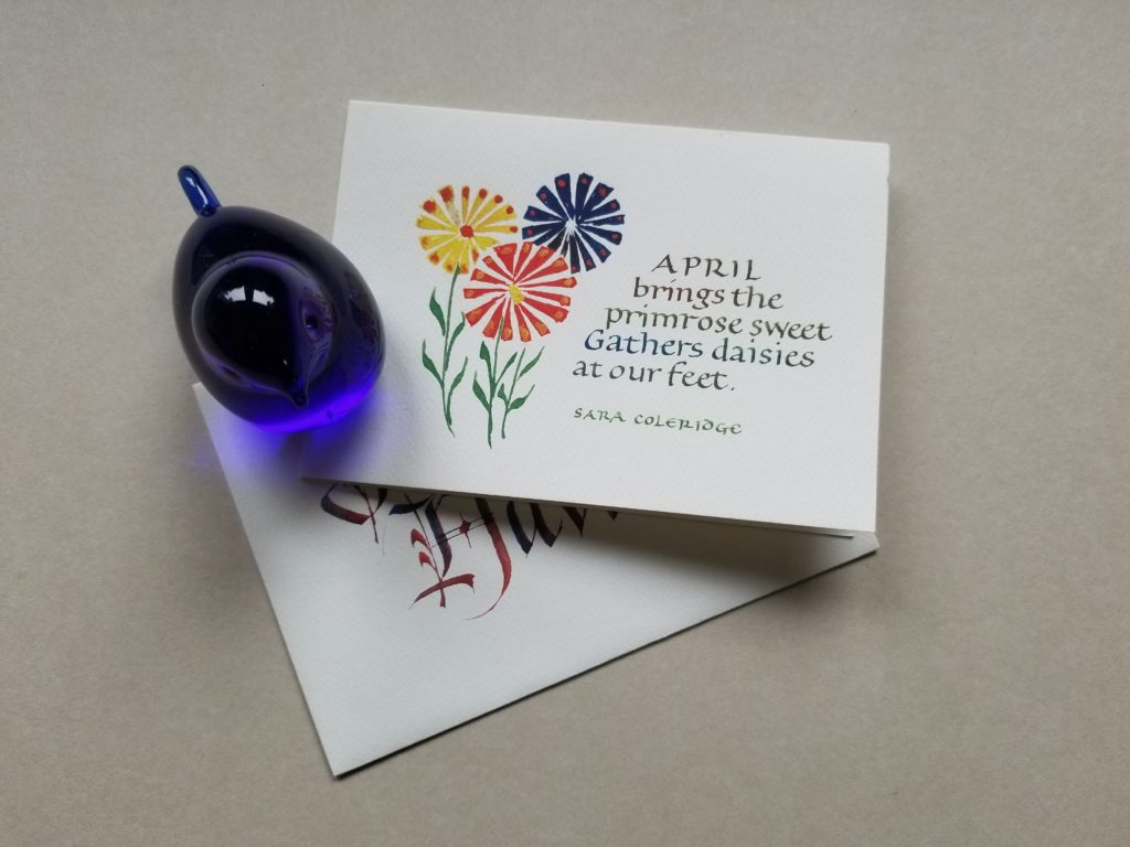
Envelope made for a year-long envelope exchange. Gouache and metal pens.
After a few years off, I’m enjoying the year-long envelope exchange that Wendy Cowley oversees. It’s a once-a-month opportunity for a low-stakes bit of creativity. This was my April envelope, as you may have guessed. The name on the envelope grew out of playing around with changing colors in the nib on the fly, something I enjoy doing from time to time. The flowers are half-remembered from a long-ago week with Alice Koeth at Camp Cheerio.
I’m running behind for May, but I’ll catch up today. The Built Up Capitals class is taking all my time these days.
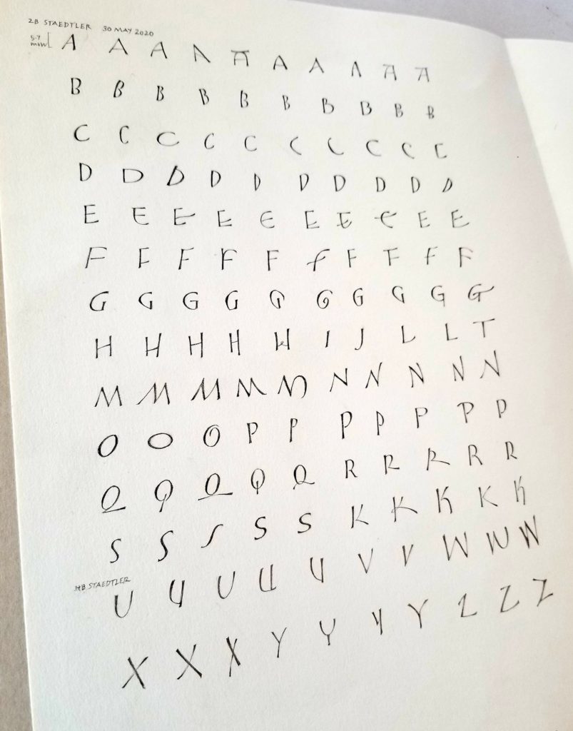
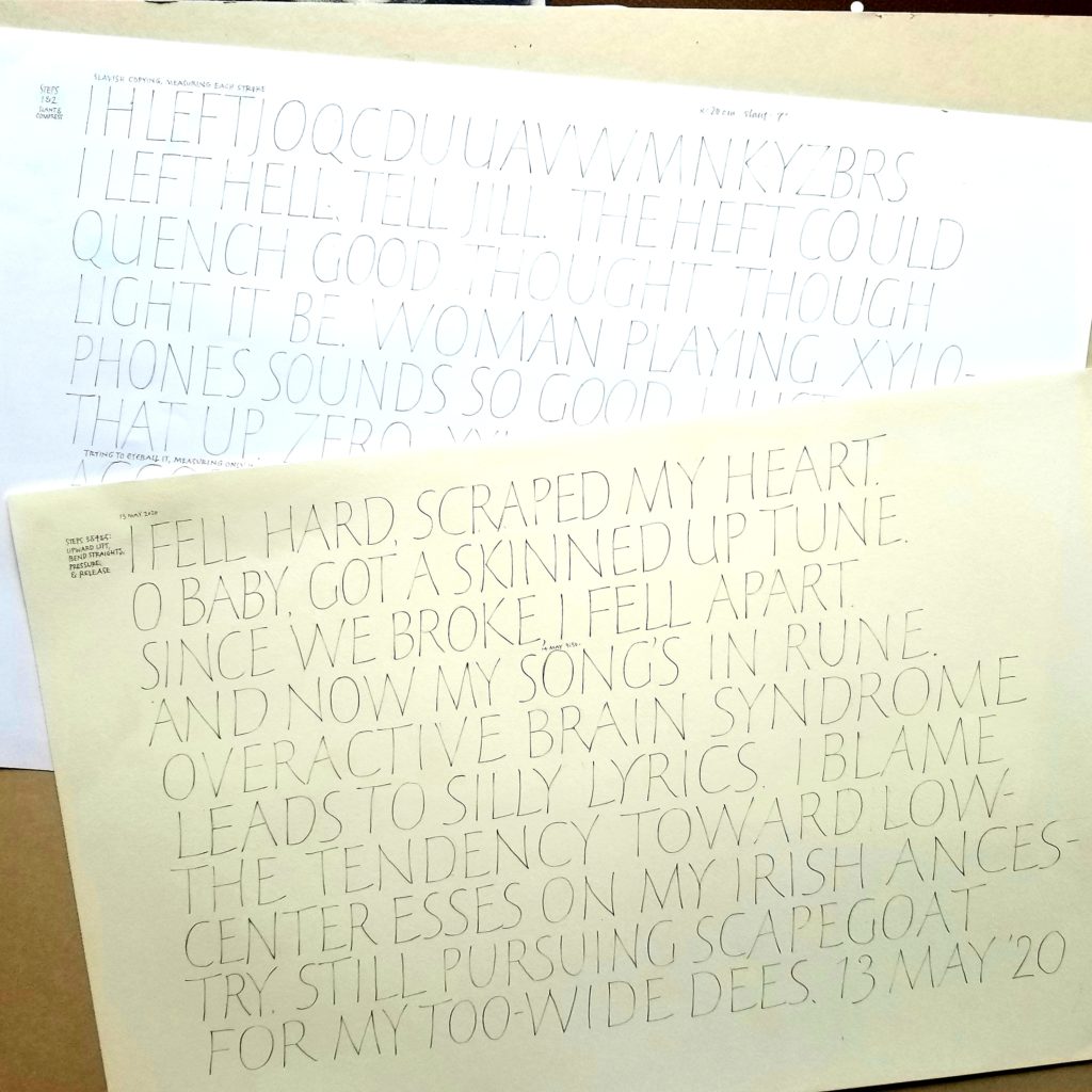
Built Up Caps – practice for the first part of week 2. Pencil for 4 lines and 005 ZIG Millennium marker for 4 lines. Strathmore Drawing 400 heavyweight, 18 in x 12 in.
What a engrossing time I’m having with these built-up caps. What an eloquent, careful, and kind teacher Yves is! I am enjoying reading his oh-so-encouraging yet exacting critiques of all the work that has been posted for his “red arrows”.
As I wrote in my Instagram post,
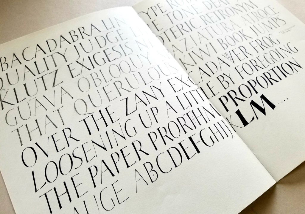
It’s a slo-mo party in my studio. This page took me three days to do, and it was mesmerizing. A fellow student has called it something like “a festival of emotions”. That’s right. The satisfaction of a well made curve, the horror as one’s seemingly disembodied hand strays irrevocably out of the carefully planned width of a stroke, the shock when one realizes that 2 lines of sub-par lettering have eaten up 2 hours of the day. I can’t wait to do more.
I realize this was a fairly negative view of the experience in its detail, so I’ll add this here: Besides the satisfaction of a well-made curve, there is also the pleasurable process of building up these elegant arboriform waisted strokes, the absorbing interest in sculpting the interior spaces, and so much more.
Stay tuned for week 2b, when we add the broad-edge nib and gouache to the mix.
Built Up Caps began last week. I’m enjoying this intensive 6-week online course taught by Yves Leterme. This is the second course I’ve taken with him online at acornartsclasses.org. He is a wonderful teacher and Harvest has created a really good online learning venue, hosting excellent calligraphers and artists teaching interesting subjects.
At the end of this first week, I’ve got a lot of practice sheets to show (but not to show!). Here were my first attempts, which are rather hard to because it’s pencil.
And here’s the homework assignment I submitted:
Yves uses a digital red pen to mark up our submissions. He was fairly easy on me, noting the rogue K join, a strangely curved N, and — and this one has been so hard for me to fix! — the fact that I often pressurize two stroke-ends that join, creating a dark spot. I thought this would be a breeze to change, but it’s a habit that has been hard to break. This page also doesn’t show a lot of pressure-and-release, as he noted. I have a light touch, so it’s been difficult to get that with a pencil. In a later post, I may show a page done on watercolor paper with a Blackwing pencil. It’s a plan, anyway.
Many of my fellow classmates are posting their work on Instagram, as am I. Just look for the #builtupcapsonline tag. We are all working so hard and having a great time.
One of the funnier bits of humor on the interwebs:
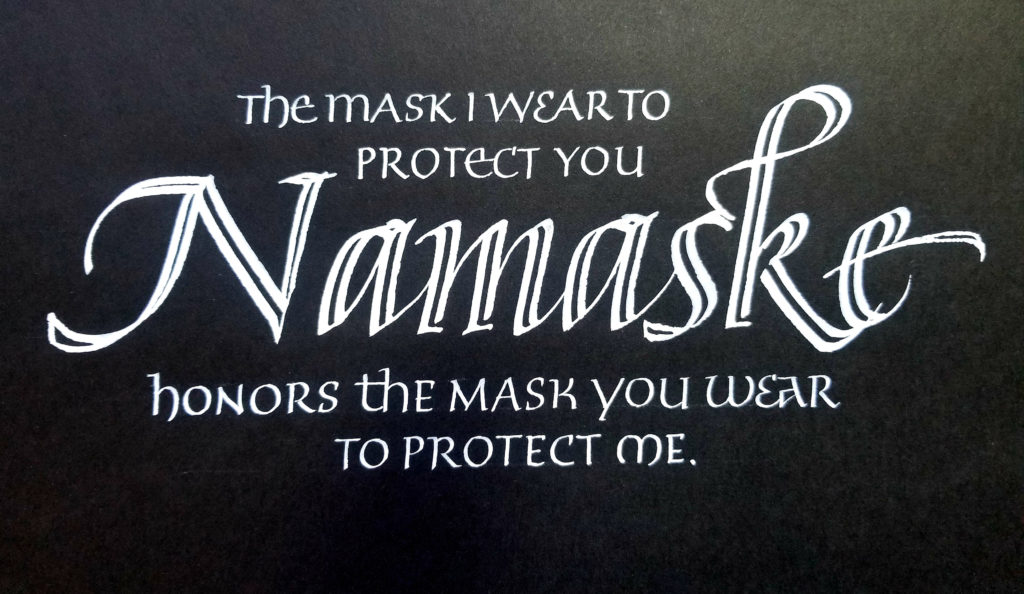
Namaske: The mask I wear to protect you honors the mask you wear to protect me. Dr. Martin’s Pen-White, automatic pen, and Brause metal nib on Strathmore Artagain black paper, about 9 in x 6 in.
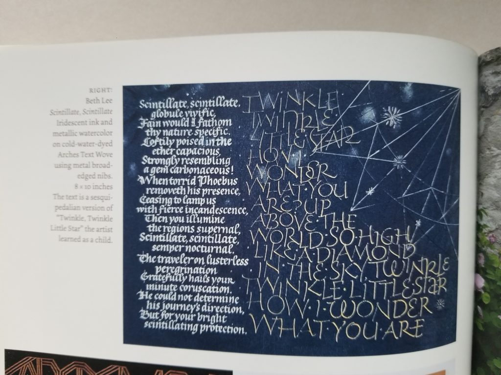
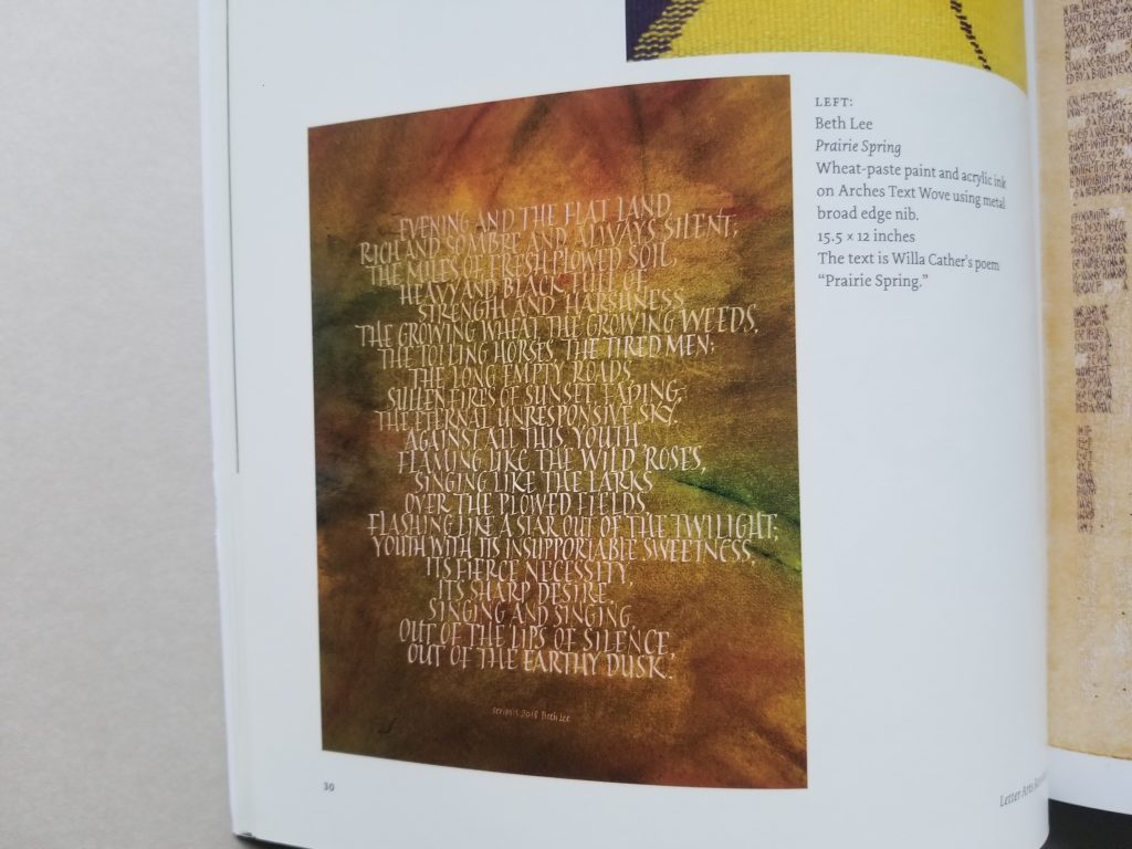
“Scintillate, Scintillate” broadside in the annual juried review issue of Letter Arts Review. Irridescent ink and metallic watercolor, metal nibs on dyed Arches Text Wove, 10 in x 8 in.“Prairie Spring” in the annual juried review issue of Letter Arts Review. Wheat-paste and acrylic ink on Arches Text Wove. 12 in x 15.5 in.
I’m honored and delighted that two of my pieces were chosen for inclusion in annual juried review issue of the Letter Arts Review. I’m in exalted company!
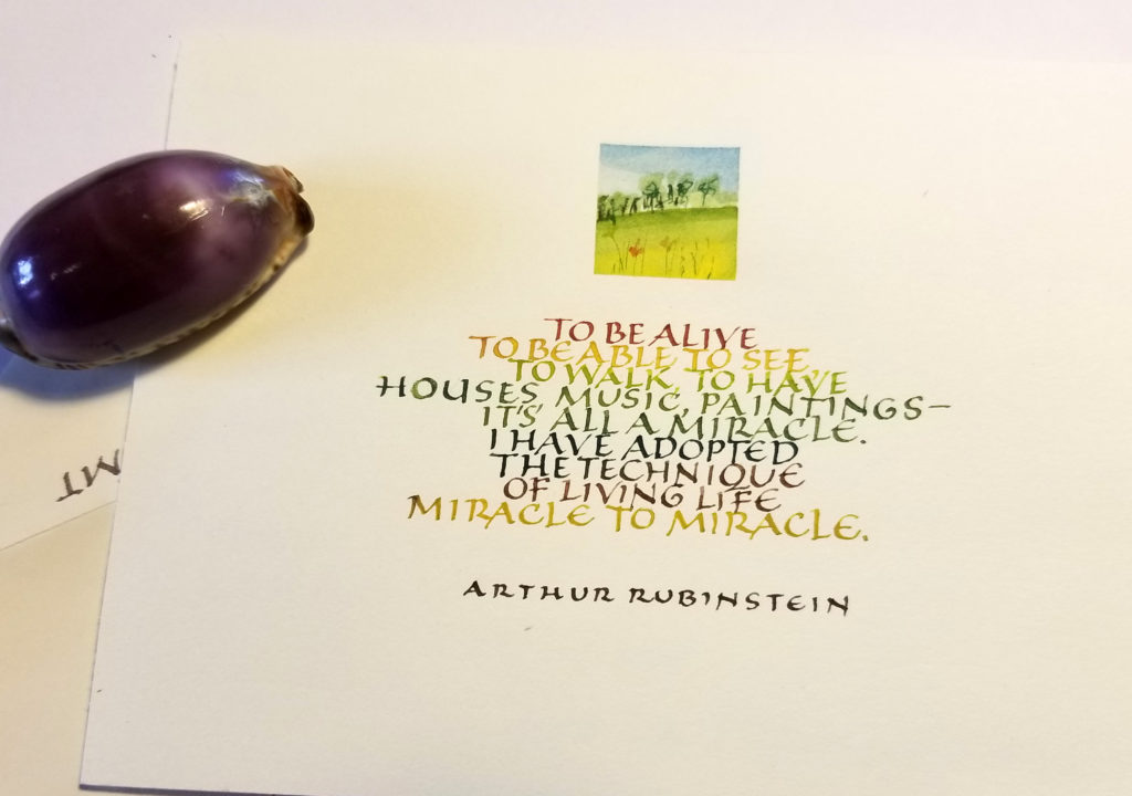
Card front, 5.15 in x 4.25 in. Gouache, metal pens, brushes.
During this quiet time — physically if not emotionally — I’m enjoying sending out snail mail. I’ve done this quotation twice so far. Rubinstein has it right.
3.8mm Pilot Parallel Pen, purple ink cartridge that comes in the box of PPP cartridges, never used (I wonder why?? — not ), and an ancient jar of yellow FW acrylic ink, on Strathmore Bristol.
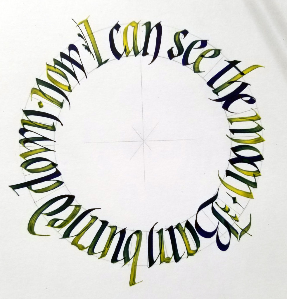
Thanks to Angie Vangalis for organizing an open-to-the public (!) virtual meeting of the Fort Worth Calligraphers Guild meeting online this afternoon. It was so good to be with people who care about x-heights, pen angles, and ink properties for a couple of hours.
Tamer Ghoneim presented the program, entitled “Circles on Steroids”, taking us through the process of writing in a circle — and, later, in a series of connected circles. Such fun! I followed along (image above), but instead of the straight-up blackletter that he demonstrated, I chose gothicized italic, a hand that is still texturally dense.
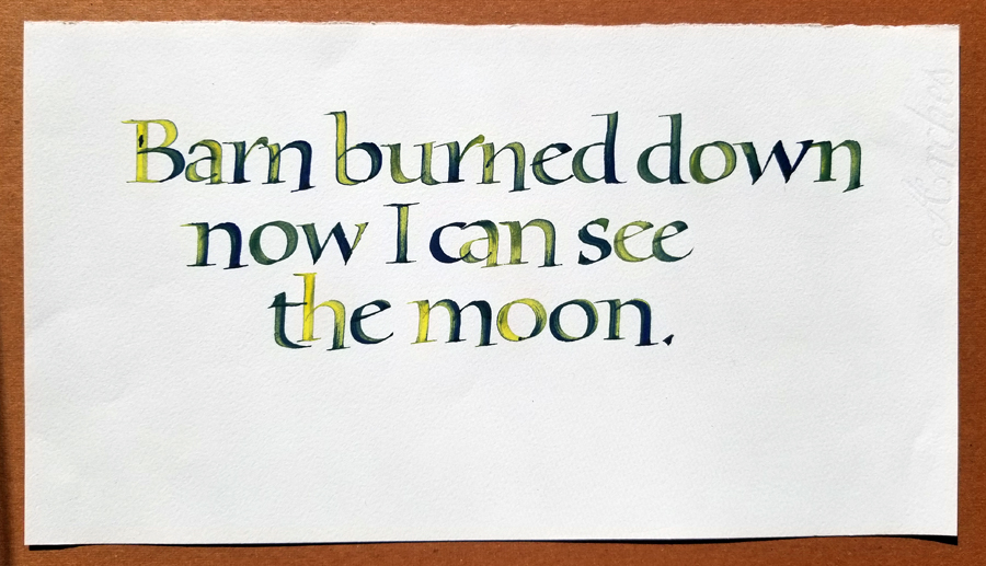
After the meeting I wanted to continue this process he introduced in the meeting: with a purple PPP ink cartridge in this Pilot Parallel Pen, he dipped the nib in the acrylic ink and then wrote, replenishing as the yellow faded and the purple approached full strength. He was using a Liquitex yellow acrylic ink, which somehow turned the purple in reddish, but my FW version didn’t do that, obviously. (I wasn’t at all surprised.) I repeated a quotation that had been suggested in the chat section of the meeting, lettering this time in a straight line somewhat in the style of the lettering by Karlgeorg Hoefer that I’ve been studying. The bolder weight necessitated some modifications.
Same 3.8mm Pilot Parallel Pen, purple ink cartridge, yellow FW acrylic ink. Bookhand on Arches Text Wove.
There are some great opportunities to connect with the book arts community online these days.
There are several resources for video presentations by book artists:
The Guild of BookWorkers has even more videos of past conference presentations. These are usually fee-based, but are now free until April 17. Just use the code ‘GBW4FREE’ at checkout. The default presentation is chronological, oldest to newest, but if you click on ‘Date” you can reverse that. Begin here: https://guildofbookworkers.org/content/gbw-videos-free-1-month. So far I’ve seen Timothy Ely’s 2015 presentation on the drumleaf binding, and Shawn Sheehy’s 2018 presentation on building pop-ups.