
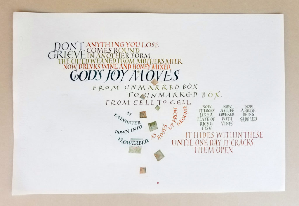
These versal variations are simply addictive. Slowly, slowly, I internalize how to waist the strokes (but not too much), how to finish the finials squarely, how to add a hairline serif. Then my concentration drifts and so does the width of the stroke, the slant of the letter, the shape of the bowl.
I was really focusing on the letter forms, and the layout was planned only line by line. As I imagine happens with a writer of a serial novel, I wrote myself into a couple of dead ends. And added the squares at the end to break up a hole that had formed.