Exploring the hand and vision of Karlgeorg Hoefer

Studying Karlgeorg Hoefer’s, “Appel an die Völker der Erde”Studying Karlgeorg Hoefer’s,

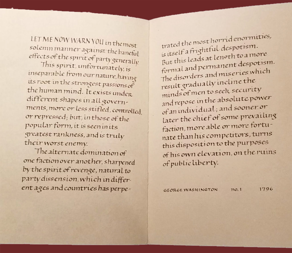
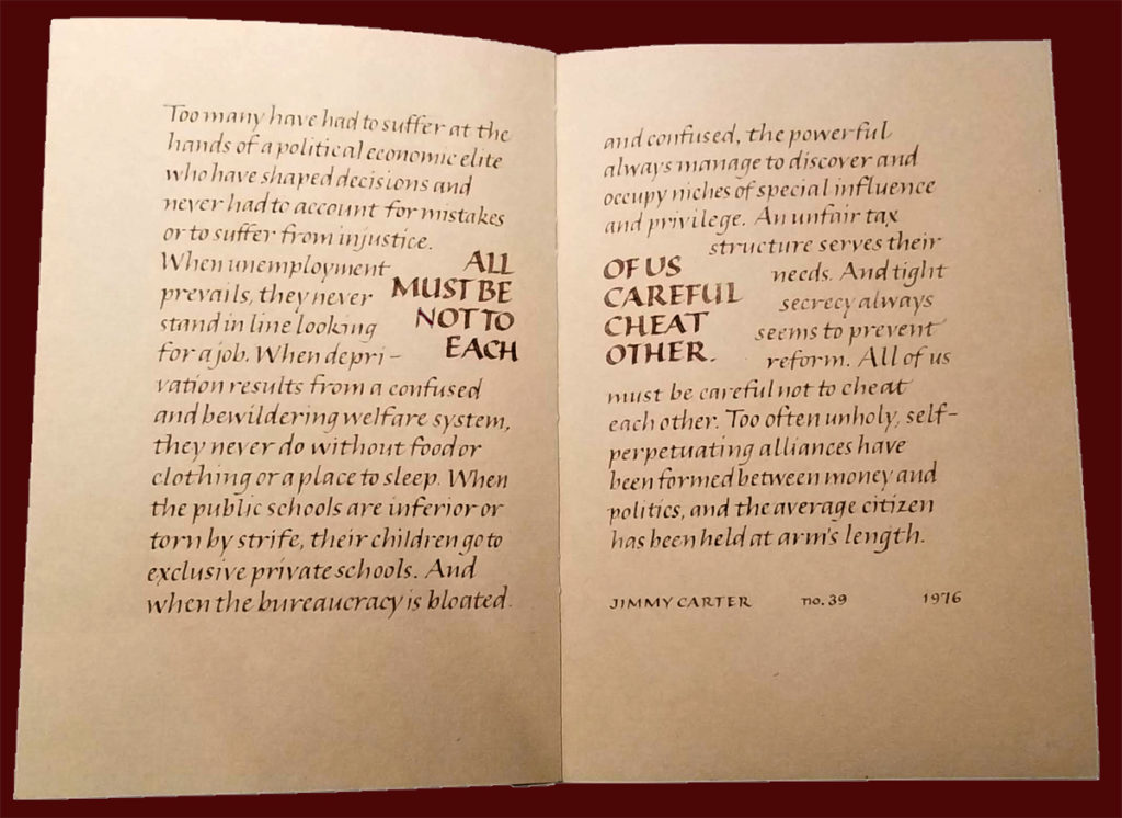
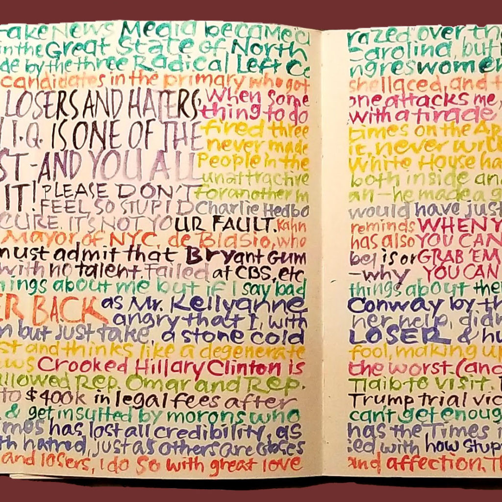
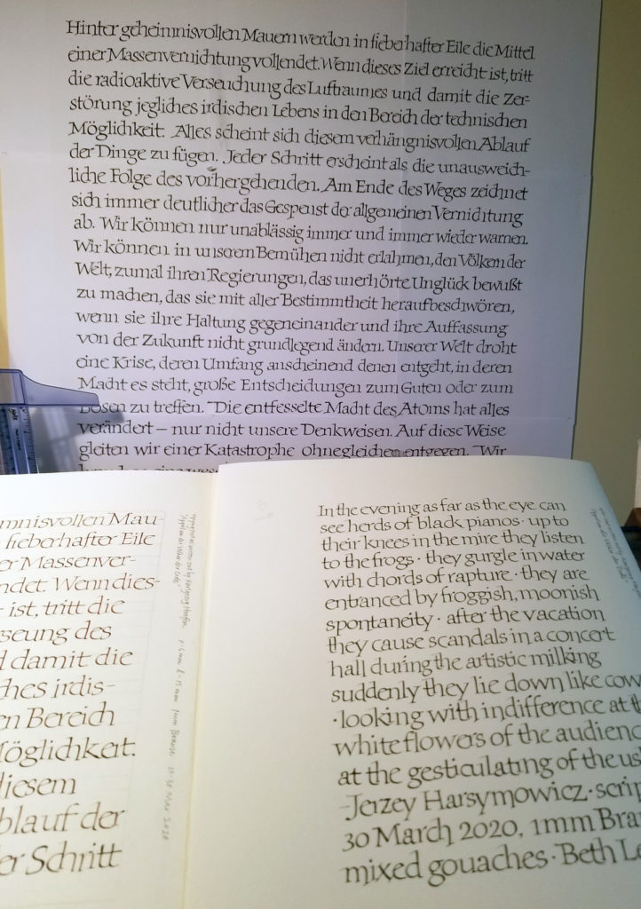
Ever since I saw it in International Calligraphy Today (1982, International Typeface Corporation), I have admired “Appel an die Völker der Erde”, a calligraphic poster by Karlgeorg Hoefer, . Here I’ve blown it up to the original 22 x 29.75 in and tacked it on the wall, the better to study. In my daily lettering journal, on the verso side, I copied the text as closely as I could, learning the Hoefer’s shapes and connections. He often slightly minimizes and tucks the ‘i’ in; I ‘ve inadvertently exaggerated it here, but I was so enjoying this tucking-in. The second stroke of the ‘r’ is often raised up the waistline to allow the next letter to tuck in. The bottom of the bowl of the ‘e’ is often pulled below the baseline to allow the next letter to tuck in. In a double ‘l’, the first one is usually normal while the second one dropped a little low to unlock it from the first. The ‘ch’ combination is always connected, but because the bowl of the ‘c’ is extended and foot of the ‘h’ raised to tuck into the bowl, it isn’t seen as a ‘d’. He seems to have done a push-pull on the finials of the ‘r’ and the ‘a’, similar to what happens in Carolingian ascenders, for instance.

These details form a compelling picture of idiosyncratic yet consistent choices that are both subtle and purposeful. Rhythm is important to the success of this piece.

Rhythm is also what my studies don’t have … yet. I’ll keep working. I’m thinking that a better paper (this is Strathmore Drawing 400 heavyweight), would be helpful. Hoefer wrote on “Japanese paper with Antiqua surface”. I haven’t been able to figure out just what that means. Nontheless, a kinetic understanding of Hoefer’s letters and connections will eventually yield that rhythm, and it’s what interests me most in this study.

Daily lettering – bookhand

Daily lettering: bookhand practice with 1.5mm Brause nib and a palette of leftover gouache.. Left side: x-height 5mm; right side: x-height 4 mm.

Lately I’ve been doing more bookbinding experiments and general studio cleaning and organizing. It’s good to get back to daily lettering.

My current reading stack is diverse. I’ve recently begun Daemon Voice, a series of essays by Philip Pullman. The sheer craftsmanship of his writing makes it a continual pleasure to read his work.

I just finished, finally, The 7½ Lives of Evelyn Hardcastle, by Stuart Turton. I’m not sure it was worth it, but every once in awhile I admired a good metaphor.

Artist book – Can’t Not Look: Democracy in America

Unique manuscript books is complete and available for sale. Can’t Not Look: Democracy in America is a collection of quotations from our presidents in three sections: “Civility & Comity”, “Ethics & Equality”, and “Dangers to Democracy”. Each section contains at its center a fold-out quadruple truck of our present leader’s tweets on the same subject.

This book is difficult to photograph, I’m afraid. The paper is vintage handmade John Green: “Dover Castle”. Here are a few images.

Gouache and steel nib on John Green “Dover Castle” vintage handmade paper. From my artist book, Can’t Not Look: Democracy in America. Text from George Washington’s farewell speech. Single page size is 4.75 in x 7.5 in.
Gouache and steel nib on John Green “Dover Castle” vintage handmade paper. From my artist book, Can’t Not Look: Democracy in America. Text from Jimmy Carter’s acceptance speech at the Democratic National Convention, 1976. Single page size is 4.75 in x 7.5 in.
Brush pen on John Green “Dover Castle” vintage handmade paper. From my artist book, Can’t Not Look: Democracy in America. Detail of first four-page foldout. Single page size is 4.75 in x 7.5 in.

Decorative exchange envelopes

After a hiatus of some years, I’ve rejoined an 11-months-long monthly decorative envelope exchange. I’m enjoying it. We aren’t required to include anything calligraphic in the envelope — although we do have to include something. I’m putting calligraphy in mine.

My February envelope, using that palette of leftover gouache (that just keeps on giving).for the card inside.
My March envelope. The blurring kind of obscures the design, but you get an idea, anyway. All done in pencil, which is what I’ve mostly been doing in my studio lately.