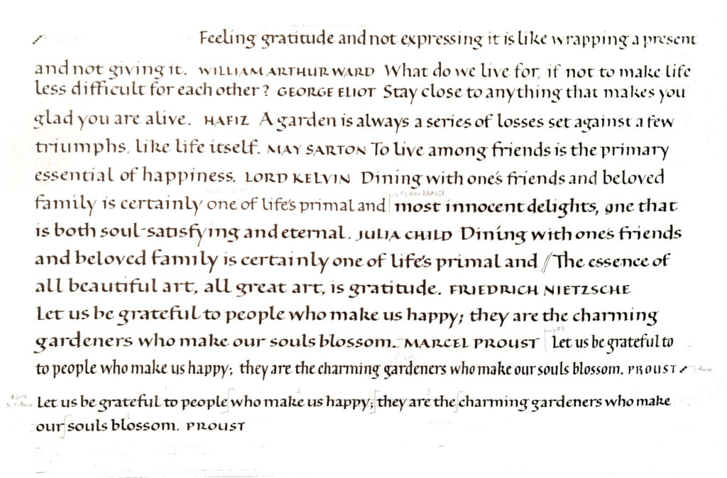
This week in the bookhand class I’m teaching, we talked about layout and copy-fitting strategies. One strategy is to write the quotation, cut up the lines and rearrange them to fit the space allotted. I did the first part here:

I didn’t actually cut up the lettering, but I did measure the lines and begin each line based on those measurements. I did a series of cards based on the one Proust quotation. As shown below, I can get very different looks using the pen and the same basic centered layout. What I’ve changed: writing fluid, ground (paper), line leading. In a couple of cases I wrote the lettering with no guidelines, and so the x-height and line leading are also variable. Also in a couple of cases, I wrote “bloom” instead of “blossom.” Oops.

