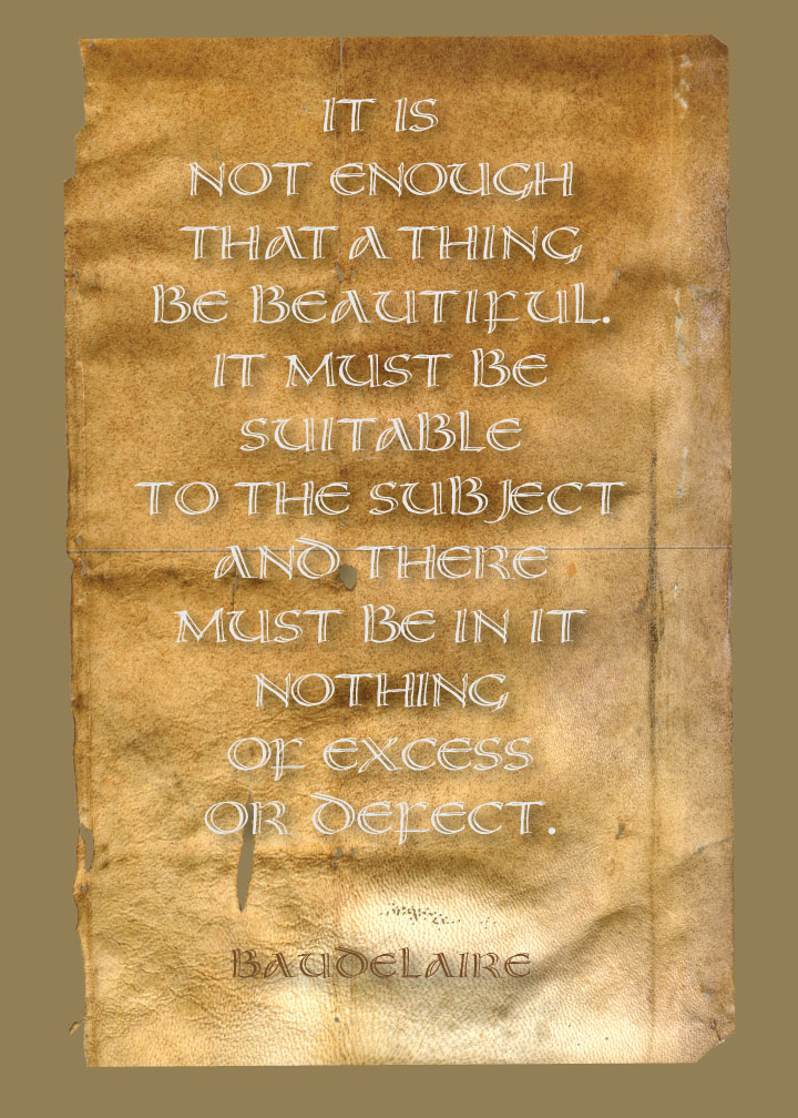
 This is a typeface I designed a couple of years ago. It was designed very badly, I might add — so badly, in fact, that I pretty much had to kern every single pair of letters to get it to look halfway decent. And I missed kerning the BJE in “subject”, evidently.
Here is a scan of the Zig-markered original lettering that I used to make the typeface. Here’s the typographic poster I blogged originally, using this typeface when it was just completed.
I don’t think Baudelaire would approve this interpretation of his words 🙂