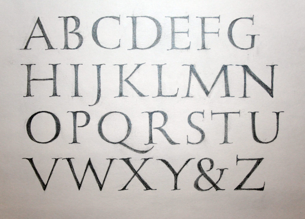
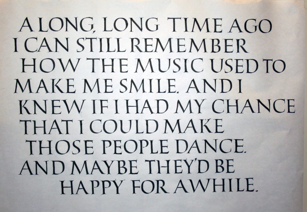
Drawn Roman capitals done at 3/4-inch height with pencil on Strathmore Drawing 300. Serifed Roman capitals done with a 3.8mm Pilot Parallel Pen on white butcher paper at 1-inch height. I don’t think I was that back-sloped at the bottom right; rather, I think I tried to fix the perspective of a not-straight-on camera shot. The stiffness of the strokes and serifs are all mine though, sadly.
These are two homework pages from session four of John Stevens’ excellent five-session course, Capitals to Uncials. Session five was held this weekend, and I’m looking forward to doing the homework from that session.
It’s been such a good class, and John presented about 10 times the material shown by my posted homework. I’ve got enough to work on for a year without stopping, and I’m sure that that year’s work would lead to another year, and so on.
Judging from the disappointed post of fellow calligraphers worldwide, I was awfully lucky to make it into this 5-week class on Uncials and Roman capitals taught by John Stevens. This is week 2. Here are the 2 pages of homework I was willing to share with the class.
I could easily work on this class full time! I’m quite sure that some of my fellow students have been doing so, and even working overtime. I’ve been drawn into spending much more time on it than I realized. So now I’m scrambling to get to all of the work piling up in my studio. Today and tomorrow will see me caught up (she says, optimistically).
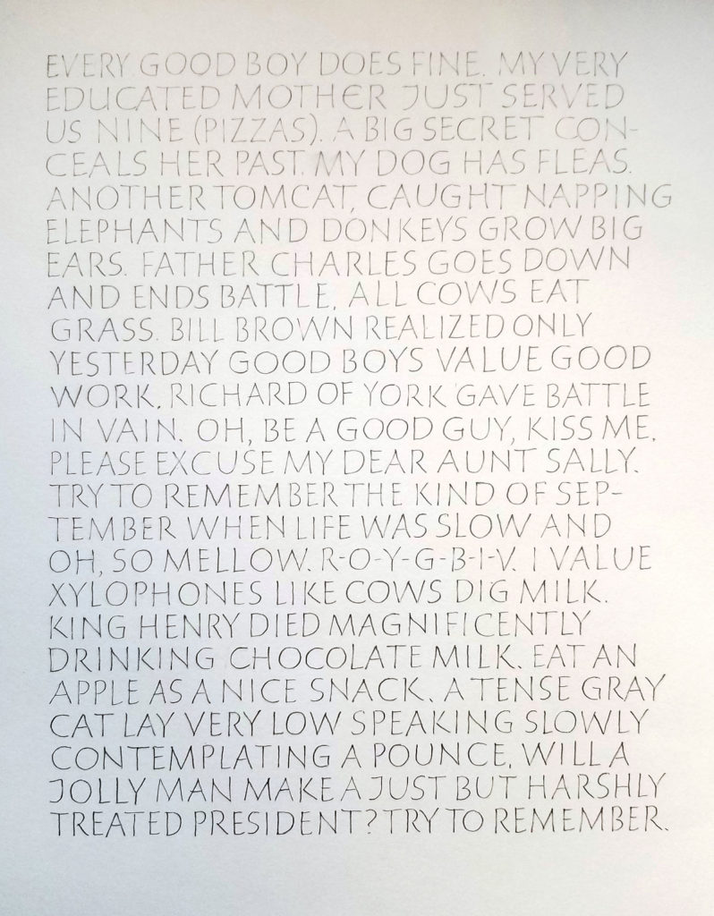
Monoline capitals 1/4″ high, lettered with 03mm mechanical pencil on Strathmore Drawing 300.
A layout showing 3 sizes of an italicized variation of uncials. Brause & Hiro Tape nib in sizes 3mm, 2mm, and 1mm on a scrap of Fabriano Ingres. I’m still working out the details of this variation.
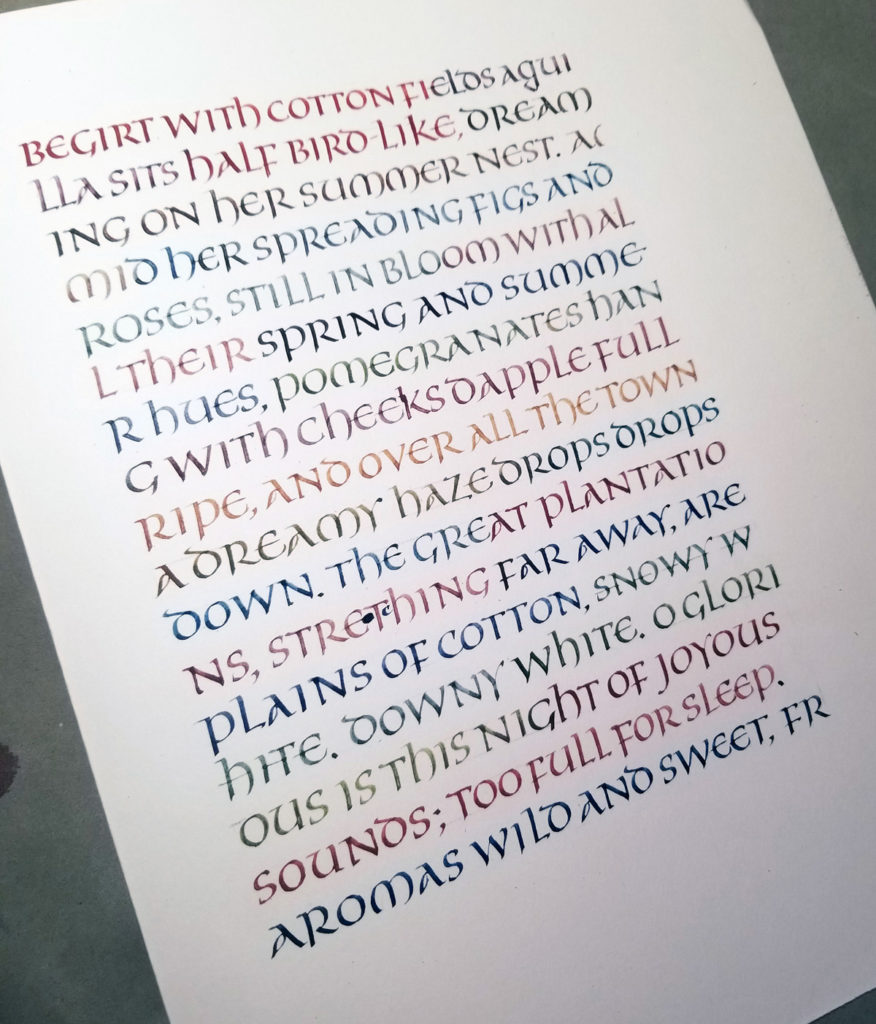
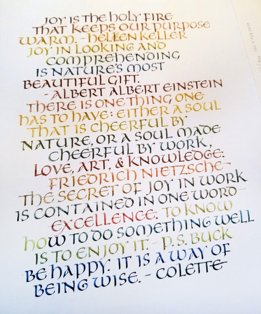
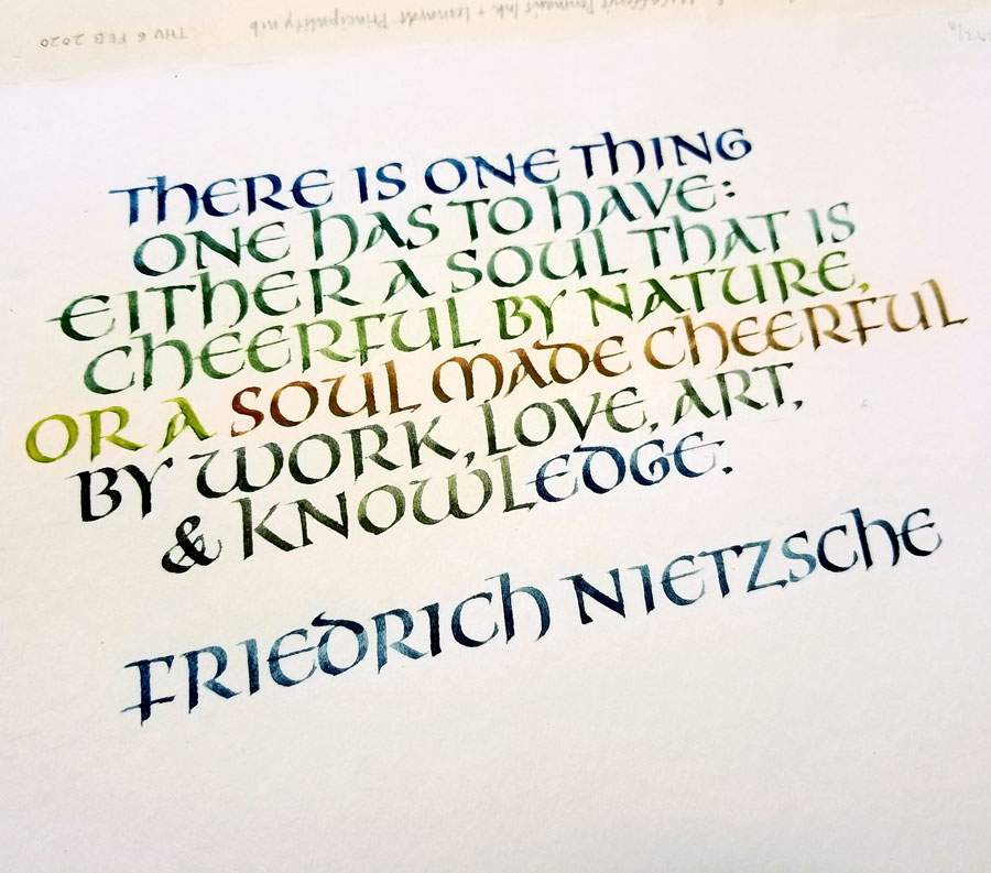
Uncial calligraphy practice, leftover gouache, on a 9in x 12in page of Strathmore Drawing 400.Uncial calligraphy practice, x-height 6mm, 1.5mm Brause nib, leftover gouache, on a 9in x 12in page of Strathmore Drawing 400.Uncial calligraphy practice, x-height 6mm, 1.5mm Brause nib, leftover gouache, on a 9in x 12in page of Strathmore Drawing 400.
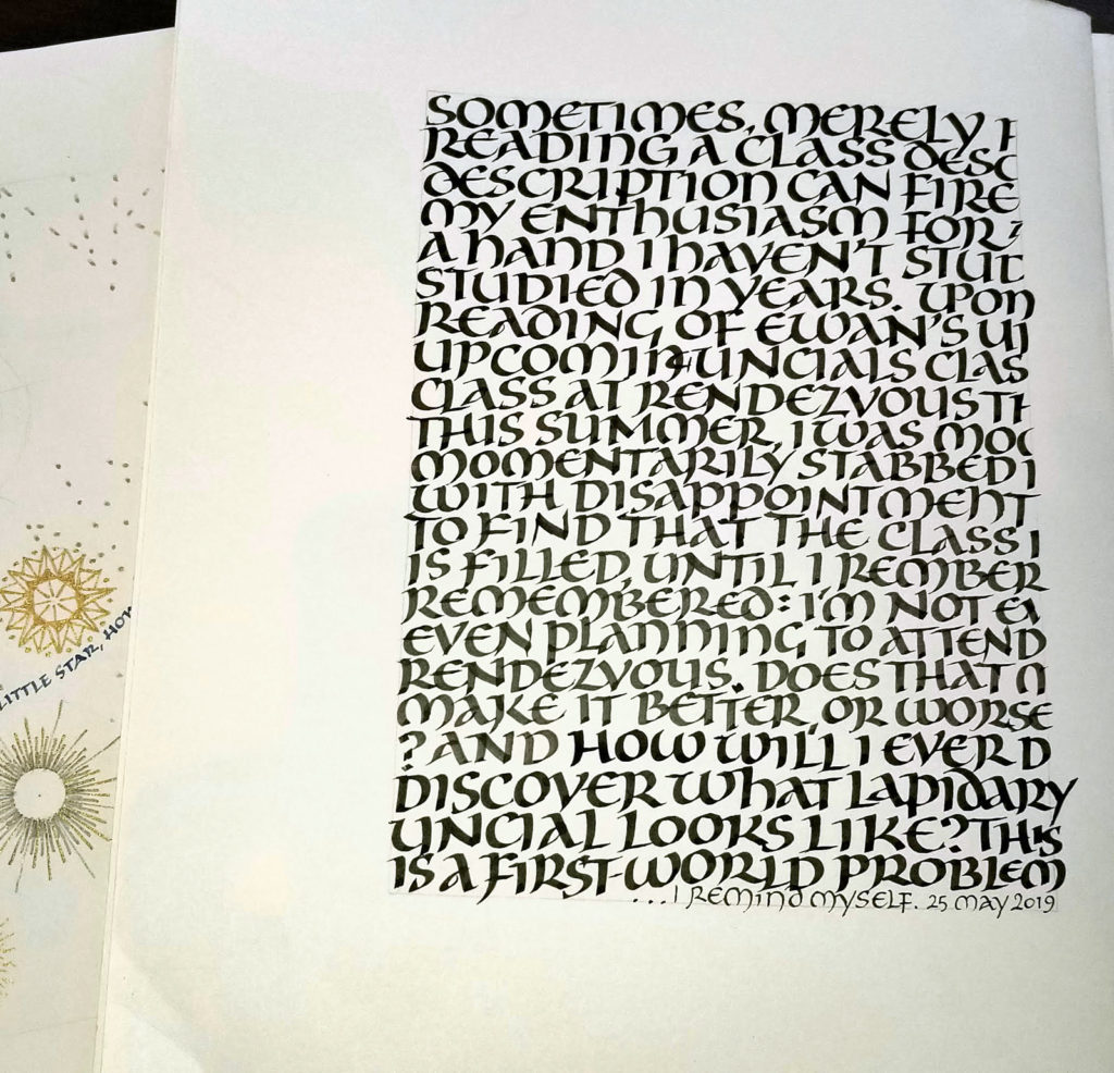
The past few days’ daily lettering have been all about uncials, particularly one old exemplar that is unlabeled except for “late XII England”.
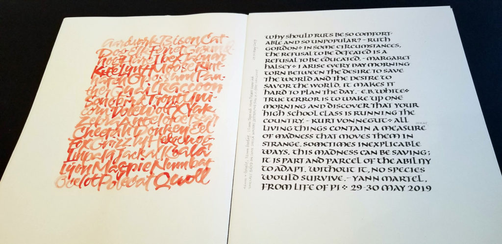
I’ve been negligent here on my blog — has it really been two months? to the day! — but I’ve been working pretty steadily in my studio. Here are a few pages of daily lettering, mostly delving into gothicized italic and uncial letter forms.
May 24 – After mixing color to match a colored background, I just kept going because I was having so much fun.May 25 – A first approach to uncial, which I had not studied in years. Just trying to remember the feel of uncials: round, short, fruity (okay, that’s some weird kinaesthesia going on).May 27 – Getting a little more specific by studying a handout received from Sheila Waters c. 1986.May 30 – The same uncials, but taking it down in size.