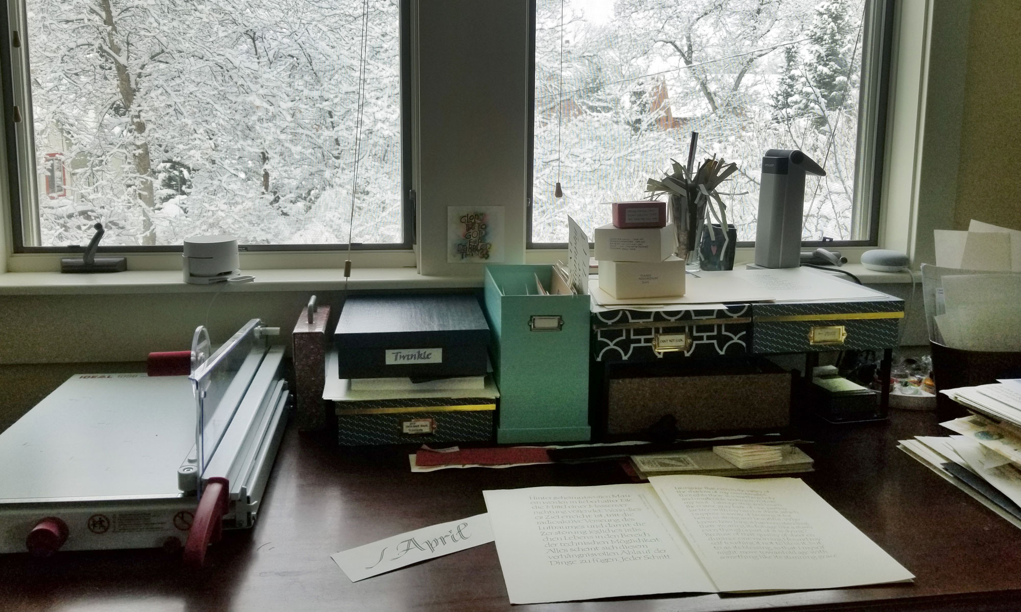
It’s been so hot that I’ve been working in the dining room on the main floor of the house. My studio over the garage is an oven this summer, especially in the afternoons. For the past couple of days I’ve been addressing wedding invitations, which is good from a “venue” standpoint: the tools and materials needed are finite and portable.
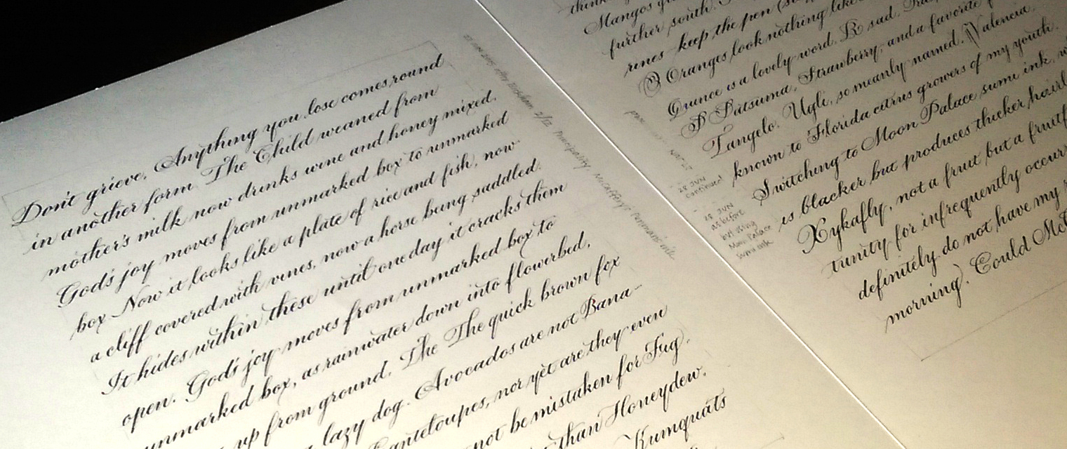
Pointed pen is so different from broad-edge pen lettering, that when I switch from one to the other that I must practice to get back in the groove. Shown above are two of the three pages done to prepare for job. For the first page (not shown) I lettered in my default pointed pen script. Because the invitation was printed in Bickham Script, on these two pages I developed a script style that incorporates some of the characteristics of Bickham.
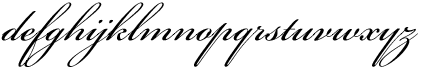
A few Bickahm characteristics I chose to incorporate in my script:
- small x-height
- 50º slant (or more)
- weight on the heavy side
- “y” descender with no loop but an exit stroke on the right
- “o” exit stroke beginning from the middle right side of the oval
- “f” with a lower loop as well as an upper loop
- entrances to letters such as i, j, m, n, and especially u, w, y are more pointed than curved, allowing for tighter letter spacing
I’m always aiming for a balance between contrasting and complementing the printed invitations. Too little contrast, and it looks like inept printing. Too much contrast, and there is no connection between the addressed envelope and what’s inside.