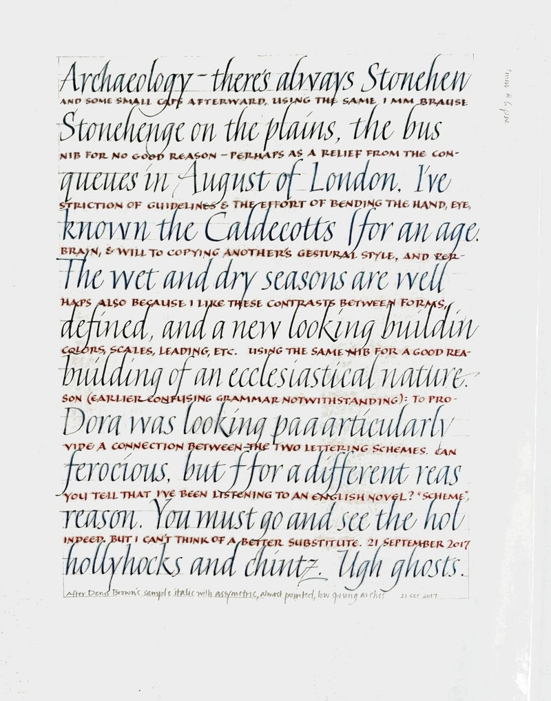
Changing it up from versals and other drawn letters … sprung italics after Denis Brown’s example, with interlinear brick-red capitals to provide contrast. The text probably means very little to anyone but me. For example: Why “Ugh” as the penultimate word in the italic lettering? It was an opinion about the preceding letter z. And why “ghosts” as the last word? I wanted another go at that “gh” combination in “Ugh”; the first time it was too close.


