 A little experimentation in the studio, inspired by Alisa Golden’s new book, Painted Paper. Both the decorative technique — using sumi ink and FW acrylic inks — and the folded structure are presented in the book. I like the look. I’m thinking of what kind of content could accommodate this layout.
Helen Musselwhite’s Beautiful Cut Paper Work
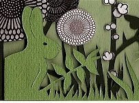 Take a little time to ooh and aah your way through Helen Musselwhite‘s website galleries of cut paper work. Pretty cool stuff.
via Paper Forest
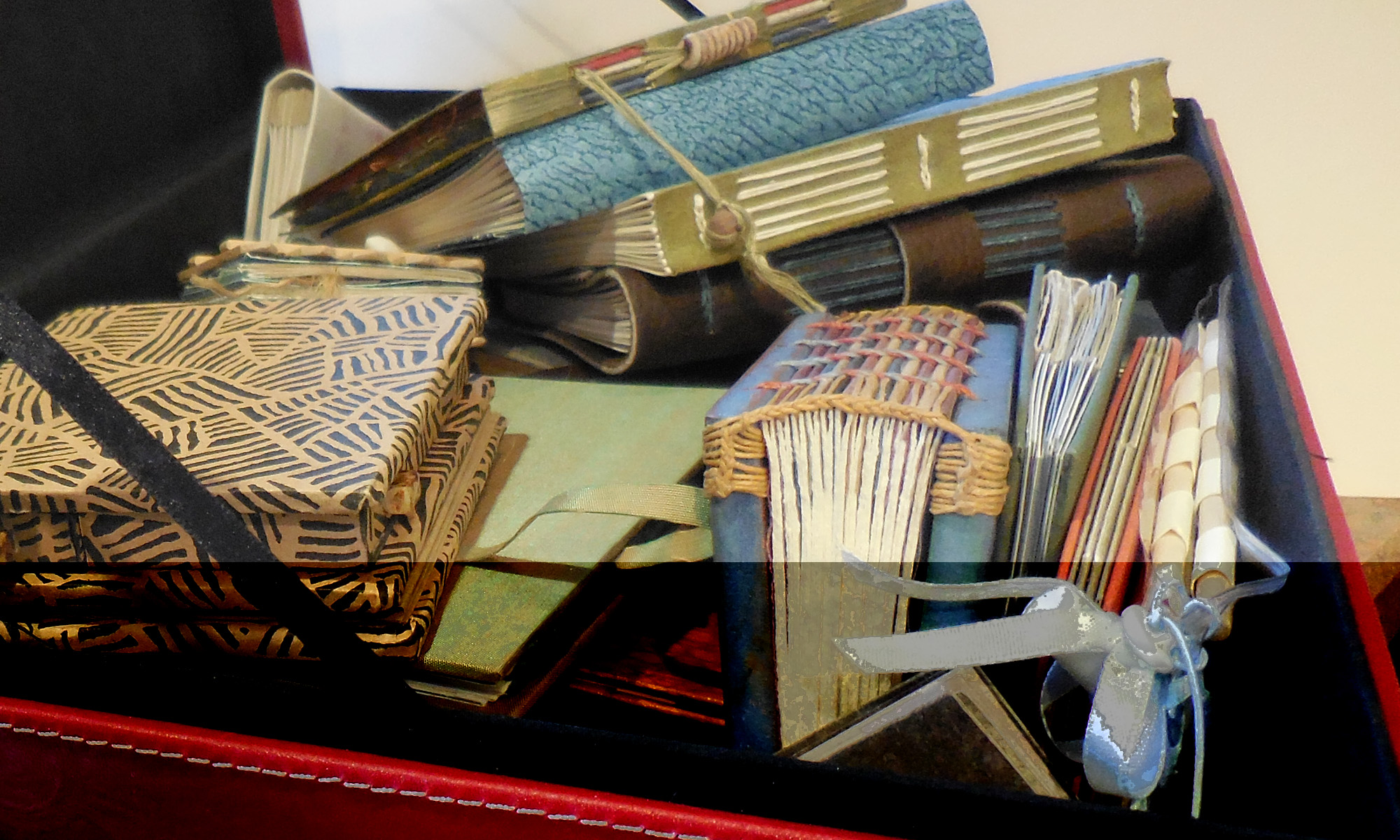
Brush lettering and studio organization
 Today I spent an inordinate amount of time searching my studio for a set of color trials that I just know are in here somewhere. It’s so frustrating. I made glair, the book pages are ready, the copy-fitting has been worked out, and I’m ready to do it. I just don’t know what colors, exactly.
Towards the end of the day I cleaned out the right two columns of my post office boxes, taking the opportunity to practice some brush lettering on the labels. Okay, not exactly practice, but at least pick up the brush and do something with it. The “brush” was the other end of a Zig Scroll-and-Brush marker, or a Pentel color brush or a Copic brush. No guidelines, no do-overs, but it added a little fun to a tedious (and slightly alarming — how did all this stock accumulate?) chore.
Codex Sinaiticus
 Tomorrow the Codex Sinaiticus website will go live, presenting the entire 4th-century Greek manuscript online. From the looks of the screenshot, it could be valuable for the study of the Byzantine Roman uncial letter forms of that time. A magnifying glass, similar to the Turning the Pages technology used for manuscripts on the British Library site, allows for close inspection. A typeset transcription is provided on the side, with a translation (I hope in English as well as German) beneath that.
The web site will be introduced on Thursday, substantially updated in November, and fully developed by July 2009.
via Slashdot (who got the manuscript date wrong by about 800 years, but who’s counting?)
Brush Lettering and Vacation
I just returned from a week or so in Oregon, where I took a 2-day brush lettering workshop with Carol DuBosch and then toured around Oregon.
As one calligrapher in a town which contains two (and, in the past 25 years, has never contained more than about five at any one time), it was simply amazing to me to sit in a classroom in a sold-out calligraphy workshop with 23 local calligraphy students. Sure, I’ve sat in a class of 20+ calligraphy students before, but they’ve always been a collection from around the state or around the country or even around the world — a Florida retreat, or a week at Camp Cheerio or a class at the annual international calligraphy conference. I had lunch with a pediatrician who was taking this annual brush lettering workshop for the second time; she has taken weekly calligraphy lessons for several years (ten? or was that someone else in the workshop?). Imagine. I’ve had exactly one opportunity to take weekly calligraphy lessons, and that was in 1988-89. And then Beth McKee, my first long-term calligraphy teacher, who had arrived from Ottawa to spend the school year here, took off for Bangladesh, and that was that. From then on out — except for a year of 2-day class meetings to which I drove 3 hours each way each month — my education has been a series of trips to learn from quite famous calligraphy teachers for a week here and a week there.
My education compares to the education of Portland students as an annual gourmet meal compares to weekly community potluck. My meals may be exotic and glamorous, but theirs have been healthier, more regular and filling. Not that I’m knocking my exotic, glamorous meals. Still.
Type designers and their handwriting
 The article, “Handwritten Typographers,” juxtaposes the type designs and handwriting samples of ten type designers. The comparisons themselves are intriguing, but more compelling to me is the whiff of attitude that each handwriting sample reveals. Type designers evidently aren’t exempt from personal handwriting shame, as Göran Söderström reveals. I’ve known lots of calligraphers who wished their handwriting were “better,” whatever that means, and type designers stand further away from handwriting than do calligraphers.
During the era of handwritten manuscripts, the same tools — brush and pen, mostly — were used for both formal and informal lettering systems, and the two systems informed the development of each other. But the tools for printing and writing now differ, and type design has fractured along lines of influence — influence of tools, culture, and more. The “serious” typefaces become more architectural, and the boutique (for want of a better word) typefaces more gestural but less grounded in traditional form.
I make these sweeping generalizations, and then I realize it’s not that simple or discrete; in this article I see many lines of connection between type and handwriting. Do I discern a repetition of rhythm in Nikola Djurek’s type design and handwriting. Does Kris Sowersby’s handwriting reveal a preoccupation with ligatures that gave rise to the typeface Feijoa? Eduardo Manso’s handwriting and type designs share the same lovely openness. Marian Bantjes tweaks her handwriting, not so surprising in a type illustrator; she’s a little closer to calligrapher than most type designers.
Interesting.
Experimentation — Photoshop

Here’s a little sample of the educational experiments I’ve been making in Photoshop. Since you can’t possibly tell this from the image itself, I’ll tell you that I was working to understand channels and blend modes in this particular experiment..
Decorated text pages waiting for the muse
 I like these pages, done with FW inks on Arches Text Wove. I have a few ideas about where to go with this one, but I didn’t start out with anything more than an idea of color and mood in mind.
Decorated text pages for a book
 These pages were made with a particular idea in mind, having to do with the island in central Florida on which I grew up. That green is very close to the greens of the pines, the palmetto bushes, and palm trees that made up much of the island‘s landscape. That brownish black is about the color of the pieces of wood that mixed in the sandy soil of the island.
Getting started
 A week ago I finished a compressed semester of “getting things done.” GTD: the siren that calls us to wrestle all the disparate pieces of our lives into a spreadsheet breakdown that we can manipulate into submission — sometimes luring us onto the rocks of busyness and away from doing what we really want to do.
It’s difficult to get back to listening to myself and working from within. Sometimes when I’m unsure about how to approach the next piece, I find inspiration in digging through my stash of variously decorated papers. The designs are great to look at, but what’s more valuable is that looking at these papers revives a kinetic memory of the me that decorated the papers. I remember what it was like to spread out the papers on the table outside, to cook the paste, to mix up the paint and spread it on the paper and move it around with combs and sponges, to drop ink and watch it spread into lovely patterns, to wait while the ink dries to just this consistency so that I can spread it this much with this tool; to respond to the unexpected combination of these colors, the gestural effect of this mark.
In this digital age, the virtual world is instant, or it is interminable. Click Print and the sheet of paper slides out of the printer in a matter of seconds. Click Movies and schedules for all the movies theaters within x miles appear; click Buy and you’ve got your tickets. By contrast, you can lose hours trying to determine why closing this window crashes that program, or why the background color of this paragraph doesn’t match the background color of that image. Instant or interminable, not much of the outside world intrudes between our brain and our fingers on the keyboard.
Doing art re-forms and reforms my connection to the physical world which digital work can sever. And decorating paper is a good start, much like gestural warm-ups for figure drawing or lettering. I’ll post a couple of examples of what I’ve been doing lately.