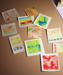
Just some experimental writing

Not much to show lately. It’s all been either wedding invitation addresses or learning software or typographic exercises.

I recently addressed 75 envelopes made of handmade paper that seems to have been abandoned at the pulp stage. Throughout the work, my thoughts kept circling around to how many decades of experience it’s taken for me to arrive at the point where I could actually letter on such a surface. But a blog post can’t really illuminate that particular battle.

I could show you my really lame 1st video in Final Cut, but really, why would you want to see it? In short, I made a vector-art flowerpot pretend-water three pen-drawn flowers so that they grow. It’s a steep learning curve, and I’m slow.

The typographic exercises are nothing to write home (or here) about. During the last exercise I kept thinking how much easier it would be to hand letter. Maybe I’ll do a comparison in another post.

Shown here is something I did last night during a telephone meeting, when my hand was mostly disengaged from the brain. The pen is a Speedball nib and the Schmincke gouache was left over from drawing the flowers for the Final Cut project …

Book Exhibition in Burlington, Vermont


If I lived anywhere near Vermont, I’d be making plans to attend the Vermont book art guild’s exhibit currently up at the Firehouse Center for the Visual Arts in Burlington. The center’s website (linked in the title of this post) has only one book image, but Elissa Campbell has photos of the exhibit up on her Blue Roof Designs blog.

The End of Pens?

Posted to the Ornamental Penmanship list this week: a link to a blog post entitled, “The Dying Art of Penmanship“. It stirred up some talk, as usual. Yes, we’re relying more and more on advanced technology to get things done … as opposed to traditional technology, of course. After all, paint is technology, and so are metal pens.

The implication in these hand-wringing analyses that crop up from time to time is that we are somehow less involved in The Making of Things now that we’re using tablets and electronic palettes instead of dip pens and ink. I don’t think that’s true, but it is harder to stay grounded. “Blue? Wait, what’s it look like in magenta? Oh, no, that’s not so great. Let’s try a nice mossy green. Hmm. Maybe blue. How about a nice drop-shadow — or maybe a bevel …” It’s easy to allow oneself to be driven by the options rather than driving the design process. Those monks who traveled from England to Afghanistan and back for some lapis lazuli for their manuscript books — now they were driving their design process!

What’s missing today, perhaps, is the physical cause-and-effect aspect of making things. When I do hand lettering, the movement of my hand and arm is directly related to the shapes of the letters forming on the paper. The ink glistens on the pen, slides down the nib onto the paper, and dulls as it sinks into the paper. By contrast, the click of a mouse can do so many disparate tasks: cause a letter to appear on the screen, or color in a shape, or close a file.

Yesterday in my typography class, I was speaking with the professor about how I use Adobe Illustrator to prepare my hand-lettered artwork for reproduction. She told me that Wacom now makes a stylus-and-tablet that emulates a calligraphy pen, so that the artist writes directly on the tablet and calligraphy appears in the graphics application window. She insists that these styluses are as sensitive as traditional copperplate nibs and that all the commercial hand lettering being done today is done using these $3,000+ tablets. Hmm. I like technology. Really I do. But I can’t imagine liking this electronic pen. As Peter Thornton (who really needs to get a website!) says, “It’s not wet enough.”

Back in school

What with traveling this summer and Tropical Storm Fay, I haven’t had much access to the Internet lately. Now school has started, and I’m looking forward to the classes.
I’m taking History & Theory of Graphic Design this semester. The textbook is Meggs’ History of Graphic Design but I’ve also bought Johanna Drucker’s new book, Graphic Design History: A Critical Guide, written with Emily McVarish.

Some interesting links from the first week of class:

  • Ancientscripts.com has a lot of information about writing systems. The timeline visually shows which writing systems existed when and for how long.
  • This wonderfully weird plaque was designed by Carl Sagan and Frank Drake as a greeting from earth to any aliens who might come across the Pioneer 10 & 11 space probes that were launched in 1972. It’s an interesting look at our own cultural skew. No language was included for obvious reasons, but isn’t an arrow a culturally derived symbol as well? In ancient Rome it was considered perfectly fine for men to be depicted nude but only prostitutes and low-class women were depicted nude. I guess 2,000 years is a blink of the eye: public outcry in 1972 caused this poor woman’s genitals to be erased 🙂

And a couple of amusing links:

  • Sumerian Beer Project — History has shown that when people quit hunting/gathering and settle down in one place, three new elements of life emerge: writing, religion, and beer. For the Sumerians, one of the first agricultural civilizations, all three were interwoven. Again, 5,000 years is but the blink of an eye, although the technology has mutated: today it’s television, football, and beer, right?
  • Write like a Babylonian — See your monogram in cuneiform, the way an ancient Babylonian might have written it.

Book commission

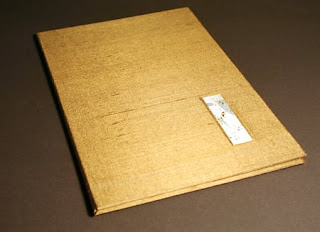
I’ve just finished a book that was commissioned as a birthday present. It was such a Jekyll-and-Hyde experience. The text was simply lovely, and I enjoyed the design of the book. But for the longest time I simply could not complete a block of writing without spilling gouache on the page, skipping a word, or unknowingly shifting the guidelines. Once I got through those mistakes and got a block of lettering done, I found I had accidentally used regular tape to affix the page to the pad of paper that was acting as a writing cushion. When I removed the tape I wasn’t able to preserve the top layer of the corners of the pages. Aargh. So I started over again. But amidst all these starts and restarts, I came to the conclusion that the text paper I was using just didn’t present the gouache well. So I switched to Fabriano Ingres, which is such a ubiquitous paper that I didn’t think of it initially. The warmer cream color of the page looked gentler, and the gouache laid down better on the surface.

Alongside the frustration, though, was a satisfaction in writing a pretty wonderful text, something that was written very directly and personally. That part of the process was a real joy.

I used a new roll of Japanese paper to back the gold/tan silk that I found in the home decorating section of the fabric store. That went well; I believe this new kozo paper is a little thinner than the 15-year-old roll of Tableau that I’ve nearly used up.