Awesome stop-motion music video: “Her Morning Elegance.” I love it.
Directed by: Oren Lavie, Yuval & Merav Nathan
Photography: Eyal Landesman
Featuring: Shir Shomron
Calligraphy & more — the studio of Beth Lee, Bozeman, MT
Awesome stop-motion music video: “Her Morning Elegance.” I love it.
Directed by: Oren Lavie, Yuval & Merav Nathan
Photography: Eyal Landesman
Featuring: Shir Shomron
I really like Denis Brown’s 2008 new year’s greeting to fellow calligraphers. It works as a time-based greeting card, encouraging the viewer to slow down and reflect on the passage of time. Because of his background in sound production, I’m sure he produced the sound as well as the video, making this an entirely original piece.
I also like this kinetic typography piece based on part of “Lions Roar” by the Hush Sound. There’s a lot going on.
A longtime favorite of mine is “The Child,” created by Antoine Bardou-Jacquet for the french dj Alex Gopher, way back in 1999 — or maybe earlier.
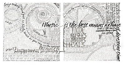 This two-page spread (click on the thumbnail picture for a full-size image) was created for the centerfold of a 12-page book designed in typography class this past semester. These were the only pages that had no photographic images, and my aim was to try to synthesize my experience of lettering into a modern piece that would work as hand lettering in a typography setting. I don’t know that I succeeded, but the experiment was interesting. All of the quotations in this piece revolve around the theme of the book: time.
When I was in high school, well before I took up lettering (or maybe not, now that I think about it!), I made these elaborate doodles I called “scribbles”, which relied more on color for their design. Looking back through this blog, I see that I’ve never posted one of those, although I still have several of those early scribbles. I’ll plan to do that sometime.
The essay question at the end of the final exam in History and Theory of Graphic Design directed us to speculate on the future of the book. It was an interesting question, and after I walked out of the exam room I continued to think about different aspects of the question.
At The New Atlantis, there’s a thought-provoking article by Christine Rosen entitled People of the Screen. In it, Ms. Rosen predicts what may result if we trade in the literacy learned throughout our 500-year-old history of book technology for “digital literacy,” as she calls it. The article is long and covers a wide range of issues. Two are particularly interesting to me. First, there is the connection between screen vs. paper reading and extrovert vs. introvert personality:
For centuries, print literacy has been one of the building blocks in the formation of the modern sense of self. By contrast, screen reading, a historically recent arrival, encourages a different kind of self-conception, one based on interaction and dependent on the feedback of others. It rewards participation and performance, not contemplation. It is, to borrow a characterization from sociologist David Riesman, a kind of literacy more comfortable for the “outer-directed” personality who takes his cues from others and constantly reinvents himself than for the “inner-directed” personality whose values are less flexible but also less susceptible to outside pressures. How does a culture of digitally literate, outer-directed personalities “read”?
The second issues is related but not identical:
[When encountering a novel,] you must first submit yourself to the process of reading it—which means accepting, at some level, the author’s authority to tell you the story. You enter the author’s world on his terms, and in so doing get away from yourself. Yes, you are powerless to change the narrative or the characters, but you become more open to the experiences of others and, importantly, open to the notion that you are not always in control. In the process, you might even become more attuned to the complexities of family life, the vicissitudes of social institutions, and the lasting truths of human nature. The screen, by contrast, tends in the opposite direction. Instead of a reader, you become a user; instead of submitting to an author, you become the master.
She finishes up with a rather harrowing picture of a monastic society of readers which dwindles to arcane hobbydom, gradually leaving the mainstream of society to fade into oblivion. This picture doesn’t seem likely to me, but it does somehow remind me of the surprise and sense of “otherness” I feel on discovering that someone I thought I knew well lives in a house which contains no books at all. It’s a divide which seems unbridgeable.
 Didn’t get to Tallahassee in October for the artist book exhibit at LeMoyne Center for the Arts? Not to worry: the online exhibition of Feathers, Fins & Foliage is now … online.
It was a pleasure and an honor to handle these books while we were mounting and taking down the exhibition.
The semester is nearly through — only one final exam to go — and all the projects are done. Maybe not exactly finished, but done.
I completed this kinetic typography project in Graphic Design III this semester. I used three minutes of “Wonderful”, one of my favorite songs in the Stephen Schwartz’s musical, “Wicked”. It’s a Flash file, my first ever. I had a great time with it, and I’m very pleased with the way it turned out.
Update 2017: I apologize in advance for those who can’t see this file. It was made in Flash, way back in 2008 when Flash was still cool.
Oops, if you can’t see this, is most likely because this is a Flash file, made way back when Flash was cool.
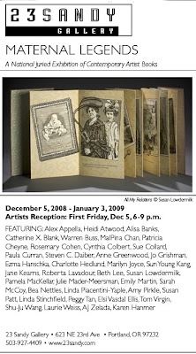 “Maternal Legends”, a juried exhibition of artist books, December 5 at 23 Sandy Gallery in Portland, Oregon. The online catalog is here.
My book, Personal Space, is in the exhibition.
Click on the image for a size that’s readable.
 Well, the title of the post says it all. I love the hand-mixer legs. If you’ve got all the cooking done, go on and whip up this centerpiece for Thanksgiving.
Click on the title of the post or the image at left for links via Creative Techs Tips to the original PDF with printable turkey parts and some truly amusing Google-translations from the Japanese to English. To illustrate just how amusing, here’s step 1:
“Each component crop. The center of the fuselage parts, maintenance hatch Crop Please be sure to complete the hole this will be a great help to me.
Put a finger, please ensure that the size of a peach but also slots in the slit, please remember to put a slit.“
via Boing Boing via Make
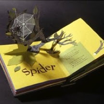 Shawn Sheehy’s pop-up artist books are pretty cool. Take a look. (Beautifully designed website, too.)
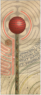 Typography poster completed in class today. I began with the split uncial typeface I’ve been designing, added a scan of a sheet of vellum and some medieval images of a maze, a sky chart, manuscript illumination, and probably a few other things.
It’s part of a continuing exploration of the historical made contemporary. Not as contemporary as I’d hoped, but still interesting to me.
As usual, click on the image for a closer look.