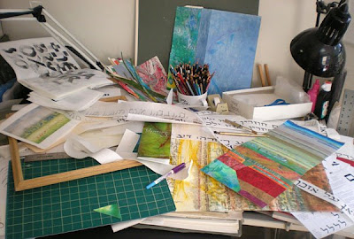
The spring 2009 semester at Florida State University is officially over. What a sprint. It’s all over but the cleaning up (except for there is this one lingering project …). I believe that this week I used nearly everything in my studio at least once.
- I had the acrylic inks, sumi ink, colored pencils and gel pens out for the pieces I made for the Senior Design Seminar show, Made (link requires Facebook login). I also used cheesecloth, Saran wrap, tapes, bubble wrap, squirt bottles, spray bottles, drop cloths, hake brushes, sponges, and so on.
- I had the framing supplies and tools out, for the next step in the same project. That included the mat cutter, the foam-core cutter, the frames themselves, glazing, framing and hanging hardware, rulers, and so on.
- I had the collage supplies and tools out for the final Color Theory assignment. And the roll of kozo paper, and the wax paper for flattening/drying, and the glue and glue brush and the glue palette.
- And before I settled on collage for the final assignment, I had the gouache and brushes out for a my first attempts. And the palettes and masking tape and so on.
- I had my paste-painted and otherwise-decorated papers out for both Color Theory, Print Design, and Animation. Those papers were in and out of storage all week long.
- I had my balsa-wood lettering out to scan for Print Design. And I went through a whole bunch of portfolios of my work for scanning as well.
- I kept cutting long pieces of paper from the roll of paper that makes me think of the paper tableclothes from potluck suppers of my childhood. That was for lettering trials in preparation for lettering Hebrew on long strips of muslin to be sewn into a quilt. And then there were the various pens I tried on the muslin, the water-eraseable pen for guidelines, the measuring tools, and so on. I ended up using a Zig calligraphy marker because it bleeds very little, and is lightfast, waterproof, and fun to write with.
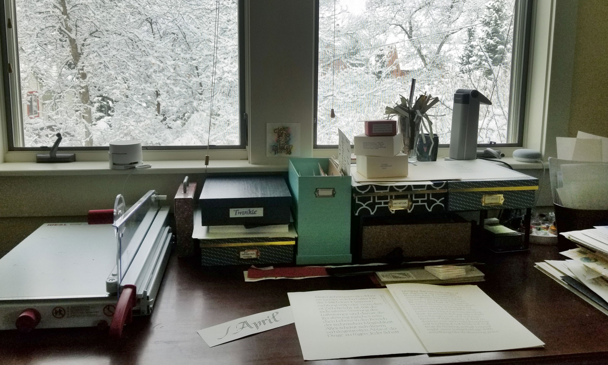
Whew! It’s good to be finished with the semester … almost. It will be nice to see the surface of my drafting table again.
