
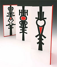
 Lee Kirk of The Prints & The Paper recently posted on the Book-Arts-L a Flickr set of photos of the annual exhibition of work by members of the North Redwoods Book Arts Guild, shown at Eureka Books in California. I recognize two book artists from book swaps I hosted in the late ’90s: Margaret Beech (her book is shown here) and Peggy Marrs. To paraphrase Reggie Ezell, haven’t they grown!
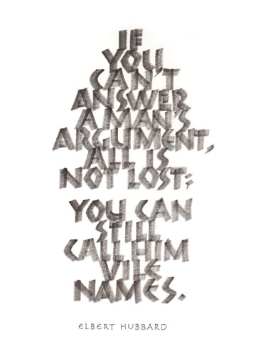
Elbert Hubbard on Discourse
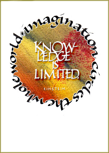
Imagination is more important than knowledge … the rest of the quotation
Francis Bacon (the Sir) quotation

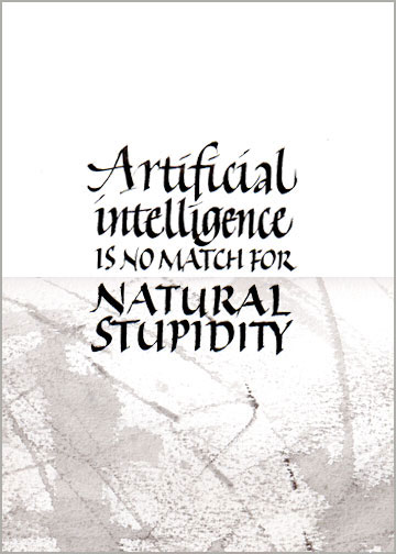
Artificial intelligence is no match for natural stupidity.
A little experimentation with scanning and layering. The jury’s out.
Luca Barcellona & DEM
Gavinana Reloaded from GoLd on Vimeo.
I’m a huge fan of Luca Barcellona, the images are compelling, and I like the idea of combining this text and these images into a performance piece. But there’s not much visual relationship between the text and image — not in layout, not in color, and most certainly not in mark-making. The flat blue line of the left mask strings makes one kind of statement, but it seems to jar against the gorgeously stapered black stem of the initial “P”, for instance. It’s de Stijl (which I love) vs. baroque (which I also love).
It seems as though Luca is incapable of making something that doesn’t hang together beautifully: the initial “P” fills the space beautifully and draws the eye down the quote, the smaller text capitals add interest to the texture of the whole, and the attribution flows from the flourished “y” so satisfactorily.
Color study
 I’ve been gone much more than I’ve been here. And when I’ve been here, I haven’t been doing much in the way of calligraphy. But I had to match a brownish-gray color today, and it got a little out of hand … and so much fun. To paraphrase George Costanza, if it was socially acceptable, I’d wrap myself in color studies.
Calligraphy + animation
 Wow! Beautiful.
Update: as of October 2013, you can see it on YouTube here.
The website for Vanessa Marzaroli’s animation of “Lilac Wine,” by Cinematic Orchestra is gone, but you can read an AIGA article about Vanessa and this video called “The Steady Hand of Vanessa Marzaroli.” A little more information about the making of the video is here.
Day 80 – DSED
… and finally, after lo these many days …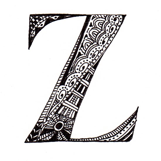
I had lost this letter, and then the backlog began, because I couldn’t possibly post out of sequence.
I’ll catch up on the scanning and posting sometime. Meanwhile, I’ve graduated from FSU with a BFA in Graphic Design — yay! — and taken a week-long workshop/retreat with Laurie Doctor and just finished a 7-day rafting trip through the Grand Canyon.
There’s a lot to catch up on.
DSED – Day 78
