Here’s something I’ve finished this morning. Since it won’t be presented for a couple of weeks, I’m only showing a sliver of it, and redacting identifying parts.
So I got it completed — on the second time time around, never mind what I did wrong on the first time around — but the names under the signature line ran a little long. No problem, I thought. I can just extend the signature lines. Then I realized that the extension ran into the space for the gold seal. This is the third time around.
Such are the minor idiocies of working under the influence of a major head cold. I’m assuming it’s a cold. After all, I had a flu shot this year, so it can’t be the flu. Right?
Yesterday I started a new journal for the new year. For many people, that means popping down to Borders for a $10 ready-made journal with ruled lines, and interesting cover, and a useful magnetic closure. (I love those magnetic closures.)
Evidently that would be too easy for me.
Instead I built my own, basing the page proportion on the golden ratio (1:0.6180339887), and the page layout on Rosarivo’s “divine proportion” and the van de Graaf canon of page construction, in turn based on medieval manuscript page design.
I’m using a pad of short-grain sketch paper, and I’ll bind it at the end of the year. Assuming I’m still writing in it by then. But of course I will be, right? It’s my new year’s resolution.
… my blog, that is. After years on Blogger — checking the archives, I see that it’s been a little over 5 years — I’ve moved this calligraphy blog to my calligraphy website. It may be a few days before I get the sidebar back in order, but the posts are all here. The old site was here but it now redirects to this blog, and you should be able to see all the old posts here.
Just a little thing, but fun to do. It’s a private little song the client sings to her grandchildren, so I haven’t reproduced that here, but I can show the little pink and purple flowers I added in the left margin.
Meanwhile, I’ve begun working on a much bigger, very exciting commission that I expect will take a good while to complete. I’ll be sharing bits and pieces, although not the commission itself, in future posts.
Using Adirondack alcohol inks and Martha’s blog posts as inspiration, I’ve just completed the last of the addresses in the annual envelope exchange … with a few extra envelopes for future purposes.
The 2nd photo shows the envelopes before they were addresses, and the stencil I used. Actually, I hated the addressing job I did on the bottom envelope, so I trashed it, made another round of stenciled envelopes and started again.
Just finished a commission for an accordion book. I thought I understood what the client wanted, but you know, every once in a while I just get it wrong.
I heard:
Stained glass but not religious (which I suggested would be difficult).
Masculine.
Traditional.
Muted colors.
Well, I’m not good with muted colors; this first attempt is muted colors … for me.
What I didn’t understand was the particular meaning of traditional. Looking at this first attempt I now realize that this looks like a particular style of my Presbyterian youth. My mother had jewelry that looks like this, and I was clueless about that connection while designing the book.
So I started over again with a style that the client had liked in the past. And I realize that even though it doesn’t have muted colors and it doesn’t seem very masculine to me, it is more traditional — in both a catholic and Catholic sense.
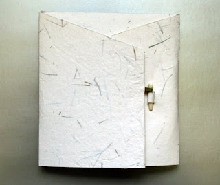
The cover is a green silk bookcloth shot through with gold. I think it works. I made a wrapper from handmade paper with leaf inclusions, using a strip of book cloth as the ribbon holding the bone clasp.
Making a case-bound book — Very thorough and well illustrated. This tutorial is geared toward making a blank book from large parent sheets of paper. If you’ve already got your signatures cut, you can jump in at step 2, about 13 screens down the road.
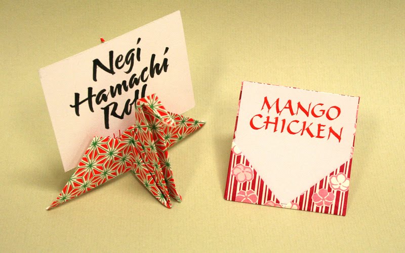
Last month I did some table cards to identify the food at a reception featuring Japanese and Chinese cuisine. I meant to take some photos before I let them go, but, as often happens, I forgot. So I was cleaning up the studio today and came across the remains of the project. These rejects show the Japanese and Chinese cards, respectively.


 I heard: