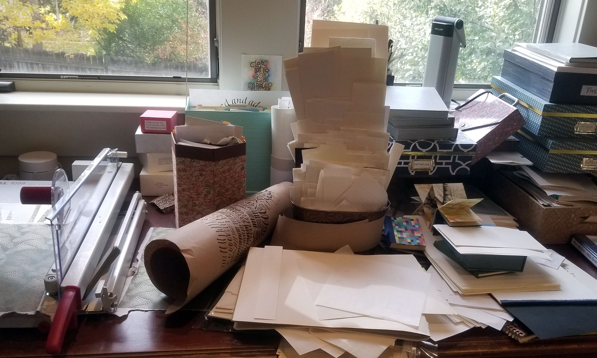
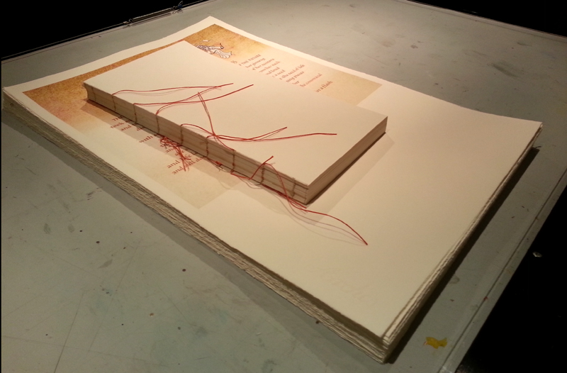
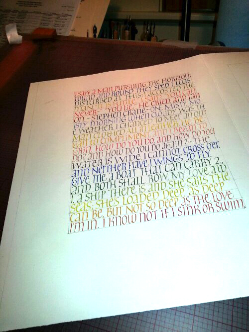
Some wedding invitation address styles

It’s been way too long since I updated my website’s wedding section. In response to several inquiries, shown below is, first, a traditional copperplate hand in white on black. The rest are “modern” lettering styles. These are all wedding addresses. I’ll post some invitation styles soon.

1-black-env-white-copperplate

4-black-env-white-modern-3

3-black-env-white-modern-1

2-black-env-white-modern-1

1-white-env-black-modern-3

1-white-env-black-modern-2

1-white-env-black-modern-1

More gold paint

Finetec gold watercolors

This summer at The Summit at Colorado Springs, I bought a set of Finetec gold watercolors, because everybody had been raving about them. As soon as I got home, I tested them out, on white paper and on black. This photograph doesn’t do them justice, even with an external flash and a diffuser. I’ll try a few more options, and maybe post a better photo later.

They are a new favorite for lettering, especially for broad-edge nibs.

Daily lettering – yesterday

2013-08-11-italic-multi-color-page-08-10Cycling through the Schmincke Calligraphy Gouache colors that make up the 6-color primary palette. Strathmore Drawing 400 paper, #5 Mitchell nib.

Some unfortunate flourishes here. I really lost my way at the end of line 8: I made the flourish and head down toward the waistline when I realized I hadn’t made the x-height portion of the “d”. Dive-bomb landing with no target. Oops. This is what happens when the mind wanders and the hand completely takes over.

Guidelines

There are all kinds of ways to make guidelines for calligraphy. Here are some of the ways I do it:

  1. A Word document. This downloadable Word document prints landscape on a letter-size sheet of paper − x-height of 10 points (a little larger than 1/8″) with a leading of 36 points (about 7/8″) and 35º slant lines. The slant lines are in the header/footer area.
  2. An InDesign document, which provides more opportunity fine-tuned guidelines. Here is a downloadable PDF from an InDesign document which has many layers of guidelines − slant lines and regular − that I can turn on and off for a variety of combinations. I could have multiple columns, or a shape that breaks up the text, or other complications that don’t work so well in Word.
  3. I like manually inked guidelines too, especially for large pieces. I use a lining guide, T-square and slantboard for these. John Neal provides instructions for using a lining guide here.

If you don’t want to make your own, you can generate some online at several websites:

I used to use Calli-Graphic, a computer app, but it seems to be defunct.