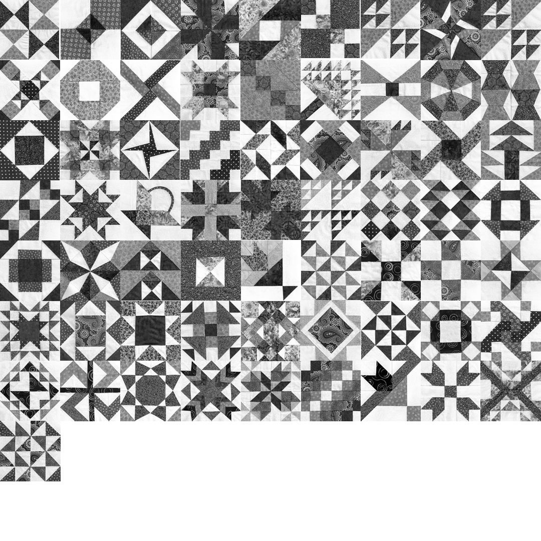
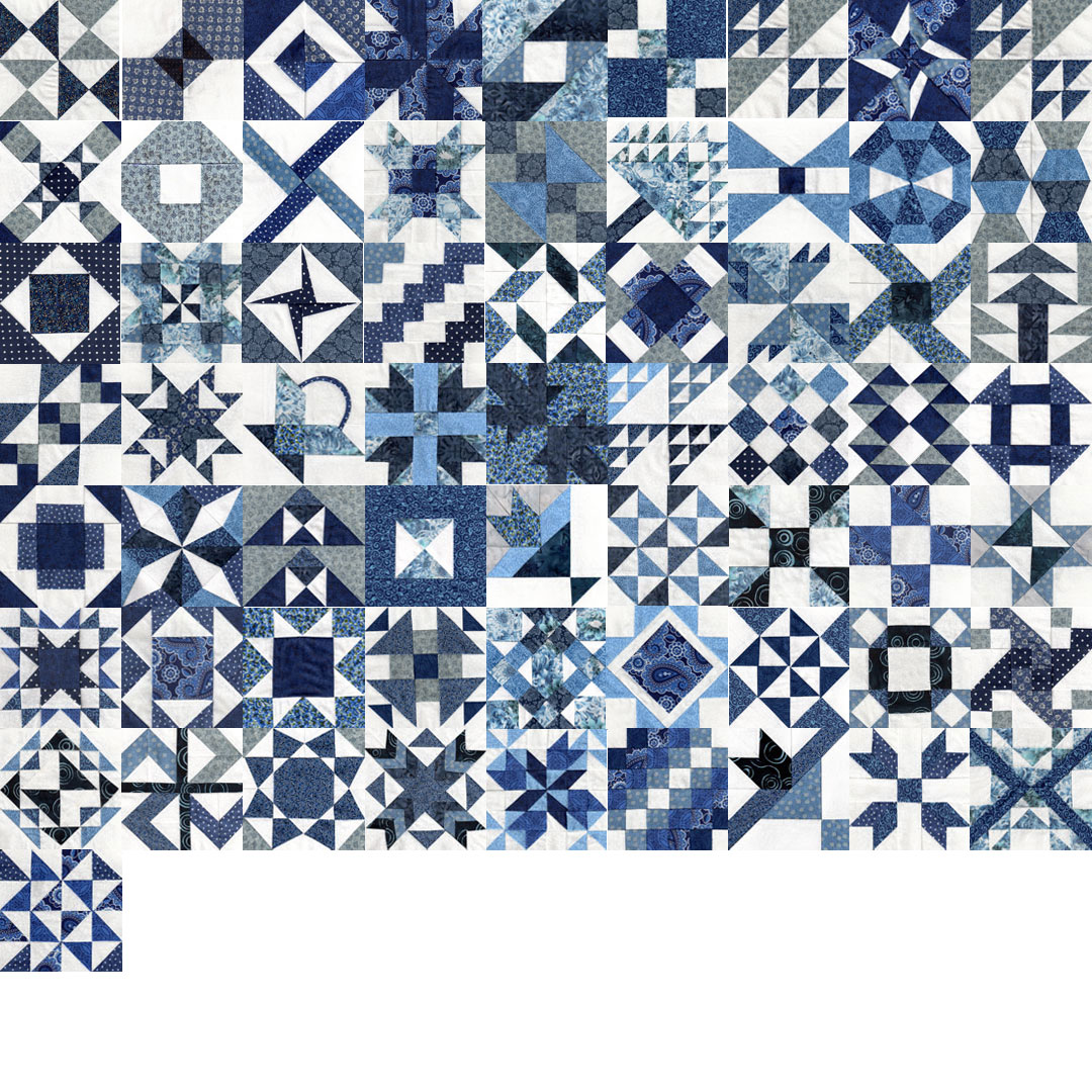
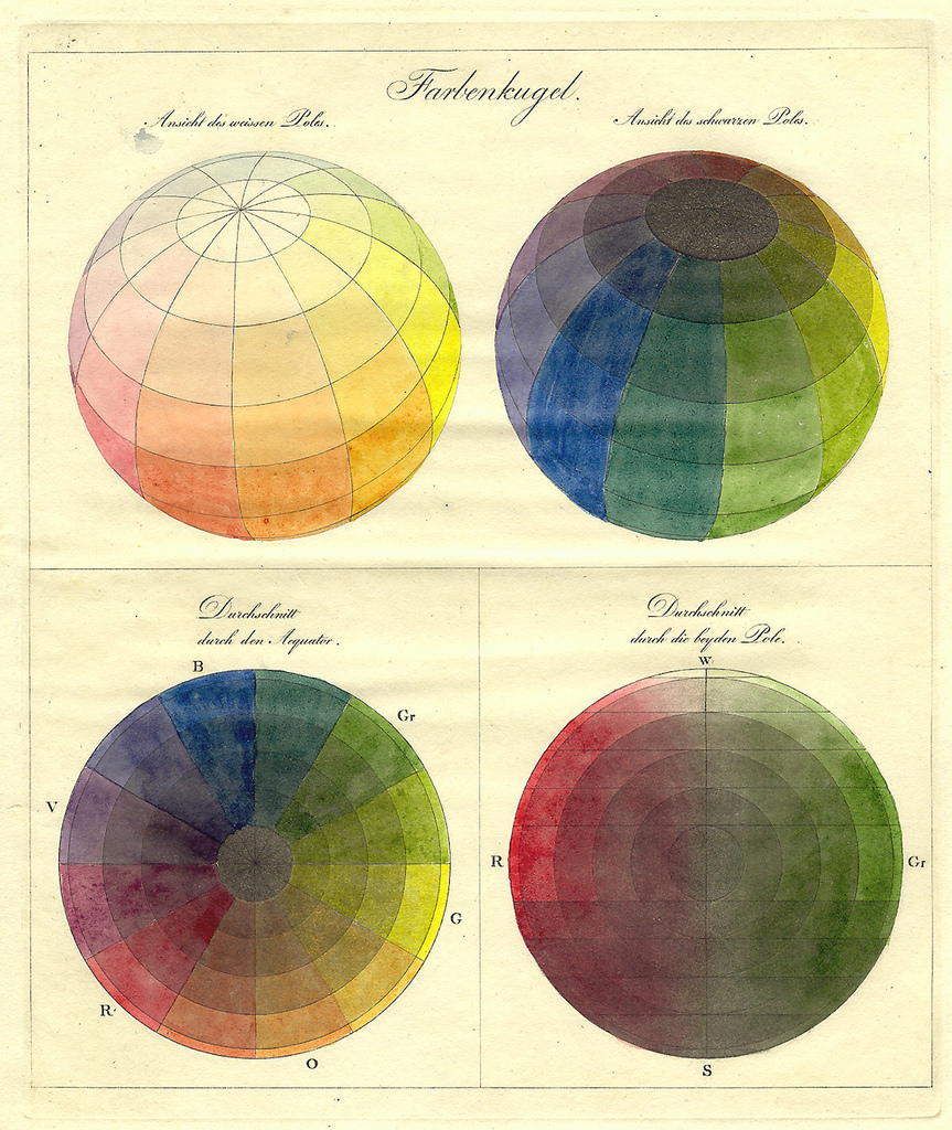
Talking with my sister about yesterday’s blog post, I said that it’s clear that I need more light blue. Then I clarified that I need more full-hue light blue, and that I have plenty of low-hue light blue. I just confirmed that when I de-saturated the image:
Farmer’s Wife quilt so far — in black and white to check value distribution
We’ve been traveling a good deal lately, and the calligraphy that I have done has mostly consisted of private commissions, so I don’t have much to show right now.
But my Farmer’s Wife sampler quilt is coming along. Back in April, I mentioned the quilt-along that my sister and I embarked on at the beginning of the year. The quilt consists of 111 unique blocks. This image shows, in chronological order of construction, all the blocks I’ve completed so far. At 64 blocks, we are more than halfway there!
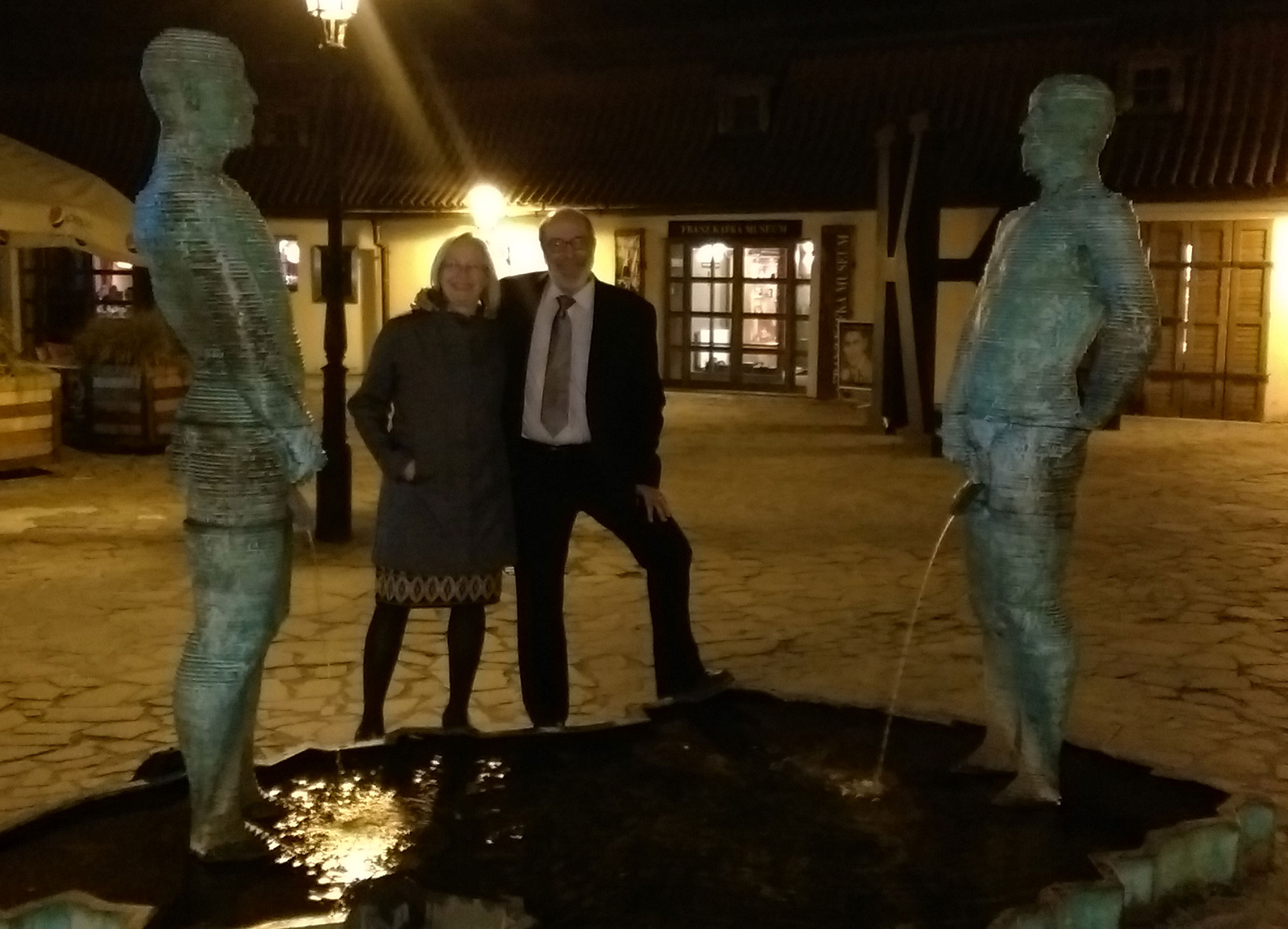
“Metalmorphosis” by David Černý. A moving portrait of Kafka, probably. Someone has posted a video here.“Saint Wenceslas” by David Černý“Slight Uncertainty” – Fiberglas sculpture by Michal TrpákCaught in a pissing match! More David Černý.
We recently returned from a trip to the Czech Republic. Prague has so many interesting sculptures, especially pieces by David Černý, Prague’s bad-boy artist.
His “Metalmorphosis” is hypnotic. We stood and watched it for longer than I would have imagined. His “Saint Wenceslas” is a biting commentary on this sculpture by Josef Václav Myslbek in nearby Wenceslas Square.
We saw most of the sculptures listed in this article in the Prague Post. Unfortunately, I’ve lost a chunk of photos, or I’d include them here.
It would have been easy to miss Michal Trpák’s sculpture, “Slight Uncertainty”, hanging above a busy intersection, but our friend Jenny was there to make sure I didn’t. Thanks, Jenny!
I’ll save the modern galleries and medieval manuscripts for later posts.
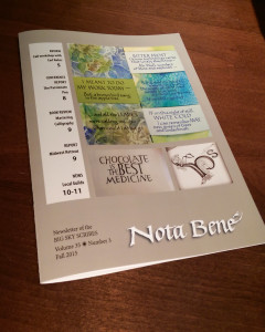
Lately, for various reasons, I’ve been hanging out at the local printer a lot. I was wearing my guild newsletter editor hat on Thursday, when I picked up the current issue of the Big Sky Scribes newsletter, the Nota Bene. This morning I took all 90 or so of them to the post office. A lot of great stuff was submitted this time, and it’s a good issue. Guild members should see it in their mailbox early next week.
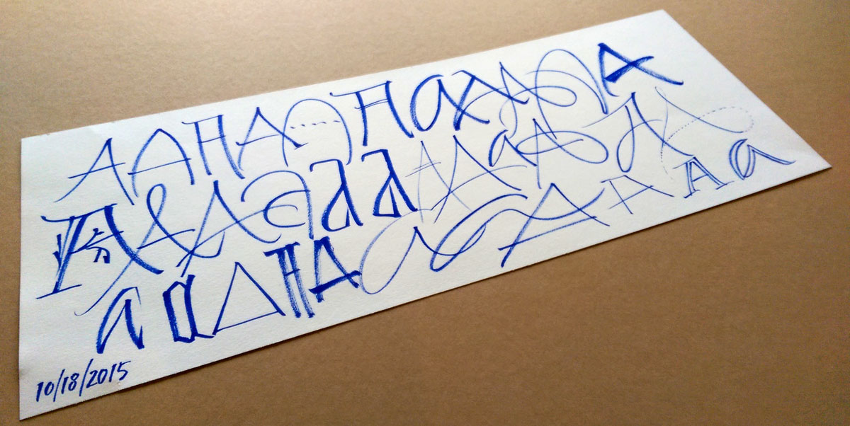
One of my favorite calligraphers, Rachel Yallop, does beautiful pointed pen work, among other letter styles. She demonstrated her method in the class I took with her at Legacies II in summer 2014. She keeps the angle of the pen staff to the paper quite shallow. I’m sure if I kept my pen at the same angle, my letters would look just this good. Not.
Here’s a video of Rachel Yallp, calligrapher extraordinaire, writing copperplate with a straight pen holder. Originally shared publicly by Rachel on Facebook May 15, 2014.
A video of Rachel Yallop , calligrapher extraordinaire, writing copperplate with a straight pen holder. Originally shared publicly by Rachel on Facebook May 15, 2014
Pointed pen practice: Jane Austen’s letter from Darcy to Elizabeth in Pride and Prejudice. Principality nib at x-height=2.8mm. Moon Palace sumi ink on Strathmore recycling drawing paper.
Today’s work included the final lettering for a commission: a long text in pointed pen script. I haven’t done much pointed pen lately, so I did this piece as a warm-up. It’s the beginning of the famous letter from Darcy to Elizabeth in Pride and Prejudice. Fun stuff. Good thing this wasn’t the real commission: there is a hando (rather than a typo) at the end of the very first line. The pen nib was new but awful. I had to change it out before starting on the actual commissioned piece.
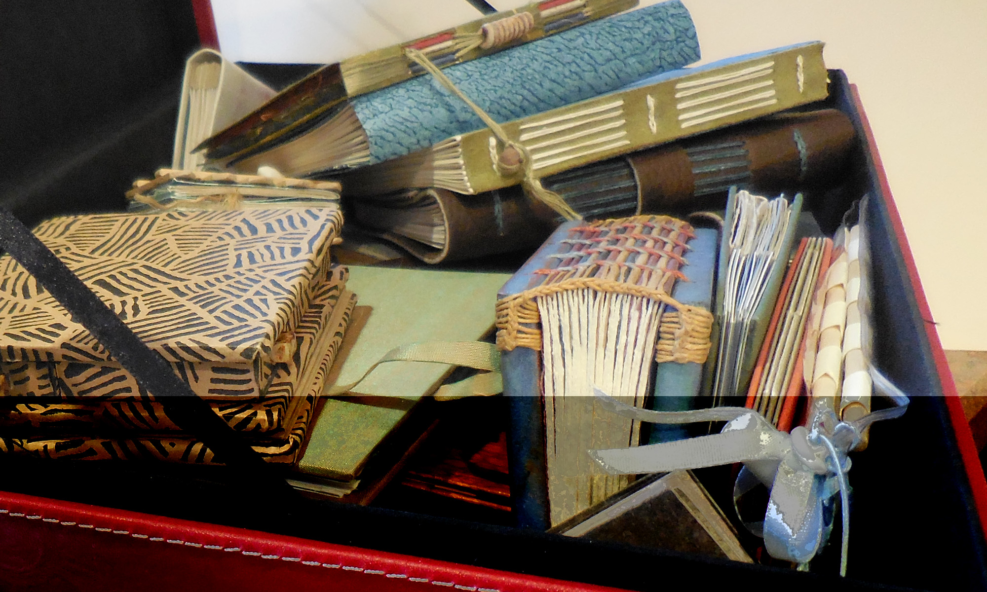
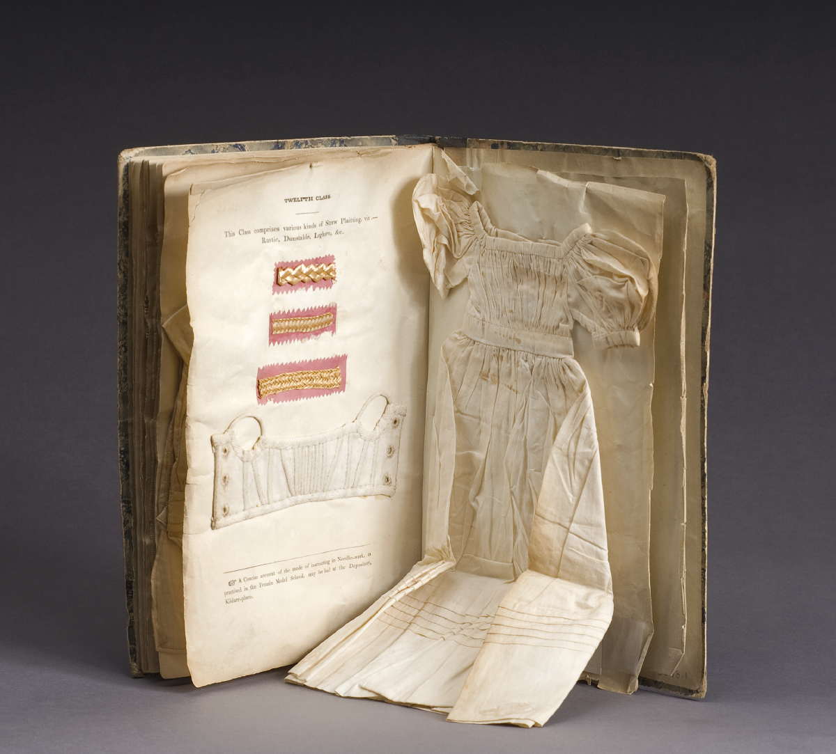
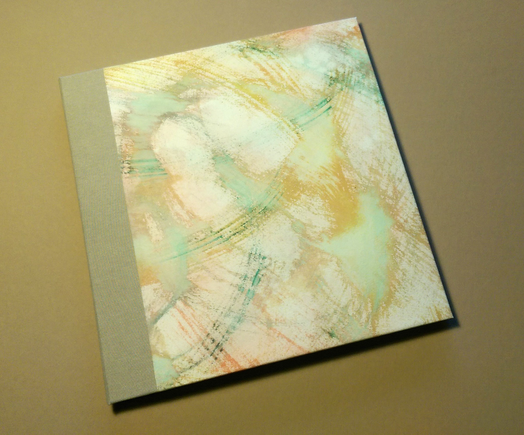
Blank 5-signature case quarter binding using the paper which will be used for the final book. Cloth spine, cover paper gouache on Arches Text Wove
Yesterday I finished the testing binding for our local guild’s collaborative book. It had been awhile since I cased in a book. It’s rather amazing how much I forget between bindings … and also how much I remember of the tiny details. Unfortunately, often the details I remember are the same ones I’ve forgotten until just after that detail is executed.