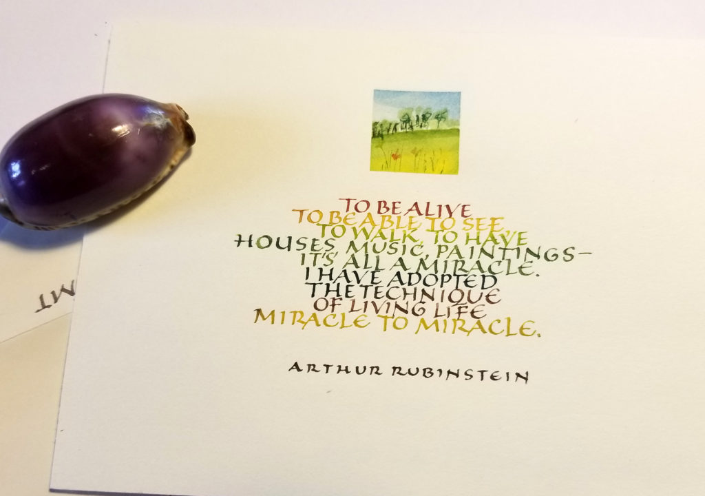
During this quiet time — physically if not emotionally — I’m enjoying sending out snail mail. I’ve done this quotation twice so far. Rubinstein has it right.

Calligraphy & more — the studio of Beth Lee, Redmond, WA
During this quiet time — physically if not emotionally — I’m enjoying sending out snail mail. I’ve done this quotation twice so far. Rubinstein has it right.

Yesterday I started a new journal for the new year. For many people, that means popping down to Borders for a $10 ready-made journal with ruled lines, and interesting cover, and a useful magnetic closure. (I love those magnetic closures.)
Evidently that would be too easy for me.
Instead I built my own, basing the page proportion on the golden ratio (1:0.6180339887), and the page layout on Rosarivo’s “divine proportion” and the van de Graaf canon of page construction, in turn based on medieval manuscript page design.
I’m using a pad of short-grain sketch paper, and I’ll bind it at the end of the year. Assuming I’m still writing in it by then. But of course I will be, right? It’s my new year’s resolution.
 On January 24, I continued my survey of handwriting, this time a survey of my current handwriting with variations in spacing and writing utensils.
I’ve currently got two large chunks of work — 450 certificates, 400 wedding invitations — and this little divertissement was just what the doctor ordered.
 In honor of National Handwriting Day, I’ve gone through various boxes of memorabilia to create a survey of my handwriting throughout the various stages of my life. I’m amused.
I like to say that I got into calligraphy out of sheer stubbornness: In elementary school the only subject in which I couldn’t get an A was … handwriting. I’ve been working on it ever since.
If you click on the thumbnail at left you’ll see my handwriting at 5-1/2, 11, 16, 24, and 42. The big gap in there could possibly be filled only by locating the children’s artwork with my explanatory labels on it; the years of rearing young children evidently didn’t provide much free time for longhand.
I won’t bore you with my practice sheets of copperplate. Rows of ovals, rows of beginning strokes, rows of other ovals, rows of stems … you get the point.
![]() To paraphrase a well-known saying: If it weren’t for bad results, I’d have no results at all! This time I tried a sheet of 3M transparency for inkjet printers (CG3480) on that Superfine Letterpress paper which I’m beginning to really hate, at least for transfers. This is an image from my January 2 post. The G transferred best; I think it’s because I burnished it more, but I’m not sure. Parts of this transfer are image are a complete mess, with bits of paper torn up from the substrate.
To paraphrase a well-known saying: If it weren’t for bad results, I’d have no results at all! This time I tried a sheet of 3M transparency for inkjet printers (CG3480) on that Superfine Letterpress paper which I’m beginning to really hate, at least for transfers. This is an image from my January 2 post. The G transferred best; I think it’s because I burnished it more, but I’m not sure. Parts of this transfer are image are a complete mess, with bits of paper torn up from the substrate.
![]() Then I transferred this image from my January 1 post (printed on the same transparency as the above image) onto an Arches Text Wove page. No tearing paper, but the transfer wasn’t a tearing success either! I burnished it a lot, and let it sit quite awhile before I pulled up the transparency.
Then I transferred this image from my January 1 post (printed on the same transparency as the above image) onto an Arches Text Wove page. No tearing paper, but the transfer wasn’t a tearing success either! I burnished it a lot, and let it sit quite awhile before I pulled up the transparency.
I’m flummoxed. (Isn’t that a great word, though? I’ll take my amusements where I can get them …)
![]() These transfers went even less well than yesterday’s transfers. Part of it was the paper, which is the Superfine Letterpress (I think) that is part of the first signature of this journal. It buckled and didn’t want to take the images. The top image, of our plum tree, wasn’t a total failure … until I kept rubbing until the pigments started to shift around with my finger. The left middle image — a bouquet of pen-made flowers — turned out surprisingly well. The image of an old worksheet from a workshop with Ann Hechle (great workshop!) was a disaster, although the bits that did work yielded very clear, tiny letters. The bottom image, Boy with Accordion, worked in places but mostly not. Interestingly, it was very unpleasant to write with pen and watercolor on the matte medium areas of the paper. The paint didn’t want to leave the pen and the paper didn’t want to take the paint. W/N manganese blue and ultramarine, plus some other brand of cadmium orange. And colored pencils in the same colors.
These transfers went even less well than yesterday’s transfers. Part of it was the paper, which is the Superfine Letterpress (I think) that is part of the first signature of this journal. It buckled and didn’t want to take the images. The top image, of our plum tree, wasn’t a total failure … until I kept rubbing until the pigments started to shift around with my finger. The left middle image — a bouquet of pen-made flowers — turned out surprisingly well. The image of an old worksheet from a workshop with Ann Hechle (great workshop!) was a disaster, although the bits that did work yielded very clear, tiny letters. The bottom image, Boy with Accordion, worked in places but mostly not. Interestingly, it was very unpleasant to write with pen and watercolor on the matte medium areas of the paper. The paint didn’t want to leave the pen and the paper didn’t want to take the paint. W/N manganese blue and ultramarine, plus some other brand of cadmium orange. And colored pencils in the same colors.
![]() I’ve tried this transfer technique before, with limited success. I’d call this limited success as well, but I’ve got a few ideas about what I’ve done right and what I’ve done wrong. That’s progress.
I’ve tried this transfer technique before, with limited success. I’d call this limited success as well, but I’ve got a few ideas about what I’ve done right and what I’ve done wrong. That’s progress.
I made a psd file with 4 images from 2 pages of my insect book (see here and here) and reversed the image so that the lettering would transfer right-way around. I printed the image on JetPaper — I have some from way back, so I think it’s the right stuff — on my Epson 88+ inkjet printer. Following instructions from the Yahoo group Inkjet Transfers, I trimmed the image and used a 1-inch foam brush to cover both the image and the receiving paper (Arches Text Wove in my journal) with a coat of Golden Fluid Matte Medium. Then I put the image face down on the page and rubbed the back with a bone folder for awhile. When I pulled up the image, some of the image came up with the paper and some of the paper stayed on the page. I was able to rub off some of the paper that stayed immediately, and some more a little later when everything wasn’t so wet — using a wet finger.
Even now, 5 hours after I made the transfer, and after I’ve photographed it for the blog, I find that I’m able to rub up a little more of the grayish white paper that was covering the image.
I was also interested in what happened when I painted and wrote over the transfer and the matte medium. Arches Text Wove is a nubbly kind of paper, but I’ve come to like — or at least understand — the sizing. Where there was matte medium the ink — sumi — was laid down more smoothly but the hairlines were thicker and I had to write fairly quickly to avoid pooling ink. Where there was just paper, less ink came out of the pen onto the paper and I had to write more slowly. I drew a red line of colored pencil indicating where the matte medium stopped. The same was true with the Zig Millennium marker write above it; there was no ink flow problem, but the line was smoother over the matte medium than directly on the paper.+
Interesting. A lot of this I already knew, but doing it again brings a more immediate knowledge than the filed-away kind of knowledge. I want to try this some more transfer and some more matte medium.
 I’ll never be able to write left-handed. It’s amazing how different a metal #5 Mitchell roundhand pen feels in my left hand, compared to how it feels in my right hand. My son walked by as I was trying this, and told me that I was holding the pen much further back on the staff than I do with my right hand. So I choked up on the pen and it went a little better, but it was difficult just to get the whole width of the chisel down on the paper at once.
The watercolor palette is all Winsor-Newton:

Here’s something I started last semester as homework in my Drawing II class. From time to time I’ve added to it, and I did a little more today. It’s a piece of drawing paper 18″ x 24″ (you only see half of it in this photo) we were given and told to doodle upon throughout the semester. When I complained that it was difficult to doodle in the middle of a sheet of paper that large, the instructor said we could fold it if we liked. So I folded my sheet into the one-page book structure that was the subject of my January 1 post. Which is why you can only see half of it.