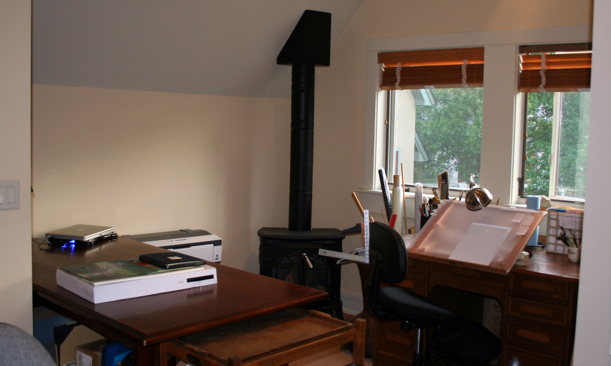
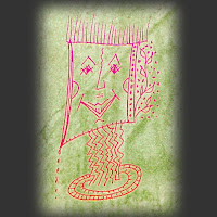
Here’s a little sample of the educational experiments I’ve been making in Photoshop. Since you can’t possibly tell this from the image itself, I’ll tell you that I was working to understand channels and blend modes in this particular experiment..
January in Tallahassee

I saw Toni’s post this morning, and decided to try something similar. It combines photography, calligraphy, graphic design and Photoshop. This first attempt is fairly chunky and heavy handed, but it’s a start. I always enjoy reading Toni’s blog, and Victoria’s blog too. Victoria beautifully combines photography with calligraphy. Toni, I tried to comment on your blog, but my browser wouldn’t let me. I’ll figure that out soon.
Even beautiful people are not perfect
I’m beginning to think about digital photography, one of my art classes which start next week. In synch with these thoughts comes a post on a web designer’s list pointing to this site which shows how photos are retouched to “perfect”the beautiful people. Click on the title of this post or the link in the previous sentence, then click on “Portfolio”. At the Portfolio page, click any thumbnail and then compare the images with your cursor in the “hover” and “not-hover” positions. Amazing.

