Once more – with color

Gouache and sumi, Brause Ornamental pen nib and 00 brush, Arches Text Wove, about 10 in x 8 in.

I’ve enjoyed the work so much in Series 2 of Brody Neuenschwander’s online classes that I did another, this time with color in the counters and 3:4 portion of rectangle.  Compare this to the monochrome square figures in my last post.

Actually, I gathered up all the bits and pieces of work/play in this seal-script-inspired vein and was shocked at the height of the pile. I can see a number of applications for this style of working. So much fun!

Color wheels

Goethe's 1809 color wheel
Goethe’s 1809 color wheel

I love color wheels as objects themselves, but also as a record of our attempts to understand color.

The Public Domain Review has posted a collection of color wheels that are beautiful and diverse.

I’ve shown two of my favorites here: Goethe’s color wheel, published in his work  Farbenlehre, and Runge’s three-dimensionally rendered color globes.

See many more at the link above.

Philipp Otto Runge’s color globes (1810)
Philipp Otto Runge’s 1810 color globes

Some recent and in-progress work

2015-10-05-worktable-in-progress-itemsLots of projects going these days.

Today members of our local guild bound a test text block for the collaborative book we’ve been working on. We are making a standard case binding using the same paper on which the book will be printed. Today we got as far as applying the mull to the spine. I had brought supplies for this, and I was determined to unpack it all when I got back to my studio. This led eventually to trimming the text block and applying a headband. You can just see that text block underneath the top black square of paper. I did go ahead and cut out the cover and spine boards, but that’s for another day, because I continued to work on …

Addressing styles. I had the best time addressing some personal envelopes recently and discovered that I don’t really need guidelines for certain styles. So I’ve been developing some more casual envelope address styles. Some of what I tried today is shown above: sumi ink, pigment ink, gold gel pen, and fine marker on white, black and shimmery gold stock.

Yesterday I got out two travel watercolor sets and made test cards using a water brush. At the tops of the cards are the pure colors. At the bottoms of the cards I’ve experimented with mixing and tints.


Color Theory – dimensional color study

In Color Theory we’ve been working with Color-Aid pasted onto bristol. This image fulfilled the assignment to make a color study which gives the illusions of three-dimensionality, rendered through a consistent depiction of light and shadow. I missed making the light and/or shadow progressive. It’s hard to hear when I’m looking at color. And when the 400+ different colors of Color-Aid are all laid out on the tables, I feel something akin to panic.

The craftsmanship of these exercises is challenging — a bunch of little pieces of painted papers adhered with PVA onto one side of a 9″ x 12″ sheet of bristol. And as we all know, pasting anything on one side only will cause cockling, wrinkling, generall drawing-up of that side of the paper. Can’t fight physics. The study shown above is 6″ square.

Experiments in Metallic Gold


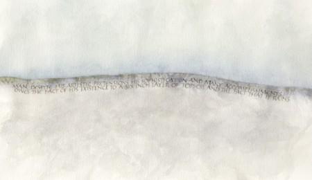
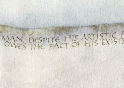
Here’s an example of a valuable scrap of an experiment I’ve saved from a job in which I had to match a very greenish gold printing ink. The notes have come in handy in later years. If you click on the image above, you should be able to read my penciled notes. In case you can’t, I’ll repeat them here. All the paints are gouache, a calligrapher’s best friend because they aren’t transparent as watercolors are, and yet don’t dry fast and turn to plastic as acrylics do.

Row 1: I started with equal parts Schmincke Glitter Gold + Schmincke Bronze.
Row 2: added Winsor Green.
Row 3: a little more Winsor Green, and a little more.
Row 4: a little more Winsor Green to the first row-3 block, and a little Yasutomo black stick ink to the second row-3 block; then a little more stick ink, and then a little less stick ink

Since a block of paint doesn’t look like a block of lettering, I continued on with lettering to further tweak the ink matching, using the ink from the last block on row 4, then adding more and more black. Notice that on the 4th line of lettering I didn’t change color at all, only taking off the pen nib’s reservoir; however, the 4th line looks darker than the 3rd line. Especially with metallic colors, the reservoir seems to collect color/metallic particles behind its tip and make the delivered paint more watery.

By the way, I’m using a Mitchel Roundhand nib here, probably a size 2½. The whole page is about 7″ x 8″. And this photo shows no light reflection. I tried to get a photo to contrast the color with light reflection, but no luck.

Color in calligraphy

The thing that is absorbing me now is color in calligraphy. So many color courses are geared toward painting or landscaping, where the artist is dealing with fields of color. But in the case of most lettering, we are dealing with two colors: the letter color itself and the background upon which the letter lies.

(I should say: *at least* two colors. If the background is not a flat color, then the color or tint is changing. And whether the color of the lettering is flat or variegated, it is changing against a variegated background.)

And the letters must have at least enough contrast from the background to be read, unless you are simply making a calligraphic painting which is meant to be abstract or representational.

So how do these new parameters affect our study of color? I don’t know. I’m floundering about on this, and have been for awhile.

The solution for many calligraphers is to simply separate a color study from the lettering, as I did in the preceding little landscapes. There are other solutions, all with pitfalls.

Schmincke Calligraphy Gouaches

For the past year, I’ve been working with the 6-color+white palette of Schmincke Calligraphy Gouaches: Vermilion, Madder Red, Ultramarine Deep Blue, Paris Blue, Lemon Yellow, and Cadmium Yellow Tone Light. And glair! I love glair. Lately I’ve dropped the white from the palette because I’m so enthralled with the layering and glazing which the glair allows that I’ve been using the gouaches as watercolors.

Here’s a little piece (8″ x11″) I did last week, and bit of detail below.