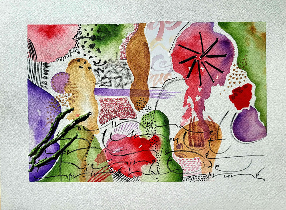
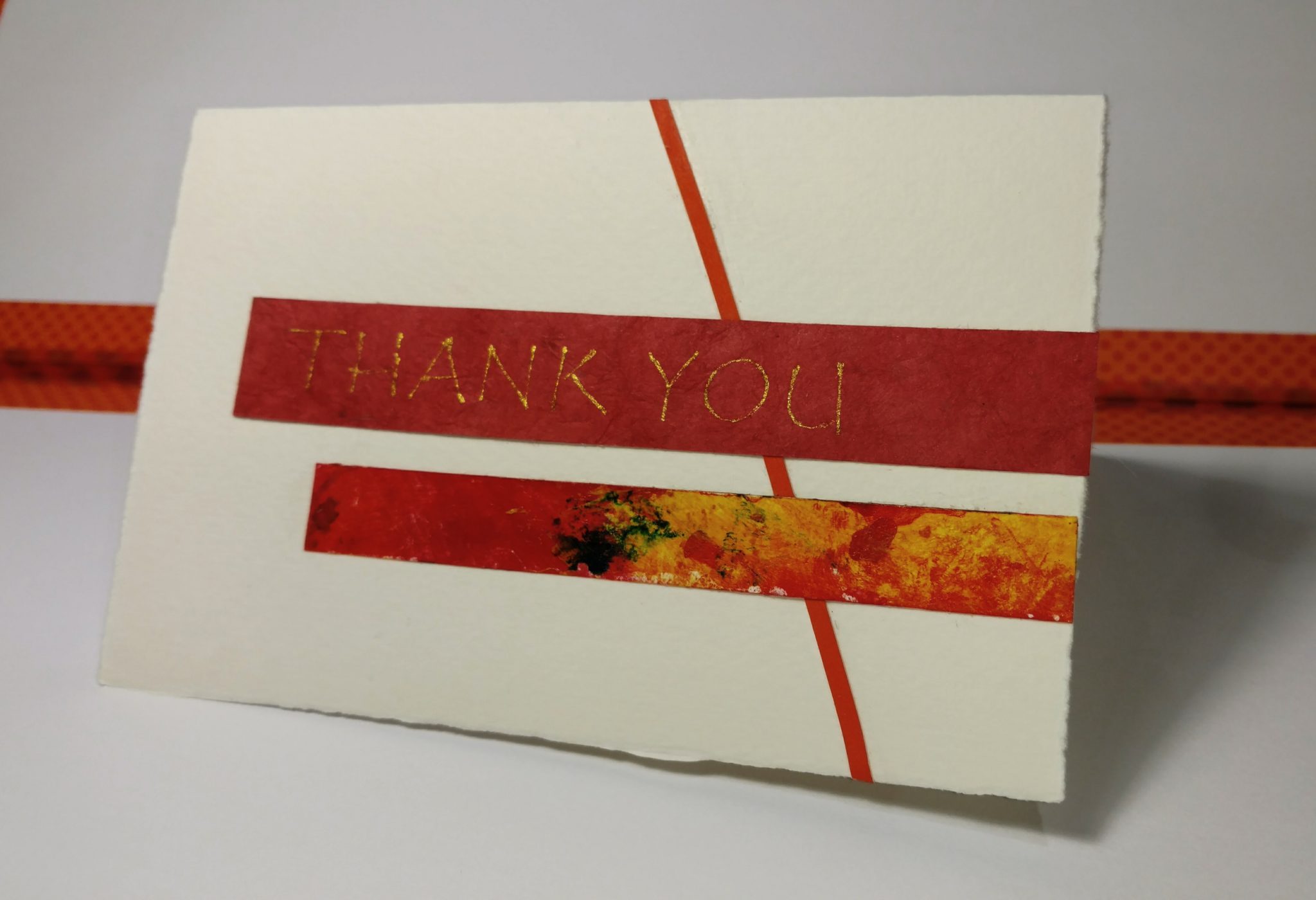
I’m having a good time with these new watercolors … and some sewing. At least a few parts of this page are interesting 🙂
Calligraphy & more — the studio of Beth Lee, Redmond, WA
I’m having a good time with these new watercolors … and some sewing. At least a few parts of this page are interesting 🙂
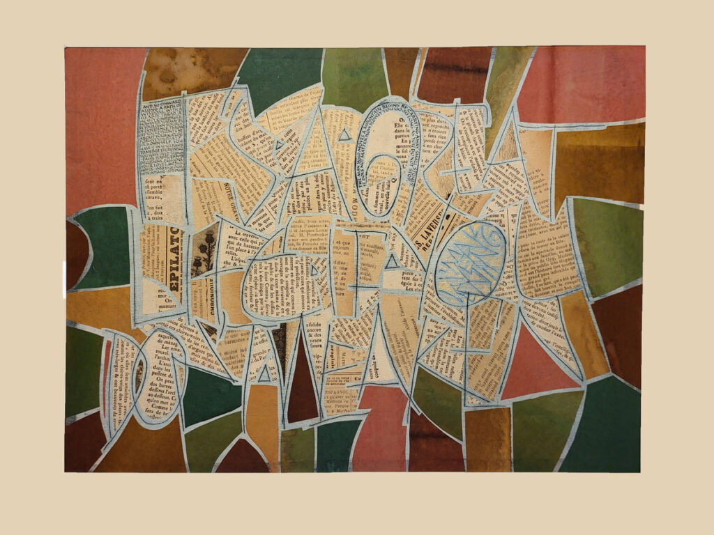
This two-month collage workshop with Brody Neuenschwander has come to an end, and I’ve barely scratched the surface (sorry! couldn’t resist … sorry again!). We explored so much that it would have been impossible to even try it all. We dyed, whitewashed, scratched letters, stamped letters, collaged old book pages and monoprints and actual items, and so much more.
The piece shown above has layers of Western and Asian papers, old book pages, tiny lettering, whitewash, and scratched letters. It references carpet pages such as you might see in 6th-century bibles. The scratched letters read (only if you want to read them) a saying my grandfather was fond of repeating. “It’s a great life if you don’t weaken.” And the tiny lettering at top left and curved at top are more literary and verbose version of the same sentiment. However, the platinum gouache in the egg shape at middle right doesn’t photograph well, answers these quotations: “I’m weakening.” Content area 11 x 14 in.
You may remember my posts about the year with Brody in 2021. What an experience!
The collage workshop is dead (not it’s not — I could spend the next 2 years at least on this material). Long live the collage workshop: The Magic of Kozo begins in just two weeks. And I’ve got a big frame to build, and more art (well, hardware-store) supplies to buy. It’s a great life, if you don’t weaken.
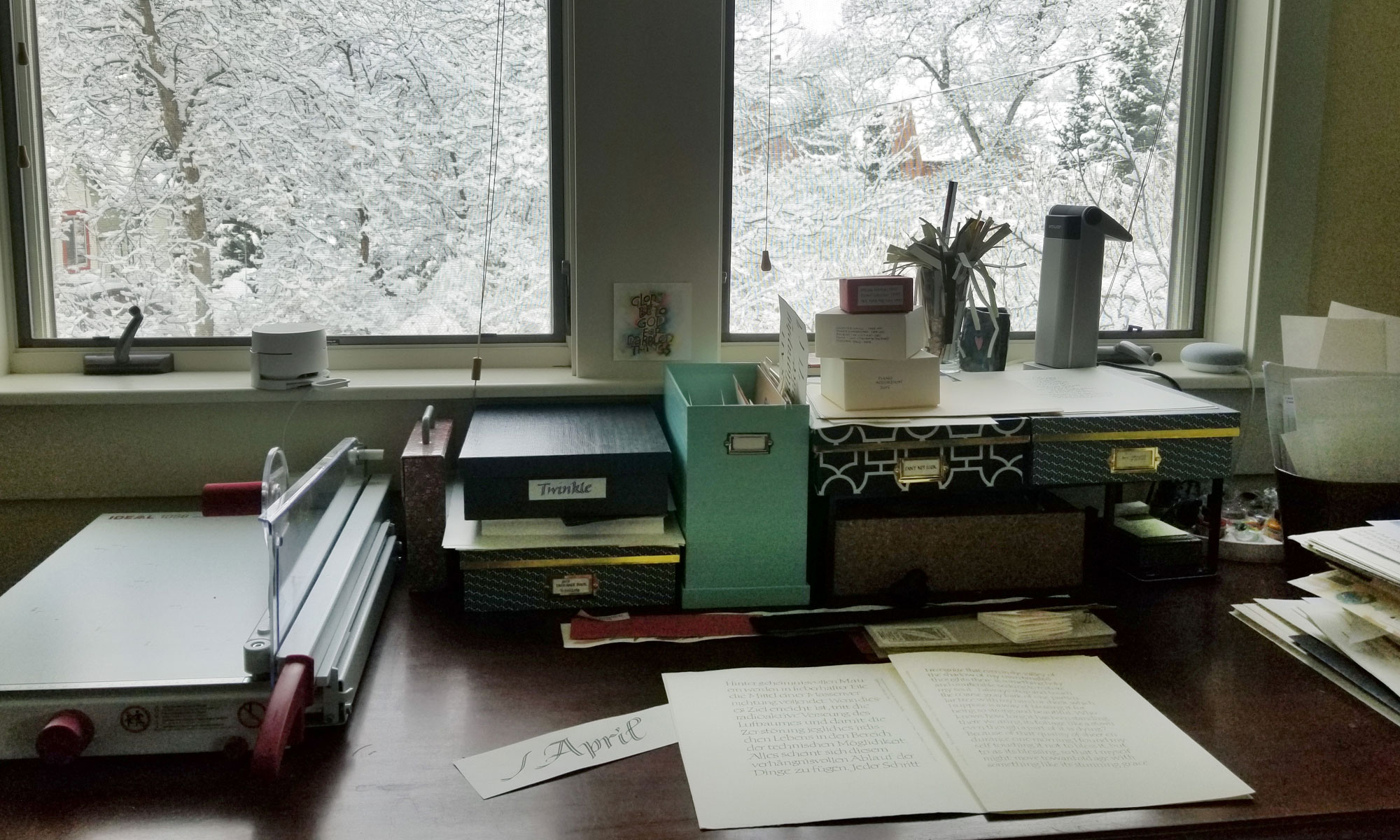
It was an organizing kind of day. I enjoyed ordering scraps of work into folios for binding into my next journal.
 After a series of tight deadlines, the stacks of art paper in my studio are piling up and weighing me down. I’ve begun organizing all this paper, and the scope of task is commensurate with Hercules’ in the Augean stables. Although my studio smells better (than the stables).
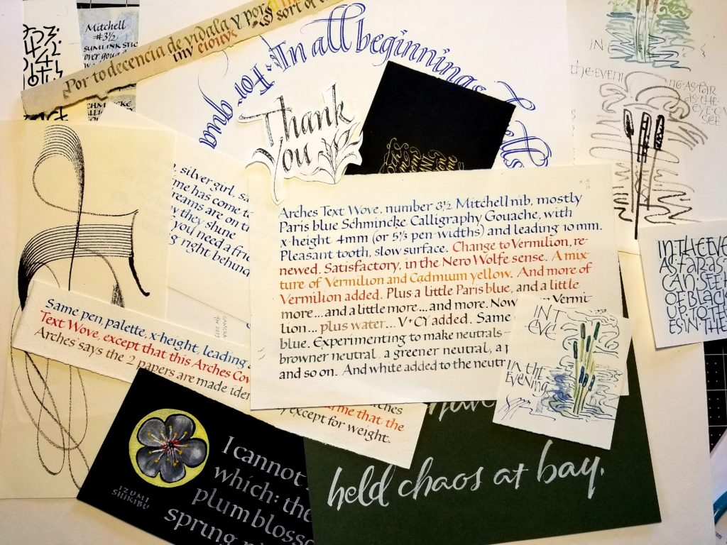
Actually, if you’re a little under the weather, as I have been, it’s rather pleasant to sort through the scraps of paste paper, calligraphy, watercolor washes, color studies, off cuts and so on. It stimulates all kinds of ideas … which makes it harder to throw anything away. I look at a 2″ scrap of interesting marks and think: “That would go well in a book whose theme is …” and “That could be the anchor in a collage on …”
Here’s a display of some of the keepers. To give you an idea of scale: The white squares at the lower part of the picture are about 3″ square.
The big question is how to organize them. I don’t have a final answer. This time I sorted them into plastic bags by general size and shape. It’s no good keeping papers together by technique — paste painting, watercolor, calligraphy, mark-making — because of the smaller smaller items get lost between the bigger ones.
Like loose change, my inventory level of paper scraps is constantly being adjusted. No inventory, and I’ve got to start from scratch for even a little 1/2″ block of orange-red, say, that will “make” the piece. Too much inventory, and every project is overwhelming in its possibilities. Way too much inventory, and I might as well have none because I don’t even want to open the box.
 And another. I started this one from collage #2, because when I cut that collage into a rectangle, the leftover frame looked so interesting I didn’t want to throw it out. More of the same detritus plus: some paste-paper scraps, bits of lettering from a hand lettered wedding service book, a bit of wrapping tissue from Victoria’s Secret, and more trial lettering scraps. Plus pen and ink and pencil and marker.
Part of me would like to put something in the spaces above the left and below the right Stimudent markings. The better part of me (I think) feels that the white rectangle is integral to the success of the piece, and is sure that if I gave in and filled those spaces then the structure would fall apart.
 Collage #3. I started with a piece of torn manila envelope from the recycling bag, and then added bits and pieces of discarded lettering — copy-fitting trials, Stimudent experiments from a long-ago workshop, pieces of an accordion book, stampings from a rubber-eraser cutting, and some truly awful brush lettering. I don’t think it looks too precious, do you? Well, maybe.
Next time I should just start with a fast-food wrapper or something. I’ve got a truly garish book jacket from a Janet Evanovich novel, but I can’t find anything to go with it. Can you imagine? Actually, the McDonald’s sticker they put on a fountain drink might work with it. Hmm.
As always, click on the image for a closer look.
 What I did today in class. These are both 4″ x 6″. I brought a small part of the box of stuff that I’ve never been able to throw out in case I might find some use for it later. You know: those beautiful little misshapen triangles of paper and book cloth that get mitered when a board is being covered, strips of lovely paper that was slightly larger than needed, and all manner of interesting scraps.
Actually, I’m rather pleased with these two. I can see that it could get to be addicting, rather like crossword puzzles, or Sudoku — really, more like a jigsaw puzzle.
Part of the point of doing collage is to prevent one from becoming too “precious” about their art.
Oops. I think my next collages had better have newspaper in them, or blood, or paint splats. Maybe just Times New Roman type would suffice. It’s certainly not precious.
I’m looking forward to one of the other current projects: collage a woman’s head and then draw her body using hand-drawn lettering. Fun!
 Collage is like the little girl with the curl in the middle of her forehead: “… when she was good, she was very, very good, but when she was bad, she was horrid.”
A collection of links to very, very good collage:
An excellent assortment of collages by Kurt Schwitters, Georges Braque, Mara Kurtz, Joseph Cornell, and more.
“Out of the Dark” by Kurt Schwitters
Kurt Schwitters at MOMA — in chronological progression.
Wangechi Mutu at the Saatchi Gallery. Striking and graphic.
Robert Nickle — images from the Art Institute 1979 exhibition and from the 1994 retrospective at University of Illinois. Low-key color schemes and other subtleties.
Georges Braque also uses low-key color schemes. This oil painting at MOMA seems to be a painting of a collage of text, whereas these three pieces are true collages. Oops, I see that the first and third of these four links don’t take you to the right images, and I can’t figure out how to get there. Just saying.
A word collage by Carlo Carra. Cool.
An awesome transition from collage to text art by Kurt Schwitters.
Glenys Mann, a fiber artist with great collage sense.
Jonathan Talbot — a few images from the now-defunct Orange County Arts Council, a few more of the Flamenco series, and a few more from the Patrin series.