New resource for bookbinding information

Paul Thomson and his grandson have put together a valuable resource at ibookbinding.com, and they continue to update it

2014-09-27 Anatomy-Hardcover-bookThe post on the anatomy of a book, for example, pulls together an illustration, a glossary and a video explaining the parts of the book.

Another post aggregates 10 coptic binding tutorials, another post gathers various stitching ideas together, and another shows various headband/endband options.

My longterm commission is coming to a close

2014-01-30 stacked sheets bound blankI haven’t posted much over the past couple of years because I’ve been working on a book commission which is almost complete. Here’s a photo of a draft of the book in sheets beneath a blank prototype book.

That was last month. Since then I’ve switched from Arches Text Wove to Mohawk Superfine because of ink acceptance issues. It’s a been a wonderful project to work on.

Overthinking the journal

2011 journal pages, guidelines and golden rectangle
Starting my 2011 journal

Yesterday I started a new journal for the new year. For many people, that means popping down to Borders for a $10 ready-made journal with ruled lines, and interesting cover, and a useful magnetic closure. (I love those magnetic closures.)

Evidently that would be too easy for me.

Instead I built my own, basing the page proportion on the golden ratio (1:0.6180339887), and the page layout on Rosarivo’s “divine proportion” and the van de Graaf canon of page construction, in turn based on medieval manuscript page design.

I’m using a pad of short-grain sketch paper, and  I’ll bind it at the end of the year. Assuming I’m still writing in it by then. But of course I will be, right? It’s my new year’s resolution.

Bookbinding Tutorials

Today I went looking for a simple multi-signature book binding tutorial for a friend. En route I found all these interesting binding tutorials:

Makes me want to make a book.

Stick-and-Band Books + Bookmarks + Lettering


A couple of weeks back, I made some stick-and-band books and some bookmarks for a tiny little crafts fair. I took pictures of the lot of them, but discovered later that the card wasn’t in the camera. Here’s a photo of the one remaining book (+ a cover that I changed out for a customer), some of the bookmarks, and some lettering I did in preparation for making collage greeting cards. I never got around to making the greeting cards, though. Maybe some day.

“Old age and treachery will overcome youth and skill.”
I think this is a good quote for a birthday card. Speaking of which, I’m planning to be a lot better about sending out birthday cards this year. (It wouldn’t take much to be a lot better!) Now I’ve got a good reason to finish the greeting cards.

P.S. I meant to mention that I was reminded of this stick-and-band structure by this post on Pam Sussman’s blog.

A big, big book

For many years, the size of my artist books generally ran to about 3″ square. Manageable, I thought. The last few books have been closer to 5″ x 8″.

The project finished yesterday is 15″ x 19″. It felt something like trying to play the xylophone with my fingers, as though it were a piano. Over the winter break, I began helping the scrapbook committee of the high school Latin club to build a handmade scrapbook. We laminated two thickness of binder board together for both covers, and covered them with book cloth that we made with cotton, kozo paper and wheat paste. The front cover has 4 cutout windows, one with several waves cut into the bottom border. That was a covering adventure. My beloved Japanese screw punch was pressed (yuk yuk) into service for the post-and-screw binding. The punched spine pieces were turned in and a spine cover strip bound with the pages.

I wish I had thought to take a picture, but as soon as we finally got it finished I had to rush off to class.

Cloth-Covered Card Case

I always enjoy reading Denis Yuen’s blog, Cai Lun. En route to filing something else, I came across a saved bookmark to his tutorial on making a card case, or, as he calls it, a namecard holder. To a book artist who is guilty of carrying her cards in a rubberband, this seemed like a good project for today! Although his example places the side flaps on the bottom section of the structure, I placed mine on the center section.

I was pleased with the overall result, although I imagine that the only way to avoid stupid mistakes in construction is to make the structures often enough and enough times that I don’t have to stop and think about where to make the cuts.

Dennis’s instructions say to make the lining flaps a little larger than the cover flaps — and this is sound advice since it allows the trimming of the flaps after the lining and cover flaps are pasted together. But I found this problematic if too much leeway is allowed for, because there is that awkward intersection of center section and adjacent hinge and flap.

I used a green moire book cloth that is fairly unforgiving of paste-y fingers. The book cloth was left over from my final project last semester in photography class. And now I realize I never posted anything about that. Maybe I’ll post photos of that soon.

Slot and Tab Book


Over at the Book Arts list on Yahoo, there’s currently a discussion about the slot-and-tab book structure. Carol blogged about the structure here when people asked her about the book in her blog header, and Celia posted her sample with instructions here.

I followed the instructions in Alisa Golden’s book, Creating Handmade Books. I’ve made many of the book structures in the book, but I had never tried this one before. I used scrapbook stock decorated with woodless colored pencils and water-soluble crayons — 8 sheets in 4 colors, with half decorated and half plain. Even with all these colors and patterns to help me keep it straight, I may not have attached the 2-sheet signatures to one another in a consistent manner. I’ll look at it again later when I have more time. I only had an hour for this today.

Some of the heavier tab papers were harder to curl through the slot papers without damaging. I imagine a strong, long-fiber paper like kozu paper would work well with this structure. It’s a great non-adhesive binding structure.

Happy New Year

Happy 2008! I’m looking forward to the new year. This month (I’ve given up on yearly resolutions) I plan to do something creative every day. I may not get to post every day, but I’ll do something creative every day and post it when I can.

Today I made this one-page book with pop-ups.
The text is from the Herman Hesse poem, “Stages”. My favorite part of the poem is not in this little book, but they are appropriate words for the new year:

In all beginnings dwells a magic force
For guarding us and helping us to live.

Although the structure is very simple and quick, it took me awhile because I decided to make the switch from Microsoft Publisher (2000) to CS2 InDesign. Since I got CS2 I haven’t wanted to upgrade my very old version of Publisher but have always been in too much of a hurry to figure out InDesign. It was fairly easy to pick up, although I’m that today sure I saw about 2% of what it can actually do.

Butterfly Tunnel Book

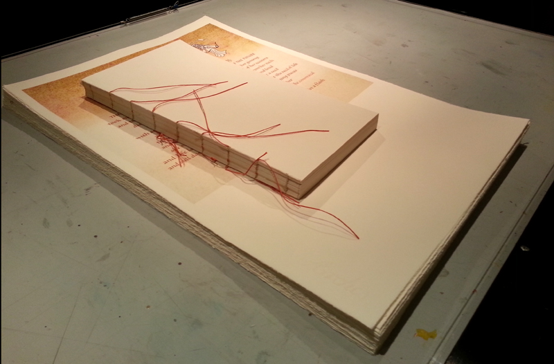
Here’s a the front cover of the tunnel book I did in my 3D Design class this semester. (Odd that I would have a tunnel book assignment in 2D Design last semester, and another one in 3D Design this semester.) I’ll post the first tunnel book when I get it back. Julia DeHoff and I are exhibiting some of our artist books at the public library during the month of October, and that first tunnel book is on display there.

The idea for the book came from an essay on butterfly collecting by Ann Fadiman in her book At Large and At Small: Familiar Essays. She describes her childhood obsession with butterfly collecting, recounting in gruesome detail the catching and killing and mounting and collecting of the butterflies. This quote stayed with me: “When did we realize that this was horrible? My brother, Kim, and I had started collecting butterflies when he was eight and I was six. Shame set in about two years later. I remember a period of painful overlap, when the light of decency was dawning but the lure of sin was still irresistible.” This seems to me an excellent description of our current relationship with our planet.

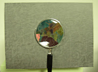
The left side of this image shows quotes from the essay written on the side accordion folds of the tunnel book. (You probably can’t even see it unless you click on the image to get the full-size image.) The right side of the image is a view of the tunnel book from above. Since the view window of the tunnel is a magnifying glass, it was even more difficult than usual to photograph the view inside. The butterflies, cut from my stash of pasted-painted and decorative paper scraps, hang from the tunnel frames by strips of transparency film.

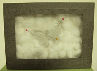
The back of the tunnel book was made to look like a Riker mounted dead butterfly, or perhaps ghost of a butterfly. I made a covered box and a lid which glass from a battered 5″x7″ frame. I thought I’d have to secure it closed with some pins, but the fit was quite snug enough to stay closed on its own. If I’d had more time, I would have found some jeweler’s cotton; as it was, the morning the tunnel book was due I was feverishly pulling apart cotton balls and trying to approximate that layer of cotton.

Such is often the nature of class projects. I have to keep remembering that they’re not actually going in a juried show, for instance.
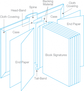