Client work

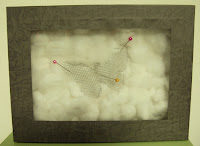
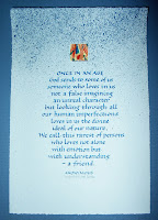
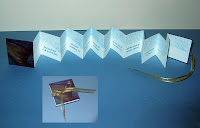
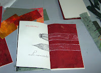
This business of catching up after a trip is the pits. I’m close to being caught up. Here’s a broadside and book for a client — same quote for each. The inset in the 2nd photo shows the book closed.

I’ve been addressing invitations, and using hot glue and cardboard, but it seems like I haven’t dealt with paint lately — although that’s not true, now that I think about it (I may post my Gandhi drawing later). Anyway, for whatever reason, I’ve been making beginner mistakes with paint — getting it on my hands, in my hair, without realizing it … generally being covered in paint for no good reason. Makes me feel kind of like a kid, though. That’s not bad.

As usual, click on the thumbnails for a closer look.

Webmaster Certification

This morning I got notice that I am a Certified Webmaster. Yay, me! I’m not sure what it signifies exactly. It definitely means that I completed courses in web architectures, XHTML, CSS, Photoshop and Dreamweaver, and that I designed a website that is compliant with W3C specifications and is accessible. As a bonus, the website I (re)designed is my own. Take a look at www.callibeth.com. Even though it was certified, I’m still not altogether happy with it — I’m continuing to work on converting all pixel measurements over to em measurements so that the website design won’t break when browsers choose to enlarge the type.

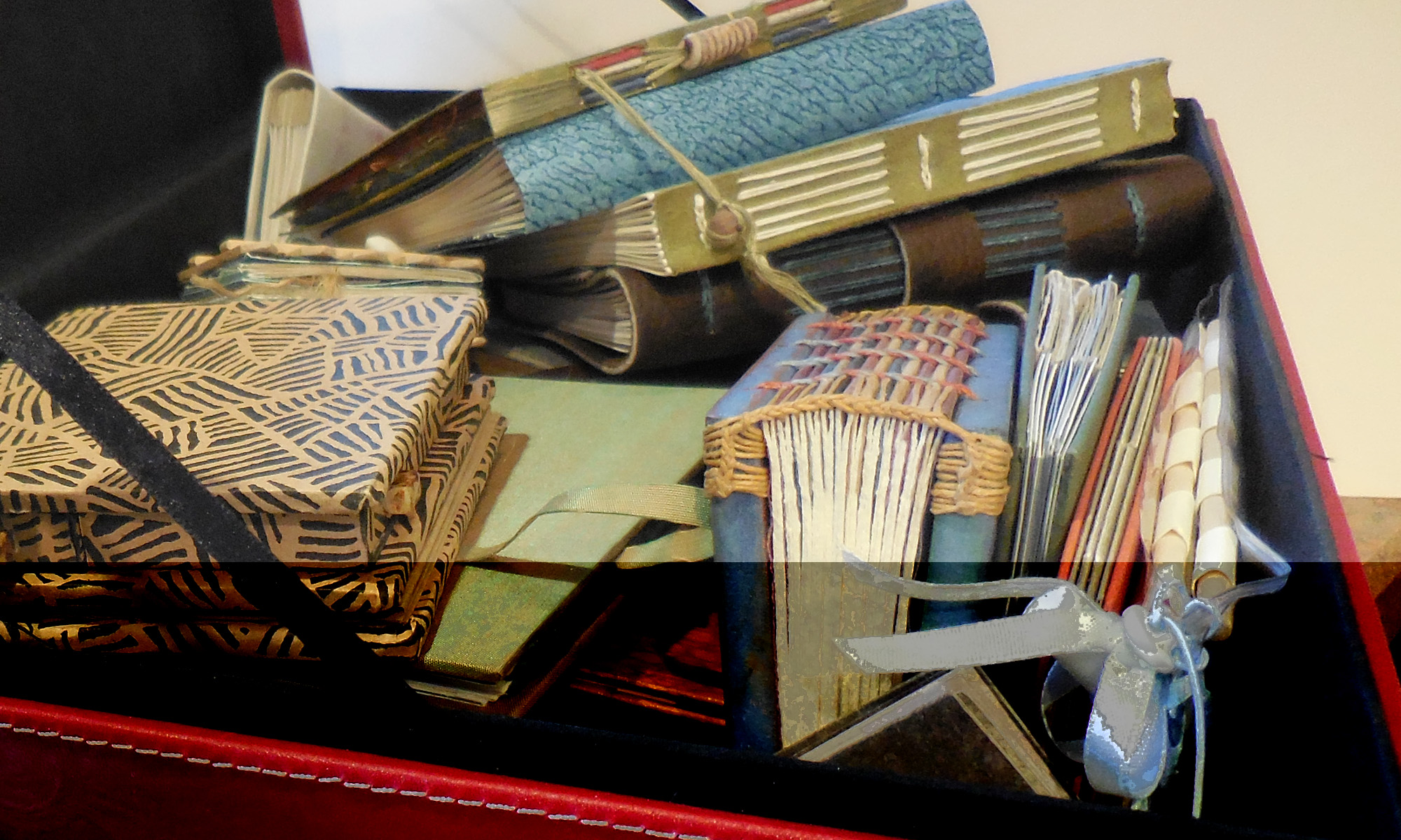
I do like my redesign of the 6 book swaps. They used to be rather ragtag and there were errors on the pages. Now it’s all consistent, and I like looking through all the books. See the books by starting here at www.callibeth.com/bookswaps.php.

That book again


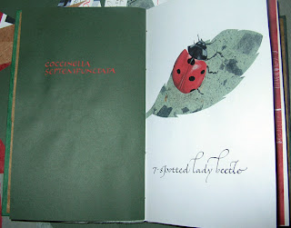
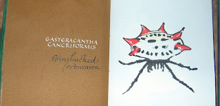
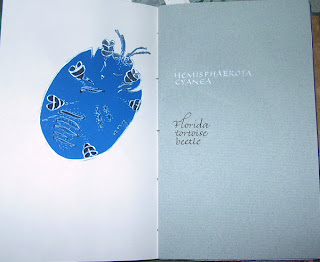
A few more pictures from the book I did as a final project in one of my summer classes. These are C, G, and H. The ladybug is mostly a collage of 3 papers, with colored-pencil highlights and black-ink spots and legs. The spinybacked orbweaver is Chinese stick ink and gouache, mostly done with a folded pen. The beetle is a piece of ink-jet blue-colored paper (a scrap from an artist book with a blueprint background that I don’t think is on my website anywhere) with stick ink and white ink. I was pleasantly surprised to find that it looks rather like a bandana print.

I enjoyed doing a sort of survey of techniques in the book, but if I were to do a book to enter in an exhibition, I’d like to try and limit myself to one of the techniques. I think. Who knows until the doing of it, right?

Final project for class

Wednesday is the last class of the semester, and that’s the day this artist book is due. I’m about 20% through, which is not good. Once again, I’m trying to do something that is too complicated for the time allotted. This is an abecedary bestiary about creepy-crawlies, a subject which is constantly in mind by the end of summer in Florida.

I’ve had to cheat on Q: it was either include the Queensland beetle — whose appearance in Florida is only anticipated with dread but not actually in the population — or something else. I chose something else: the mosQuito. I’ll put the mosquito in the Q, I think. No creepy-crawliary of Florida would be complete without the mosQuito anyway.

The nematode, whose microscopic head and tail are blown up across two pages and two papers, was drawn with a school nib and Chinese stick ink and McCaffrey’s ivory ink. I knew drawing on that unsized leaf-inclusion paper would be a difficulty. But I did it anyway. You can see some bleed-through on the next spread for the zebra butterfly. Oh well. I kind of like that too.

The zebra butterfly image is an acetone image transfer of a photocopy of a drawing I made by using a folded pen (a butterfly pen, it’s called, haha). The image transfer is a little “pebbly,” probably because of the texture of the Arches Text Wove paper it’s on. I like it. The bit of vermilion gouache matches the rust-colored leaf-inclusion paper better than is shown by the photograph, which turns the rust sort of maroon, for some reason.

Tunnel Books — Links

I’m not a fan of tunnel books, but a current class assignment has led me to look at them more closely.

It’s often frustrating to look at images of tunnel books. You’re shown the cover, you see the sides, you see the sculptural aspects of the book, but only rarely do you get to see even an approximation of what one sees when one looks through the tunnel book.

Here are some of my favorite tunnel books that you can see online:

  • Roberta Lavadour’s Harvest Moon, a luminous view of the moon with layers of twig branches covering the main image.
  • A collaborative tunnel book made in Julie Chen’s class at Pyramid Atlantic. I like it that the square confines of the outer shape are breached.
  • Tara Bryan’s World Without End, with the story on the accordion panels and the images in the tunnel. At roughly 3″ x 3″, it seems a little small for comfortable tunnel viewing, but since the story is on the outside, maybe that’s not as important as it might be otherwise.
  • Ed Hutchin’s Grandma’s Closet — a great use of the tunnel structure. (Update Nov 2017: no longer on the internet except on Pinterest and as a rare book for sale.)
  • Peter and Donna Thomas’s awesome Ukelele Tunnel Book, part of a series of uekele books. The back of a ukelele was sawed off to allow for the tunnel structure. The entire series is here. Although I found this book first, I list it last, so that the rest of the list wouldn’t be disappointment.

I don’t like tunnel books as much as I like other book structures, I think because it functions more as a sculpture than a book. You get the whole picture at once, and time doesn’t play the part that it does in books whose pages have to be turned and whose images and words appear serially. In a tunnel book, there are more things to see as you look around more, but that’s true of paintings and sculptures.

Yippee!

I just got back from the opening of “Creative Tallahassee,” the juried art show I blogged about here. And guess what?? Second place! Yup. Second place, for the ABC book, as I tend to call it. I was very surprised. Life is good.

Now that I’m going back to school for a degree in art — did I mention that I originally frittered away my undergraduate education in accounting? — I’m swamped with work. Wedding invitations, commissions, certificates, more certificates, more wedding invitation addresses . . . the list goes on and on. Pretty soon I’m going to have to quit accepting at least some work. Not that I’m complaining.

Really, there’s simply nothing to complain about, except perhaps that there’s not time enough to do all the things I want to do. In a little over a week I’ll be playing the piano for a doctoral student’s ensemble recital, and accompanying a violin major for her spring jury. I like all the music: Loeffler’s Two Rhapsodies for oboe, viola and piano; Elgar’s violin sonata, and a violin arrangement of Debussy’s La Plus Que Lente. Much fun. And art school classes start on May 9. And we’re getting a puppy on Memorial Day weekend. And somewhere in there — hopefully before classes start — I need to finish the webmaster certification project which is my redesigned website. All things I’m looking forward to.

I feel like there are little champagne bubbles floating up from my head. And I only had water with dinner. Yes, life is very good.

Ehon: The Artist and the Book in Japan


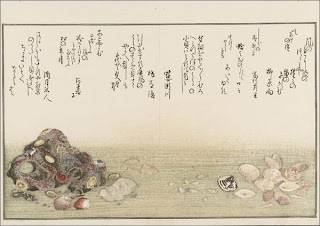
Here’s something I wish I’d caught when I was in New York recently: an exhibition of ehon, Japanese picture books at the New York Public Library that looks fabulous. Click on the title of this post to get to the NYPL’s description of the exhibit. Or click here to see a slide show and description at Slate.

Asian artists are so lucky. Their art tradition has always integrated drawing and writing and painting because their systems of writing are based on pictorial representations. In Western art, letters may have started out as representations of something — a yoked ox for an A, for instance — but for millennia those letters have represented sounds rather than pictures. So we are usually working to integrate two alphabets (capitals and minuscules) together with illustrations, and the mark-making for each of the elements is markedly (ha) different. The capitals are more a drawn letter form, the minuscules more a written/cursive form, and the illustrations are achieved by any number of methods.

Our medieval illuminated manuscripts solve this by placing the paintings in a window, setting them in a different plane of existence. It’s not nearly so satisfying as the Asian approach to book design. And this exhibit shows that clearly.

Thanks to members of the Book_Arts-L listserve who posted information about this exhibit.

Happy ABC Flag Book


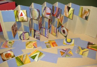
I’m so enamored of these little alphabet paintings I did summer before last. I’ve been scanning them in, altering the scans, deciding not to alter them after all, trying them out in my website design class, and playing with them in books. Here’s a flag book in progress. I had to tell myself this was just a very, very rough prototype so I wouldn’t spend all my time getting perfect accordion folds — a particular obsession of mine, and nearly totally useless in building models.

I imagine that the finished book — if I ever finish it — won’t look much like this. But it’s a start.

As always, click on the image for a close look.

Mystery Matchbox Book


It’s been more than 10 years since I participated in my first Internet book swap, and this book is one of the first swap books I ever received. I had some idea that the colophon was a folded piece of paper in one of the matchbox drawers, but if that’s the case, the colophon has disappeared.

So, anybody recognize this? Circa 1996 or so.

The matchboxes were covered and then seem to be glued together in a log-cabin-quilt sort of pattern, and the base and top and book cover are, I believe, paper-covered foamcore. The paper is not lightweight, and the covering of the matchboxes with that paper made it a much sturdier structure than would have been the case if the matchboxes were left uncovered. I’ve always liked this book. My one critique of it is that the accordion text paper could be a little heavier … maybe. It’s got great little drawer pulls, which were originally rectangular beads before they became drawer pulls. It’s a great little book.