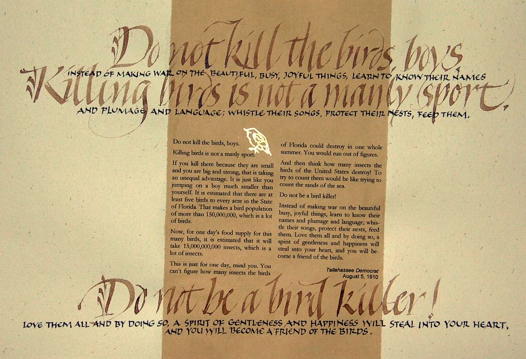
Here’s another one. Not shot straight, but that doesn’t matter. That’s gold leaf on acrylic ground for the bird, walnut and Chinese stick inks for the calligraphy, and archival inkjet for the article.
Tallahassee: In Its Own Words
Here’s a piece that may not see the light of day in real life. I’ve been working on 10 pieces for a show that was to be hung tomorrow in the local community theater. The pieces are based on lines from the script of the play that starts next Friday. This had been in the works for 2 months, but there may not be room for my pieces.
In the original post, the picture was much bluer than this one. This one’s color-corrected.
Cathy Connolley
I want to use black and white the way Cathy Connolley does. She does color, too, but here‘s a gallery of just black and white.
What not to do
Sometime when you don’t have a project that must be done, head over to 52 Projects and check out the exhaustive list of what not to do when you’ve got a project deadline.
Yes, I’ve got a project deadline. And I can’t believe how much of that list I’ve accomplished just today 🙂
Room to breathe
So often I get calls for calligraphy which has to be crammed into a space that is sometimes smaller than the typewritten original. It’s very frustrating. But this quote was required to fit a space at least 23″ tall by 32″ wide. So the x-height of these letters is 5/8″. What luxury! (That’s not a wrinkle at the top right, but a shadow from an open door. I set the piece on the floor and leaned over it to take the photo.)
Escape
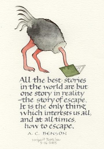
I don’t draw. Okay, I used to not draw. This was more painful to do than I expected, but also satisfying to have accomplished. A baby step, but still a step.
Obsessive Drawing

The drive to doodle: compulsive therapy.
I read this review in the New York Times (click the title of this post if you’ve subscribed to NYT online), and I want to head right on over to the American Folk Art Museum. Too bad I’m 1,110.39 miles away.
A few more images of the show are here at American Folk Art Museum’s website.
So small a thing
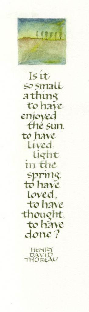
I seem to be making bookmarks lately. No matter. I am really enjoying the little 1″ square landscapes.
Spring Haiku — 1997

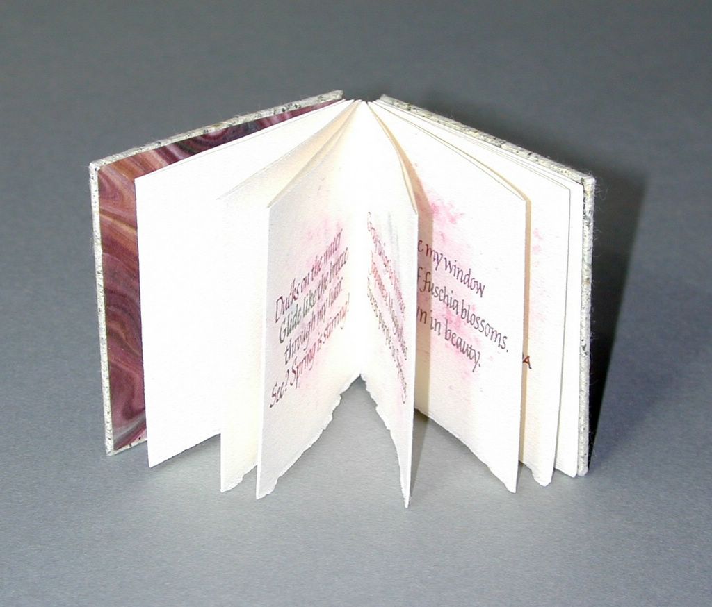
Spring Haiku — an artist book I made in spring 1997. Covers of handmade paper with turnip greens inclusions, over matboard; Arches Text Wove for text. Oriental paper hinges, painted, cut into 3x-wide strips. Handmade paints — pure pigments plus gum arabic plus (in the case of Alizarin Violet) titanium-coated mica flakes for sparkle. The washes brushed with methyl cellulose — to improve the surface for fine (that is to say, small) lettering. The lettering was done with a #5 Mitchell dip pen.
Size: 2 1/2″ x 2 5/8″.
Uploaded to test software. Both photos are thumbnails to larger photos.
"Depth"

Here’s an artist I discovered through Illustration Friday. I just love her colors, shapes, symbols … everything.