 Drawing is one very good reason I’m a calligrapher. I mean it. This drawing class is like trying to walk after choosing to sit for decades. I leave every 2-1/2 hour class meeting simply exhausted. Which seems ridiculous, but how hard can it be to put on paper what you see with your eyes? Pretty hard, evidently.
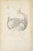
Here is the first image of my first efforts in Drawing I. This one was a gestural drawing of an arrangement of really, really random things in the center of the classroom: a partially dismembered skeleton, a red tricycle, various fake flowers, and some Styrofoam balls.
We were given 1 minute, then 3 minutes, to get as much of the still life down on huge sheets of paper — these sheets were about 24″ x 36″. Then we started on this fresh sheet and were told we had 5 minutes, but after the first 5 minutes we were given another 10 minutes to get in more detail.
Very stressful for me. I’m hoping this all starts to come a little easier as the semester wears on.