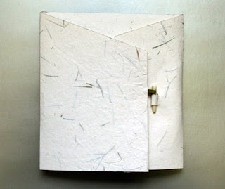
Just finished a commission for an accordion book. I thought I understood what the client wanted, but you know, every once in a while I just get it wrong.
 I heard:
- Stained glass but not religious (which I suggested would be difficult).
- Masculine.
- Traditional.
- Muted colors.
Well, I’m not good with muted colors; this first attempt is muted colors … for me.
What I didn’t understand was the particular meaning of traditional. Looking at this first attempt I now realize that this looks like a particular style of my Presbyterian youth. My mother had jewelry that looks like this, and I was clueless about that connection while designing the book.

So I started over again with a style that the client had liked in the past. And I realize that even though it doesn’t have muted colors and it doesn’t seem very masculine to me, it is more traditional — in both a catholic and Catholic sense.
The cover is a green silk bookcloth shot through with gold. I think it works. I made a wrapper from handmade paper with leaf inclusions, using a strip of book cloth as the ribbon holding the bone clasp.
Commissions are always a learning experience.


Thanks for sharing the experience. Whatever it is I really liked both options 🙂 Both look great.
Keep the good work!
Beth, you have my sympathy as well as my praise for the beautiful commission(s). You have a lot of design skill to draw upon! So much work…
Jocelyn
Jocelyn, thanks for the comments. This wrapper you taught us in the workshop in Billings has come in handy more than once since then. Thanks for that!