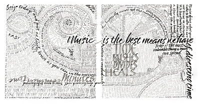
 This two-page spread (click on the thumbnail picture for a full-size image) was created for the centerfold of a 12-page book designed in typography class this past semester. These were the only pages that had no photographic images, and my aim was to try to synthesize my experience of lettering into a modern piece that would work as hand lettering in a typography setting. I don’t know that I succeeded, but the experiment was interesting. All of the quotations in this piece revolve around the theme of the book: time.
When I was in high school, well before I took up lettering (or maybe not, now that I think about it!), I made these elaborate doodles I called “scribbles”, which relied more on color for their design. Looking back through this blog, I see that I’ve never posted one of those, although I still have several of those early scribbles. I’ll plan to do that sometime.

Seasons’s greetings Beth, I love your doublepage spread. Makes me want to drop everything and do some drawings (as I’m pretty hopeless at calligraphy).
I love taking a regular peek at your work. I’m a lapsed calligrapher, but I appreciate your beautiful blog. I hope you made an A+ and that you have a lovely 2009.
Thanks for the comments, y’all. Happy holidays to you too.
I love your work and come here often to see what you’re up to. I don’t think I have ever left a comment though and I wanted to thank you for sharing your work and to wish you a HAPPY NEW YEAR!
Happy New Year to you too!