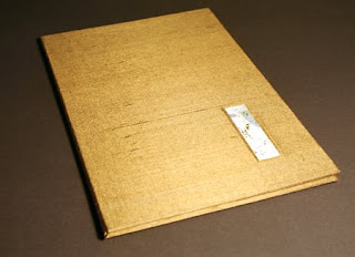
 I’ve just finished a book that was commissioned as a birthday present. It was such a Jekyll-and-Hyde experience. The text was simply lovely, and I enjoyed the design of the book. But for the longest time I simply could not complete a block of writing without spilling gouache on the page, skipping a word, or unknowingly shifting the guidelines. Once I got through those mistakes and got a block of lettering done, I found I had accidentally used regular tape to affix the page to the pad of paper that was acting as a writing cushion. When I removed the tape I wasn’t able to preserve the top layer of the corners of the pages. Aargh. So I started over again. But amidst all these starts and restarts, I came to the conclusion that the text paper I was using just didn’t present the gouache well. So I switched to Fabriano Ingres, which is such a ubiquitous paper that I didn’t think of it initially. The warmer cream color of the page looked gentler, and the gouache laid down better on the surface.
 Alongside the frustration, though, was a satisfaction in writing a pretty wonderful text, something that was written very directly and personally. That part of the process was a real joy.
I used a new roll of Japanese paper to back the gold/tan silk that I found in the home decorating section of the fabric store. That went well; I believe this new kozo paper is a little thinner than the 15-year-old roll of Tableau that I’ve nearly used up.

The binding looks beautiful. I think being a calligrapher must be a wonderful asset for a book binder, you can really use all your talents. Adding text is a real challenge for me so I really admire your ability.
Thanks, Carol. I do like being able to use calligraphy in the books. Because the copy fitting and lettering take so much time, books with calligraphy are almost necessarily simpler in form. I always forget that until I’m in the middle of the project 🙂