Well, it’s that time of year: The Season of Gold Ink.
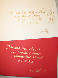
I just finished a Christmas-card-addressing job. Some of the envelopes were red, and some were a creamy white. The two you see here are — obviously — the remains of a couple of errors. I shouldn’t say “obviously”. You, my readers, may be calligraphers, in which case you most likely looked more carefully at the letter forms than the actual words, a tendency which non-calligrapher friends and spouses find humorous.
Anyway. As I was saying.
I thought I would have to use two different media: a light gold for contrast on the red, and a darker gold for contrast on the white. I started with the red envelopes and Schmincke gold pearl calligrapher’s gouache, which is about the lightest gold I know of, excepting only the late lamented Schmincke platinum gouache. Although it worked well on the red, the pearl gold is too light to make enough contrast on the creamy white. I checked.
After awhile I switched to the creamy white envelopes. After some experimentation, and a look at a handy metallic colors guide I painted awhile back (maybe I’ll blog that later), I determined that after I shook up my bottle of “Dr. Ph. Martin’s Iridescent Calligraphy Colors 11R Cooper Plate Gold” ink (henceforth known in this post as “long-name ink”) — and it took a very long time before I could see movement on the bottom of the bottle when I turned it upside down — umm, I lost my train of thought. I think I was headed toward something about the little ball in the bottle of fingernail polish that could have helped this process … Have I mentioned that I’ve had a sinus-and-respiratory infection for 13 days? This is my 2nd day of antibiotics and I’m feeling quite light-headed (haha). Or it could be the Claritin.
Anyway.
I used the long-name ink for the creamy white envelopes, since it was dark enough to contrast with the paper. And the ink was so much easier to use than the gouache! With the gouache I was constantly re-mixing with the brush, occasionally cleaning the nib, and sometimes going over letters twice. With the ink, I just reloaded the pen nib with a a drop from the dropper onto the top of the nib and kept going.
So when I switched back to the red envelopes I tried the long-name ink on one, and was surprised to see that the contrast was just about equal to the contrast I had been achieving with the gold pearl gouache (which took 25% longer because of the mixing and double-stroking, etc.). I never looked back. The rest of the envelopes were done using long-name ink.
As usual, click on the photo for a closer look.
The creamy white envelope shown (poorly photographed, sorry) has an address in long-name ink, with a contrasting vertically oriented note in the gold pearl gouache. The difference in contrast with the paper doesn’t show up so well here as it does in real life.
The red envelope’s first line of the address was done in gold pearl gouache, and the rest in long-name ink. There’s almost no difference in contrast here or in real life.
P.S. Anybody get the zip code references? (Looking back, the entire post seems to be a very broad hint.)

