BETH LEE
Calligrapher | Book Artist
I teach locally in Bozeman and offer individual instruction on a wide variety of book arts topics: lettering styles, book making, illumination, and more. I also offer these workshops via Zoom or in-person.

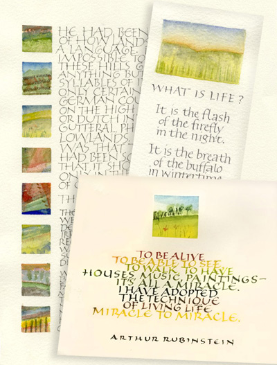
About this workshop: The complexity of monumental Roman capitals can be intimidating for many calligraphers, but tiny pen-made capitals can be a real delight. Writing at "human" size more naturally creates rhythm and movement that is difficult at a monumental size. Arranging those small capitals with another graphic element can help us to connect with the fun of lettering while surveying some basic design principles.
In this workshop we will explore Roman capitals as a text hand. We'll begin by reviewing the shapes and proportions of Romans, and then shrink them down to 1/4-inch size and even smaller. What must we lose in the reduction, and what can we add back with pen pressure, rhythm, serifs? We'll find out. We'll also investigate adjustments to our materials -- pen nibs, writing fluids, writing surfaces -- that will set the stage for marks that are as clean and precise as possible. Through the use of letter spacing, color changes, and other design decisions, we'll manage the texture and rhythm of our texts.
Then we'll paint 2-inch-square landscapes and a few abstract graphic elements and look at what design choices will ensure that they meld beautifully with our texts. Suitable for beginners and experienced letterers alike.
UPCOMING DATES

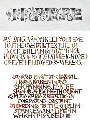
Although Ben Shahn was a gifted graphic designer who could render letters as precisely as anyone, he had an affection for the naive lettering of the homemade sign. He developed at least two lettering styles that are recognizably his. One is the style that most often comes to mind when a calligrapher talks about Ben Shahn. There are no definitive exemplars of this style, and why would there be? These were the idiosyncratic letters that he used in personal and religious projects — greeting cards, posters, and artist books — often pairing them with his illustrations.
In this workshop, we'll start with Ben Shahn's lettering style and then explore and improvise our way to new forms and styles. Shown here are three of those improvisations. As we work, the importance of letter relationships will become evident. We'll also try a variety of tools to create these letters, explore script analysis, and have fun with more improvisations.
UPCOMING DATES