BETH LEE
Calligrapher | Book Artist
Calligraphy class
Layout Variations
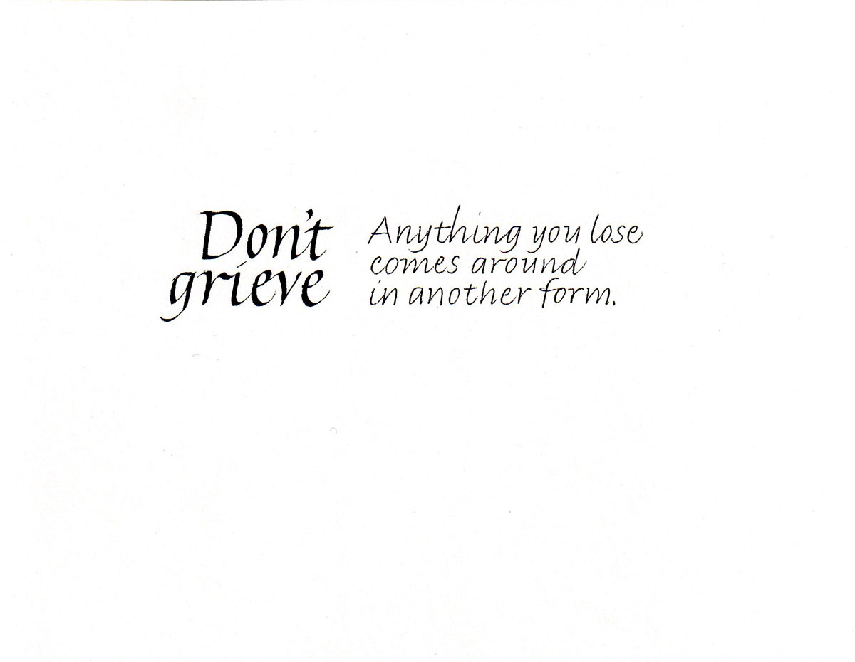
The layouts below show the variety that can be achieved using just the standard italic hand we've been studying. I have made changes in line leading (spacing), color, size, weight, tool, direction, and baseline shape. Below each image is a description of these decisions.
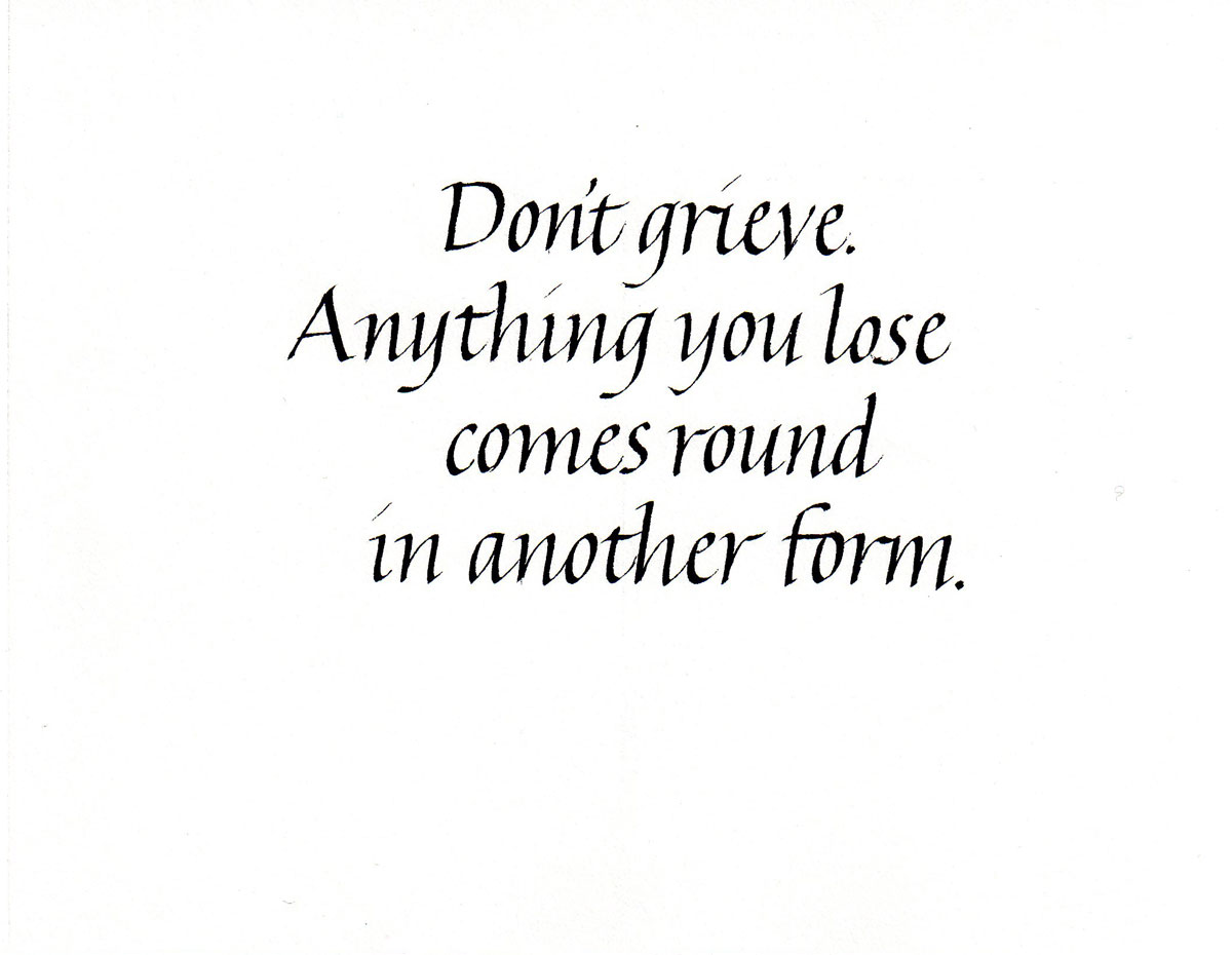
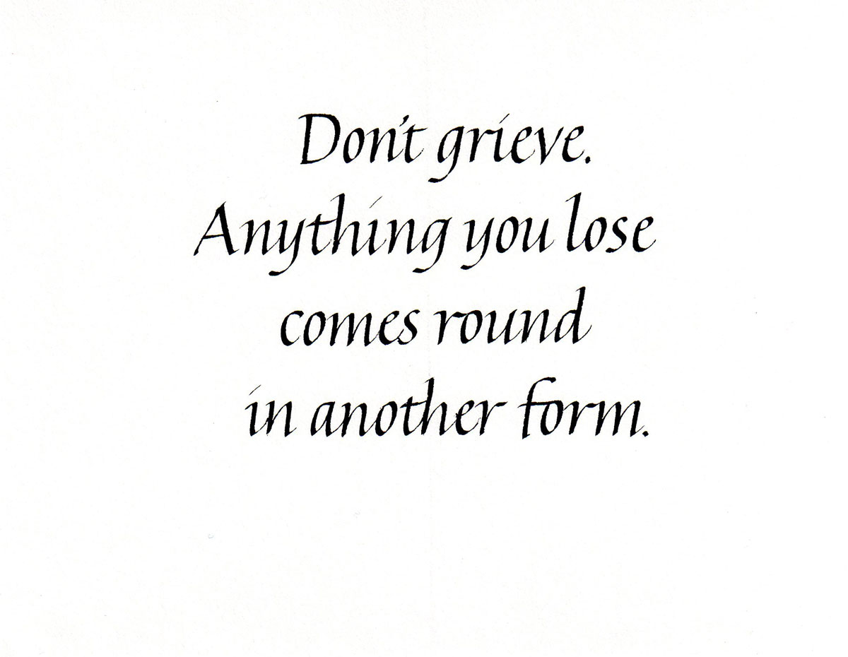
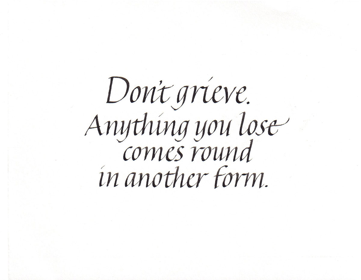
Default layout using the line spacing shown on the guideline sheets.
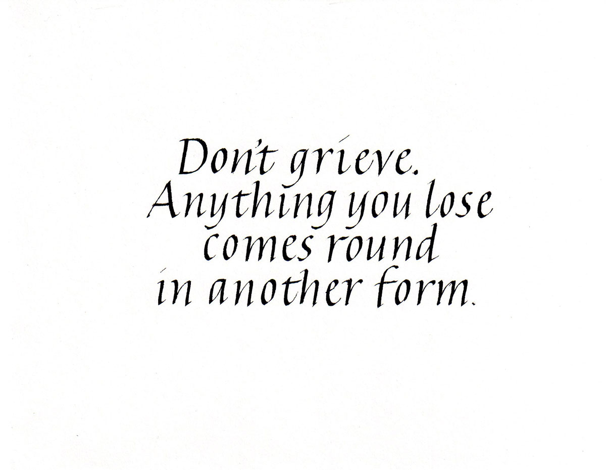
Tighter line spacing
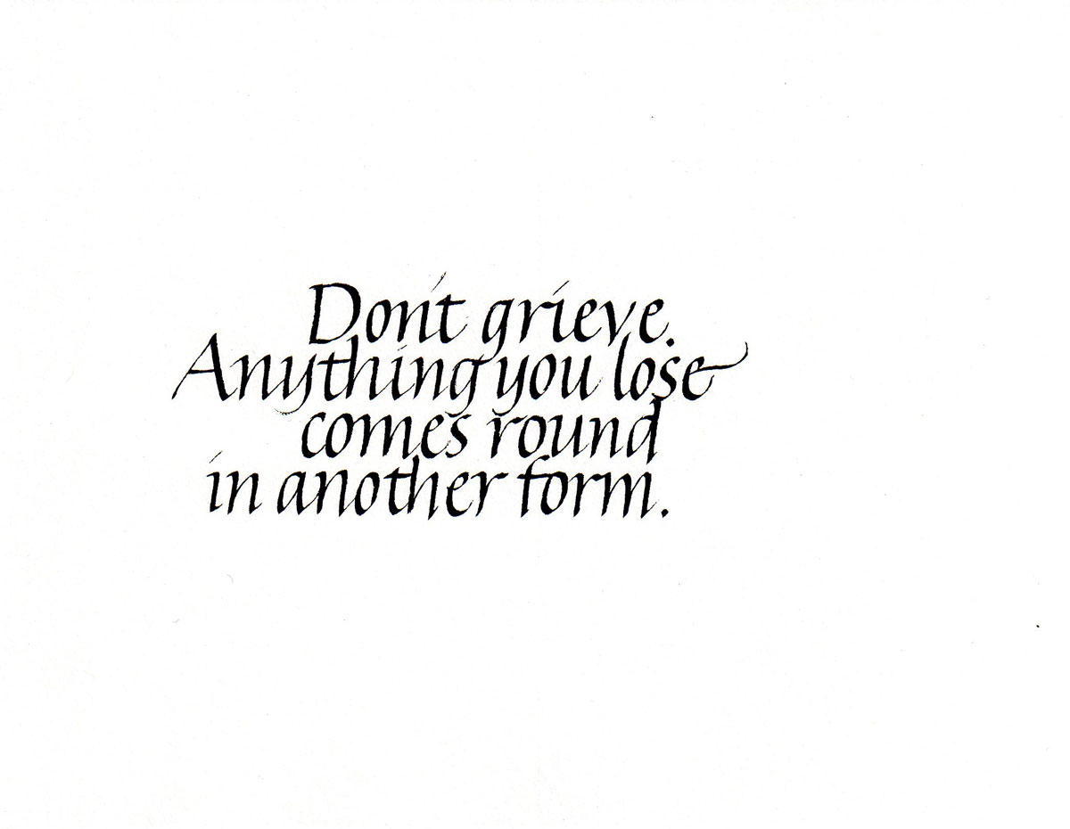
Even tighter line spacing
Wider line spacing
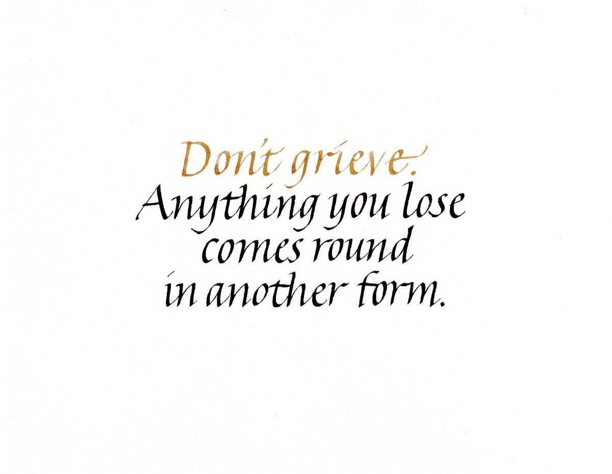
Contrast in color, gold and black. Gold does not have the weight of black and so might be made larger and/or bolder to balance.
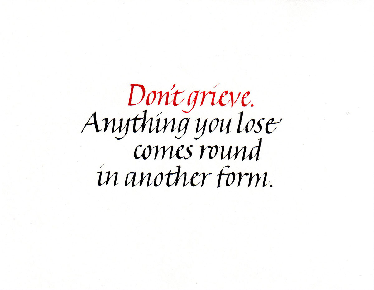
Contrast in color, red and black. Red is the only color which rivals black in visual weight.
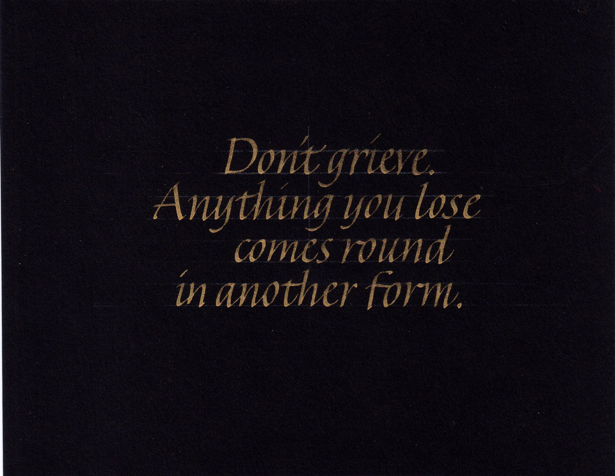
Gold lettering on black background.
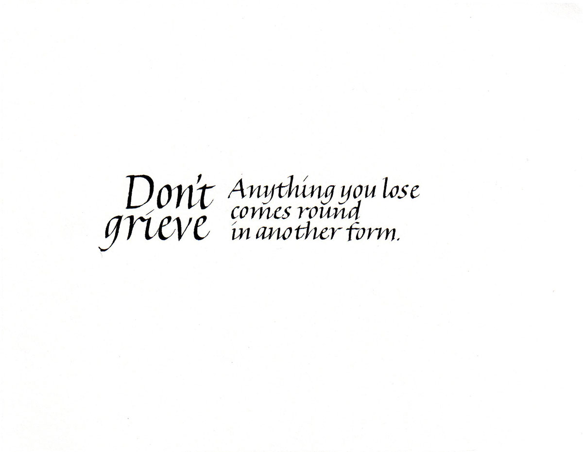
Contrast in size: first line is larger. Because the same pen was used to make all the lettering, the first line is lighter in weight than the succeeding lines. This contributes to a lack of contrast between the two.
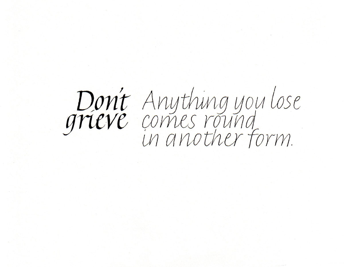
Contrast in size, and contrast in position: different pens were used to make the two sizes, and since both were made at the same height in pen-widths, the weights of the letters are similar.
Contrast in weight and tool: the letter sizes are the same, but the weights are different because the tools are different.
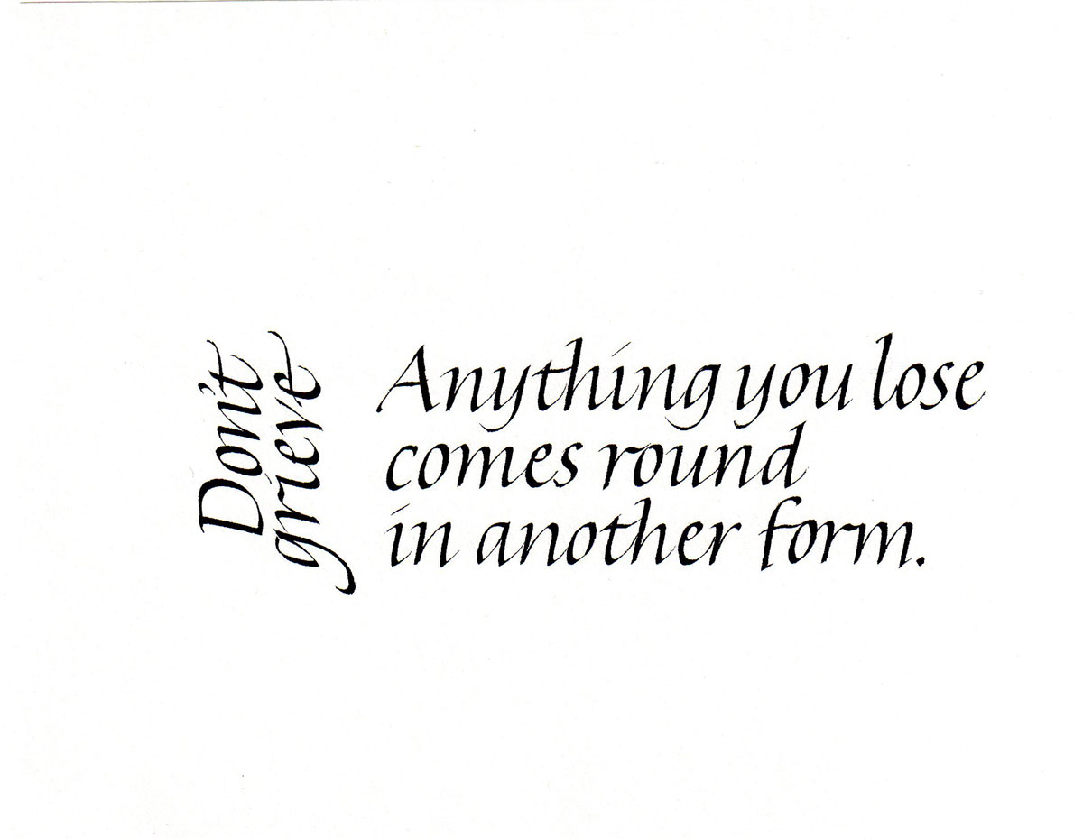
Change in direction: all the lettering is the same size and made with the same tool.
Contrast in weight, tool and size.
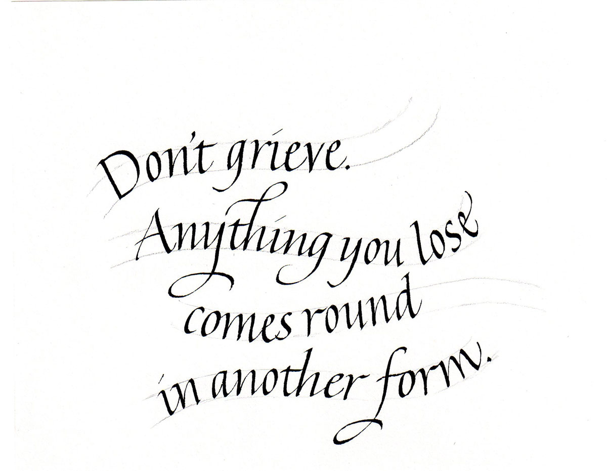
Waving lines. The baselines are made first, and waistlines penciled in by eye. A curve could be used to make more accurate guidelines.