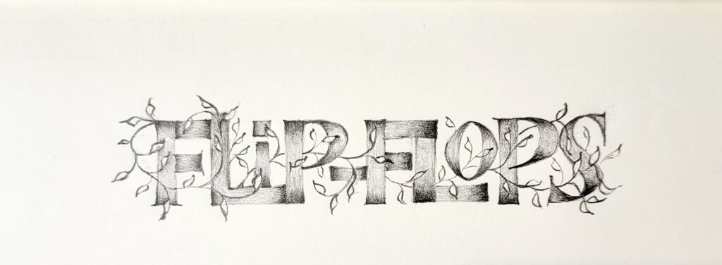
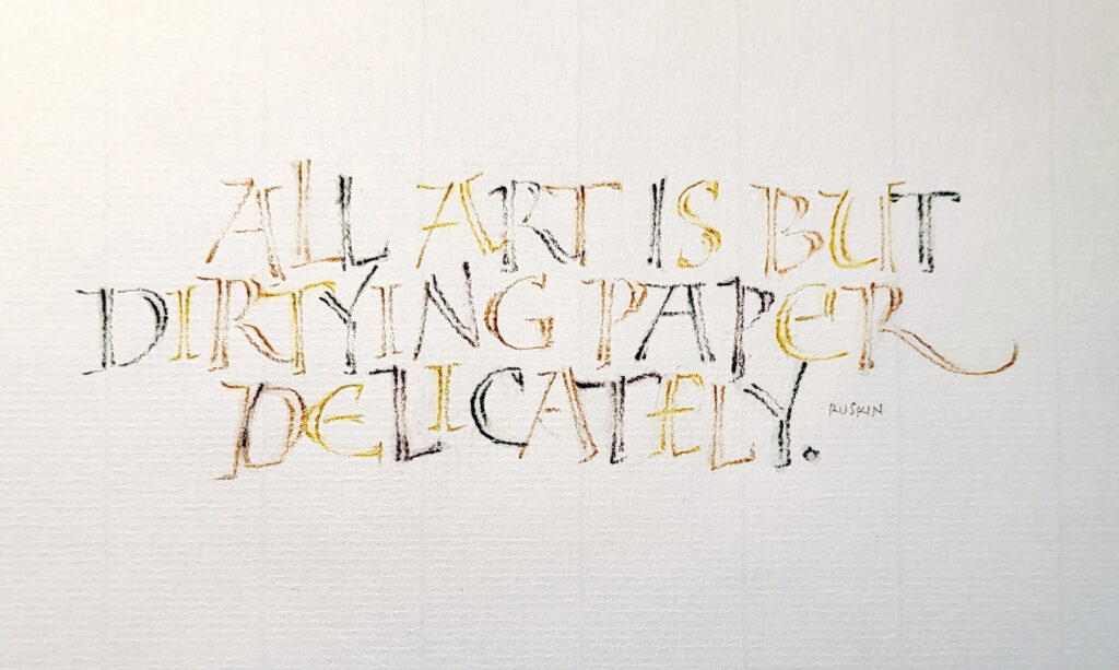
Here’s a perhaps weird mash-up of summer, illumination, pencil, and Ben Shahn’s lettering.
I have an impressive, or perhaps merely excessive, array of flip-flops, all dating from at least 15 years ago, when we moved from Florida to Montana. They were all the footwear I had, besides a pair of sneakers and a pair of dress sandals. My closet looks very different now, but I love hauling out the box of flip-flops every summer for, oh, about 6 weeks each year.
Done in my pencil journal on a plane with a Blackwing pencil (Natural).
I’m honored to have two of my books selected for inclusion in the artist book exhibit CONTENT at the The Artery in Davis, CA. If you follow this blog, you’ll have seen them here before.
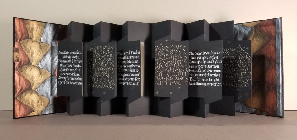
Scintillate, Scintillate is an edition of 12 manuscript books. I talked about them earlier in detail here.
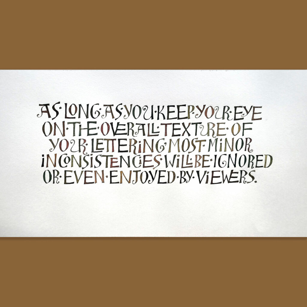
This week I begin teaching a 3-week, online edition of my workshop, “Ben Shahn-ish.” In preparation, I have continued to improvise with Ben Shahn’s folk hand as a basis. I last taught this more than a year ago, but each time I revisit the hand I discover more about it.
Ben Shahn’s folk hand is a wonderful canvas for improvisation in so many ways. As far as I know, we don’t have conclusive information about what tool he used for these letters. Ignorance is bliss in this case: I’ve tried them with a broad-edge pen, a pointed pen, a folded pen, a pointed brush, several pencils, and more. Each tool teaches a little more.
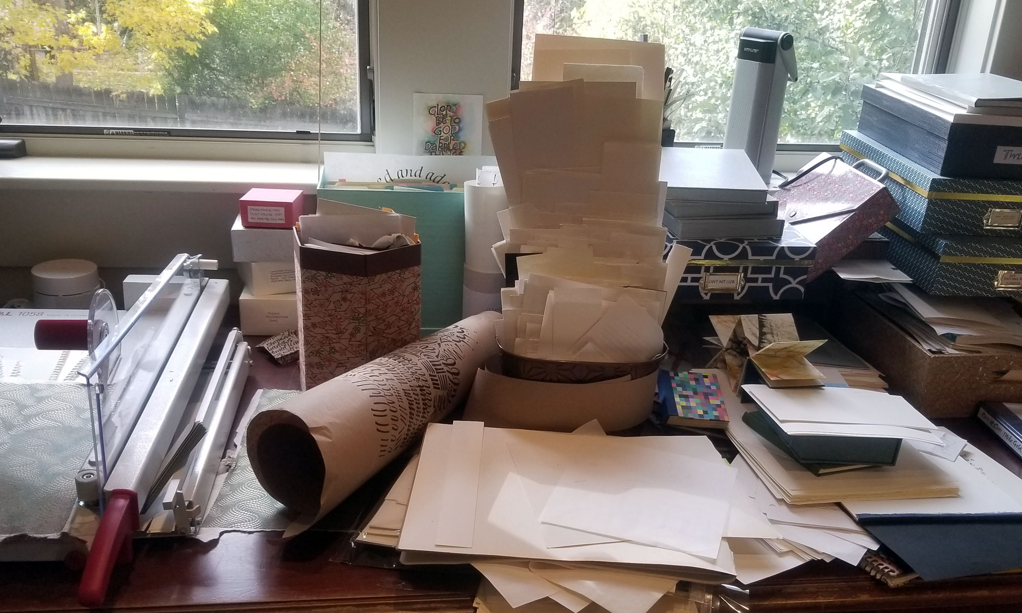
Later I’ll discourse at length on a philosophy of learning, but first: There’s a lot going on in the studio! But I have very little to show here. Nearly all of my recent work has been commissioned for weddings and other occasions. I’ve also updating the workshops I will teach this summer and fall.
In the past few weeks, I’ve completed a ketubah with watercolored maple trees, a Quaker-style marriage certificate (on mat board, unusually), place cards, menus, chopstick tags, invitation addresses, and more. And I’ve been developing new handouts for my updated “Ben Shahn-ish” workshop.
How we learn
I often use the pages of my daily journal to determine lengths, plan layouts, and explore scripts and script variations. When sharing my daily journal with my (awesome!) critique group last week, someone asked me how I switch so easily between calligraphy hands. I didn’t have an answer then, but I’ve been thinking about the question a lot.
It has something to do the way we learn. I vaguely remember that the ancient Greek philosophy of education asserted that when we learn one subject, we apply that learning to the next subject we learn, and we also learn how to learn, and so on. I think it’s called constructivism in modern jargon.
It’s all coming together
So when I first learned Edward Johnston’s foundational hand, I learned to analyze shape and spacing. Later, I learned pointed pen lettering and the important kinetics of pressure-and-release and gestural writing. When, much later, I circled back around to bookhand, that learning gave me the tools to do the pressure and manipulation required for a nuanced bookhand such as Civilité or those taught by Elmo van Slingerland. That’s just one example.
My point is that, after a mere 40 years of lettering, the disparate disciplines have come together for me, both intellectually and kinetically. Every hand has its mix of shape, counter-shape, gesture, tempo, rubato, pressure, nuance, and more. At this point, to sit and write in an italic hand and then switch to an uncial hand is, at its simplest, a matter of changing up the combination of these elements.
… except when it’s not, of course
This is not to say that I can perfectly render every hand at any time. Not at all! To write my very best bookhand, for instance, I’d need to write a lot of bookhand for several weeks. And I’d have to write with focused intention. This is true for just about any hand. And it’s true for broad-edge pens, pencils, and pointed pens. (I’m least tutored in the latter). The brush lettering is creeping its way into the tent, though I may not live long enough for the brush to join the other tools fully.
This is how I feel today. Tomorrow, I may sit down at the desk that my great-grandfather built for his son, the desk I’ve sat at for the past several decades, and find that I know nothing whatsoever about lettering. It has happened often enough now that I know to expect it.
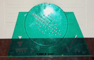
Calligraphers are always on the lookout for cool studio tools and guideline makers. Hanging out on social media can net you some great resources; online guidelines generators are some of these.
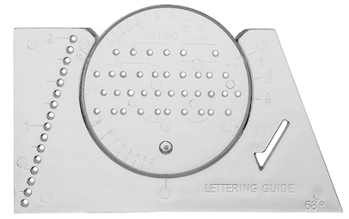
These are good, but give me one of those green lettering liners any day. Too bad they’re not made anymore. The closest equivalent is the Ames lettering guide, but I don’t use those. It took me awhile to figure out what was wrong with them. There just aren’t enough of the holes that I use for pencil guidelines. The Linex (Koh-i-noor and Steadtler also made them) liner, on the left below, has 16 holes, compared to the Ames lettering guide on the right, which has only 10 holes down the center. The Linex lets you do a lot less repositioning, which means you can do it in a lot less time.
Linex lettering liner. Antique, as you can see.
Ames lettering guide
These lettering liners are far from intuitive. There’s a great tutorial at JetPens that explain how to use all the features of the Ames lettering guide. I only use the center row; the holes in that row are equidistant. But perhaps I should try the other rows, which allow for an x-height that 2/3 of the capital height, or an x-height that is 2/3 the capital height.
Guidelines are a constant source of interest to calligraphers. I’m amused to re-read my post on guidelines from more than 10 years ago on the subject. I still mourn the demise of Calli-Graphic, an app that allowed one to make straight and even circular guidelines with a desired x-height and leading.
I had a wonderful time last weekend teaching my workshop, “Capitals as Text & Tiny Paintings as Graphical Elements,” to my own state guild. We had a good time studying a fragment of this 5th-century manuscript book written in square capitals (see this earlier post), improving our tiny nibs, making tiny broad-edge nibs from pointed nibs, and getting into the weeds with pens, gouache, and paper. It is nourishing to be among friends who share our love of all things alphabetic!
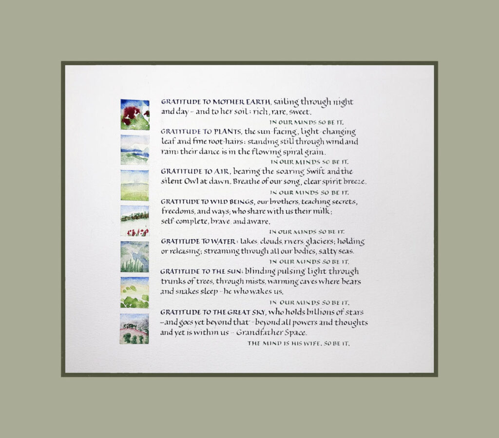
Mohawk prayer made in celebration of Earth Day. 6″ x 6.5″ content area.
The workshop name is problematic: “Capitals as Text & Tiny Paintings as Graphical Elements,” “Tiny Capitals & Tiny Painting,” “Small Capitals & Landscapes” — perhaps some day I’ll settle on a cogently brief name.
This is only the second workshop our state guild has hosted since the pandemic, and it was so good to be together again. Many thanks to my friend Mary Jo who put me up in her lovely house. I’m amazed at what a stellar job she and Ruth did in organizing the workshop. (AND we got to see baby geese!)
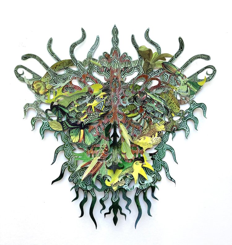
The opening reception for Kako Ueda’s solo show, “Tori Tori Tori,” will be held May 12 at Olympia in NYC. The show runs from May 12 through June 17. I wish I could be there to see it. Her cut-paper creations are beautiful, intricate and wholly absorbing.
The themes for the show “Tori Tori Tori” are migration and the presence of the chimera. For more information about the show, check out this page at Olympia Art.
I’ve posted about Kako Ueda’s work before: once about her solo show in 2008, and once as part of a list of links to paper cutting artists I like, back in 2007.
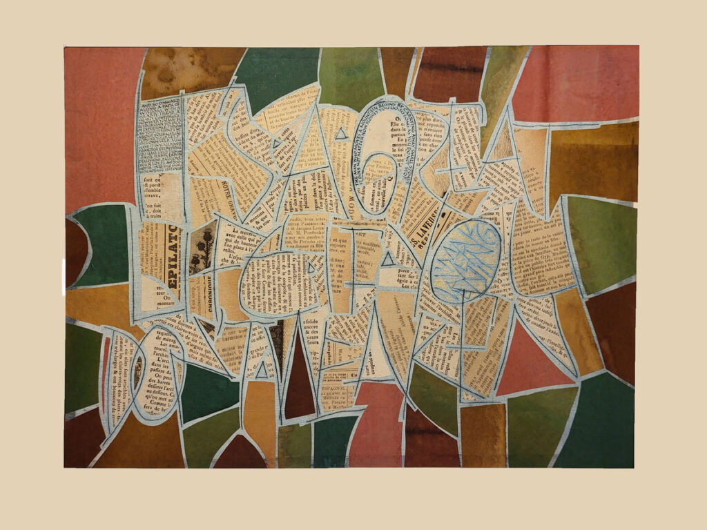
This two-month collage workshop with Brody Neuenschwander has come to an end, and I’ve barely scratched the surface (sorry! couldn’t resist … sorry again!). We explored so much that it would have been impossible to even try it all. We dyed, whitewashed, scratched letters, stamped letters, collaged old book pages and monoprints and actual items, and so much more.
The piece shown above has layers of Western and Asian papers, old book pages, tiny lettering, whitewash, and scratched letters. It references carpet pages such as you might see in 6th-century bibles. The scratched letters read (only if you want to read them) a saying my grandfather was fond of repeating. “It’s a great life if you don’t weaken.” And the tiny lettering at top left and curved at top are more literary and verbose version of the same sentiment. However, the platinum gouache in the egg shape at middle right doesn’t photograph well, answers these quotations: “I’m weakening.” Content area 11 x 14 in.
The collage workshop is dead (not it’s not — I could spend the next 2 years at least on this material). Long live the collage workshop: The Magic of Kozo begins in just two weeks. And I’ve got a big frame to build, and more art (well, hardware-store) supplies to buy. It’s a great life, if you don’t weaken.
This online class finished a couple of weeks ago. However, I’m still working on the plethora of blackletter exemplars and examples that John Stevens shared with us. So it not only was a wonderful class, it still is a wonderful class for me.
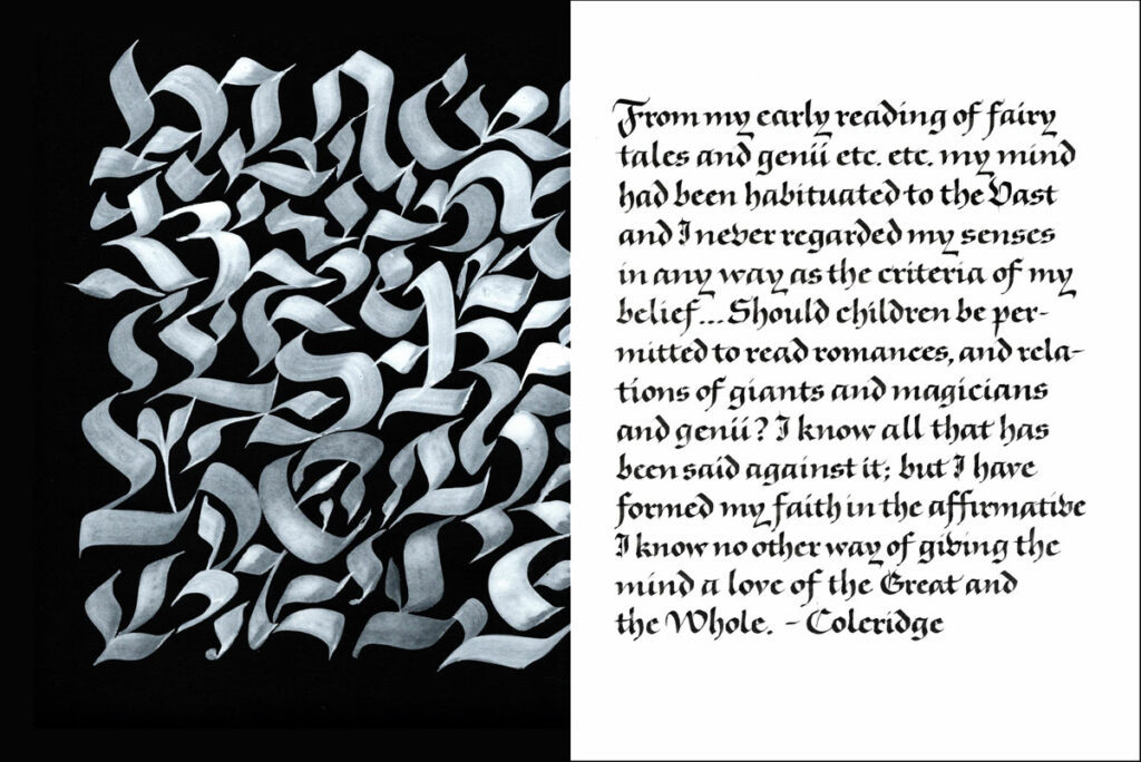
Left: flat brush and Nicker poster color on Artagain black paper. Right: 2mm Brause nib and stick ink on unknown difficult paper. Each page 9×12 in.
John usually includes layout in his classes. And he often uses the folio to combine image and text on the page together. The work above is a response one of those folio assignments.
I still want to spend some time with double-stroked blackletter (this example of John’s is so luscious), Fraktur capitals with pen and with brush, pattern-filled Lombardic capitals, and some Zapf and Koch exemplars. And more …
It’s interesting to compare the lettering I did in this class with the blackletter work I did in Luca Barcellona’s class two years ago. I felt more comfortable with that earlier work, even as it was happening. And I wonder why? I think it may be that the earlier class did not present as many choices, as much background. I feel that I came away from the blackletter class with John Stevens with a whole panoply of lettering choices and ideas, and that I learned one style very well in Luca Barcellona’s class. Both have been extraordinarily valuable classes. And I’m glad that I happened to take the two classes in the order that I did.
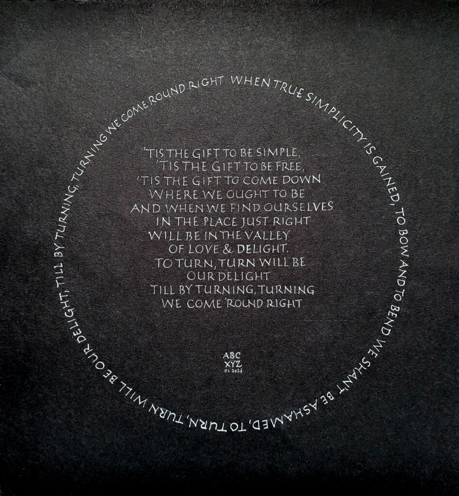
Done for a weekly prompt, this one: Simplicity & pointed pen. The circle is 7.4″ in diameter.
Has it been over a month since I last posted?! I’ve been learning a lot of calligraphy and a lot of bookbinding and box-making. And I’ve been playing a lot of music.